Pienso
Pienso is a start-up devoted to putting the power of machine learning in the hands of non-programmers. Their success depended on the team's ability to develop an interface that made all the data manipulation capabilities of advanced text analysis algorithms intuitive for people without a PhD in computer science. I spent the summer between my first and second years of grad school helping out.
Lexicography
Before designing anything, I would need to build a practical understanding of what the Pienso team had already built. Interviews with Pienso's CTO and director of engineering were instructive, but also revealed a simple problem: teammates were using different words for the same things, leading to unnecessary confusion. So as I took notes on each conversation, I began to develop a list of all the new terms I encountered. When I had identified the redundancies, I met with the team to present my recommendation for standardized terminology. Once they were aligned, I developed the resource above — a short document that visualizes the analogies embedded in Pienso's official lexicon.
Cartography
Now that we were using the same terminology, it became easier to have substantive conversations about our varied visions for the next iteration of the interface. Pienso already had a functioning prototype when I joined the team, but much of it was opaque to the uninitiated. So I developed the diagram above to explain my point of view to my teammates: this is how I envision a new user flowing through the Pienso process, and these highlighted sections are markedly different from what we have right now. By making a map of my ideal user journey, I gave the team a tool through which we could discuss the addition, omission or re-sequencing of features and information in context.

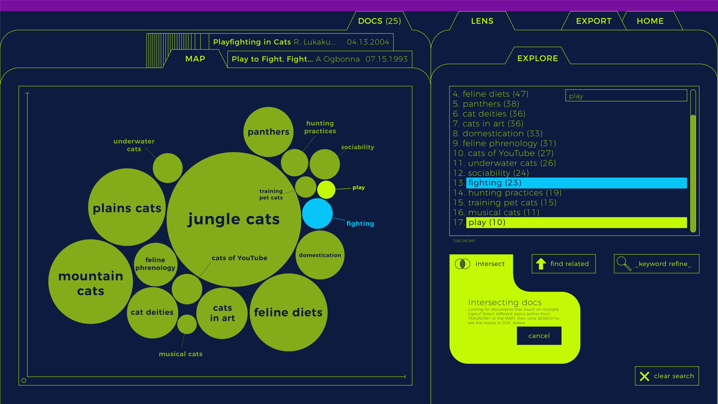
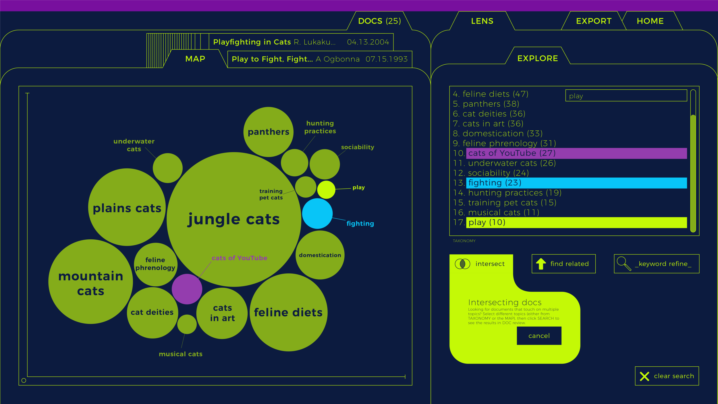
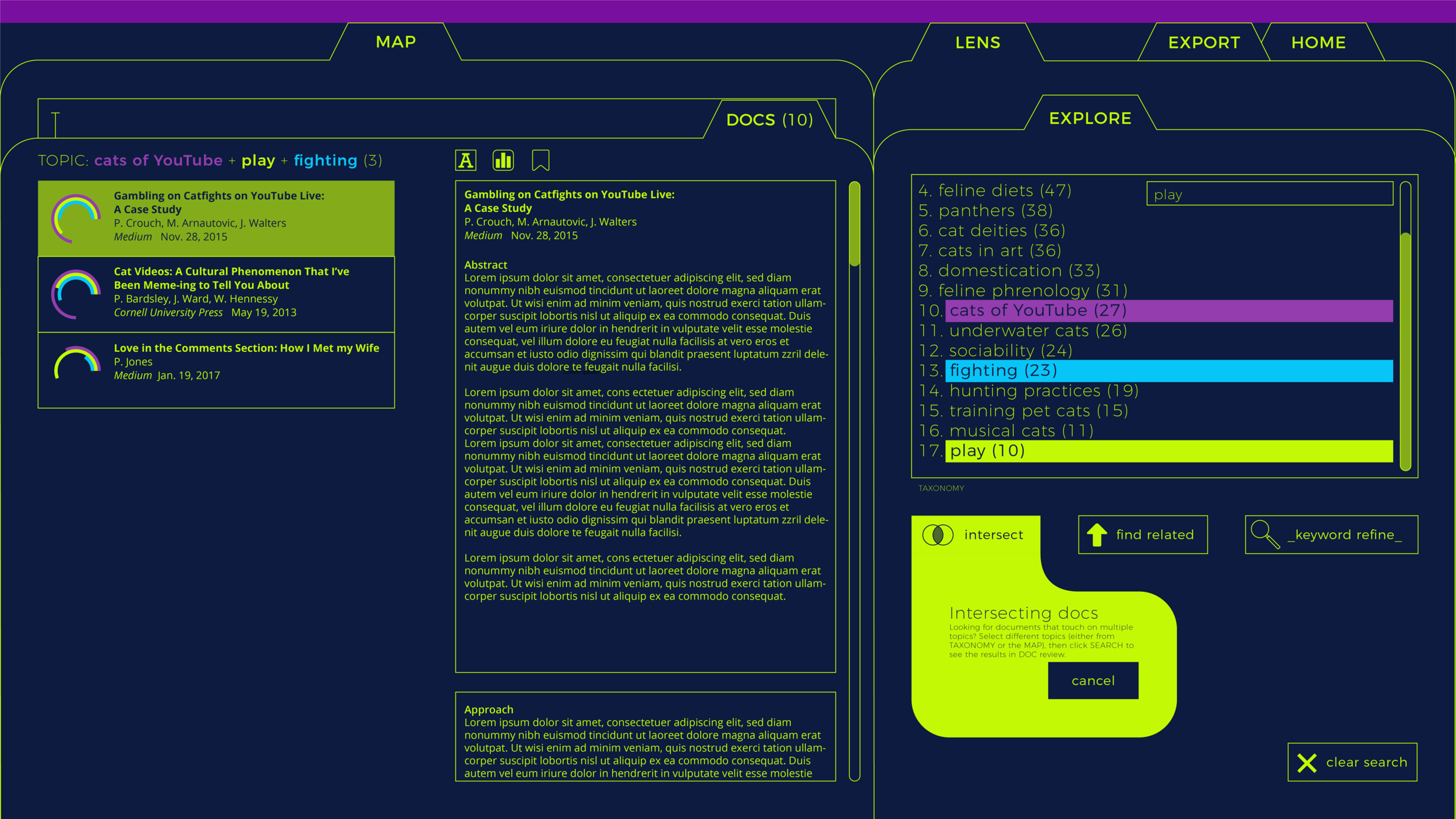
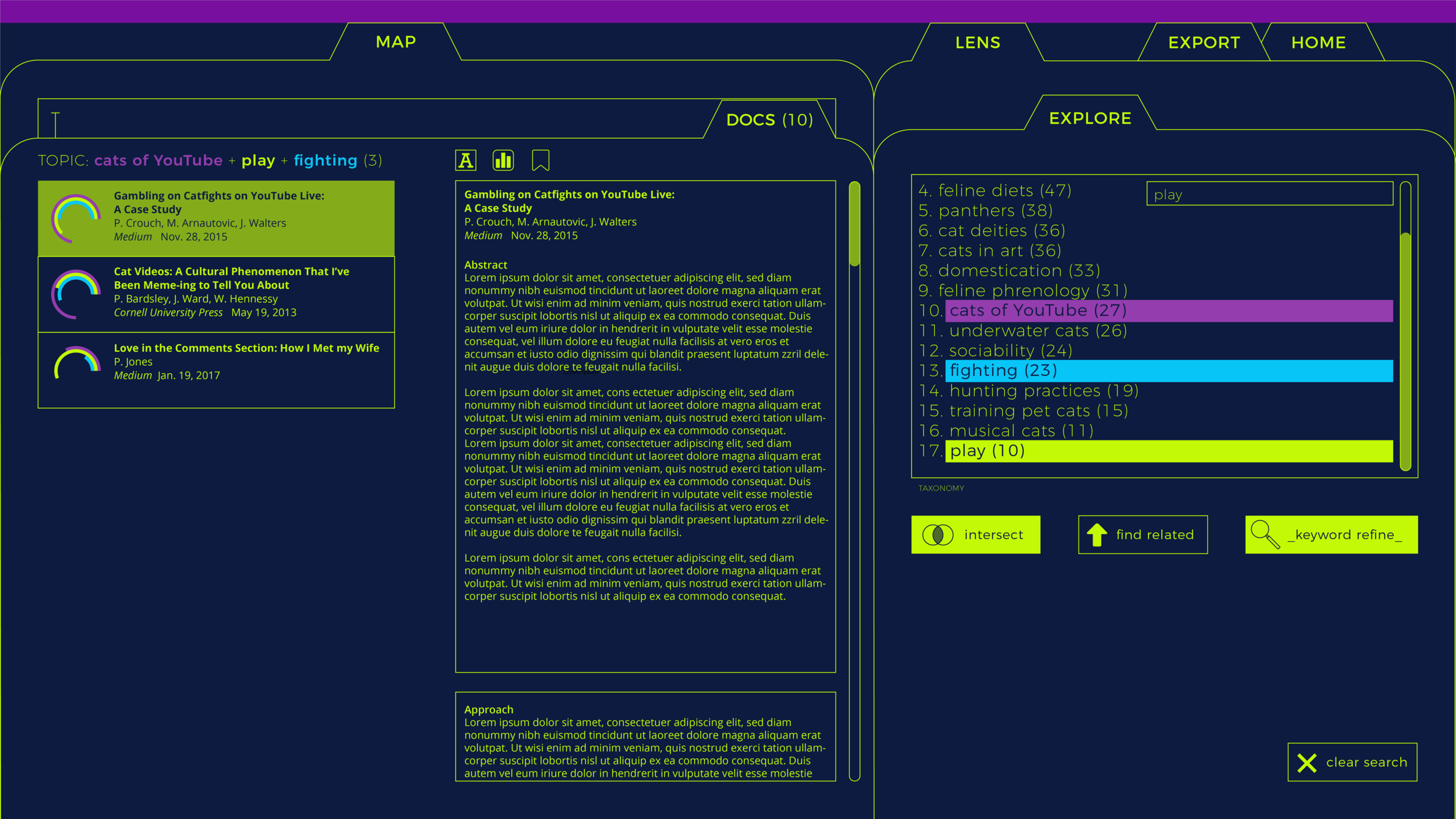

Wireframing
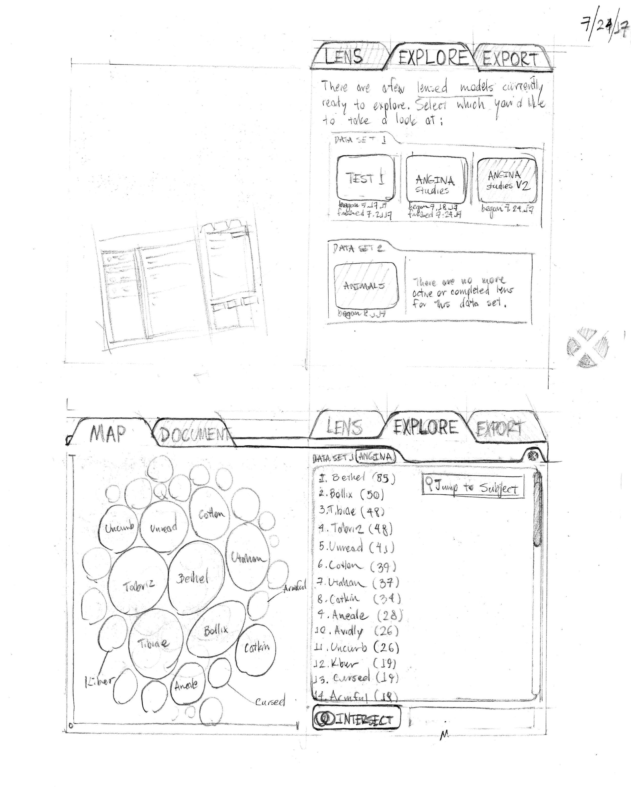
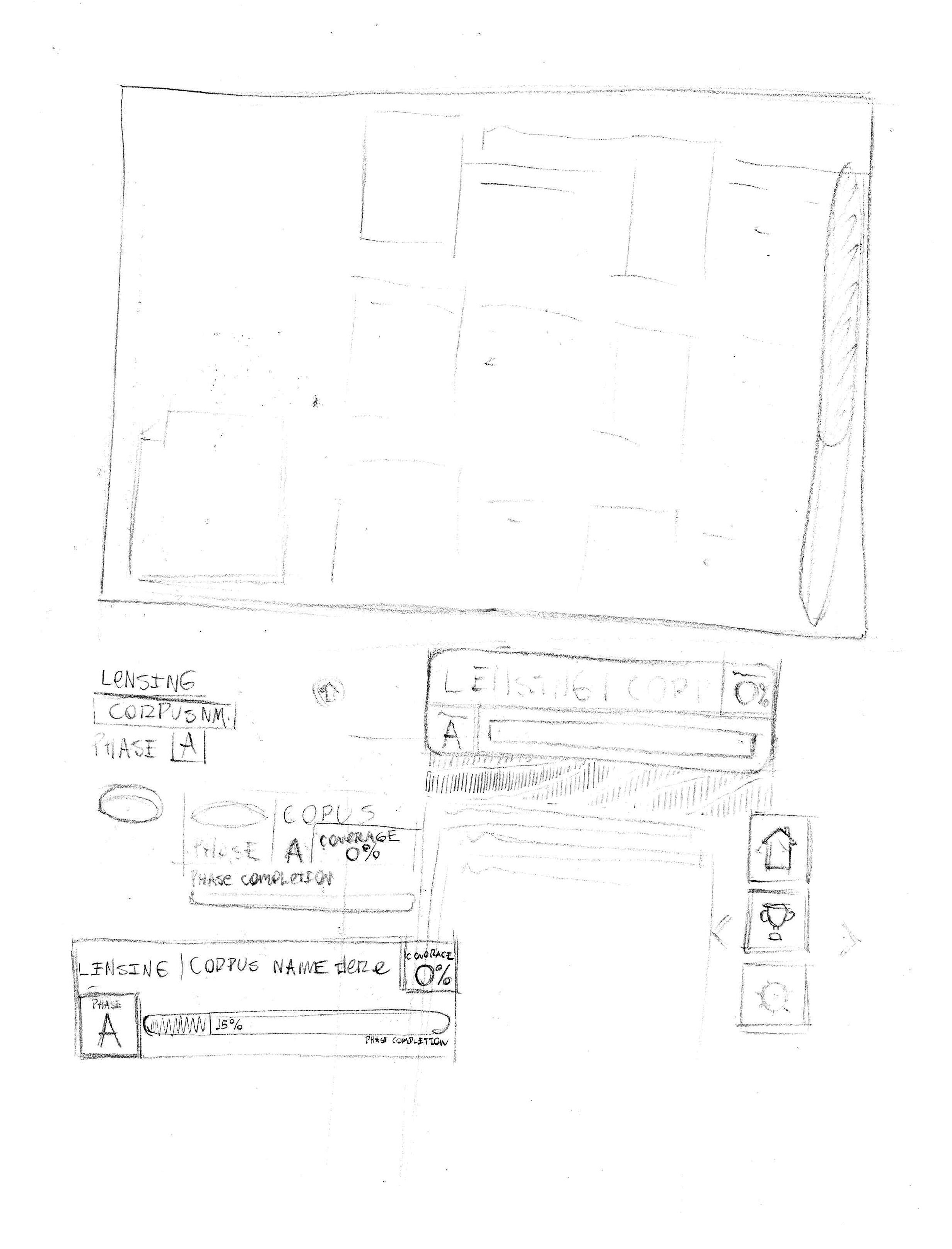
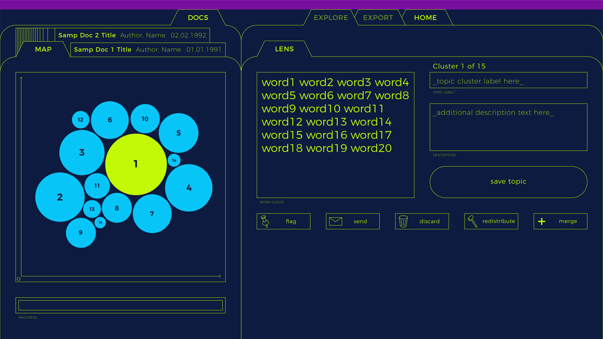
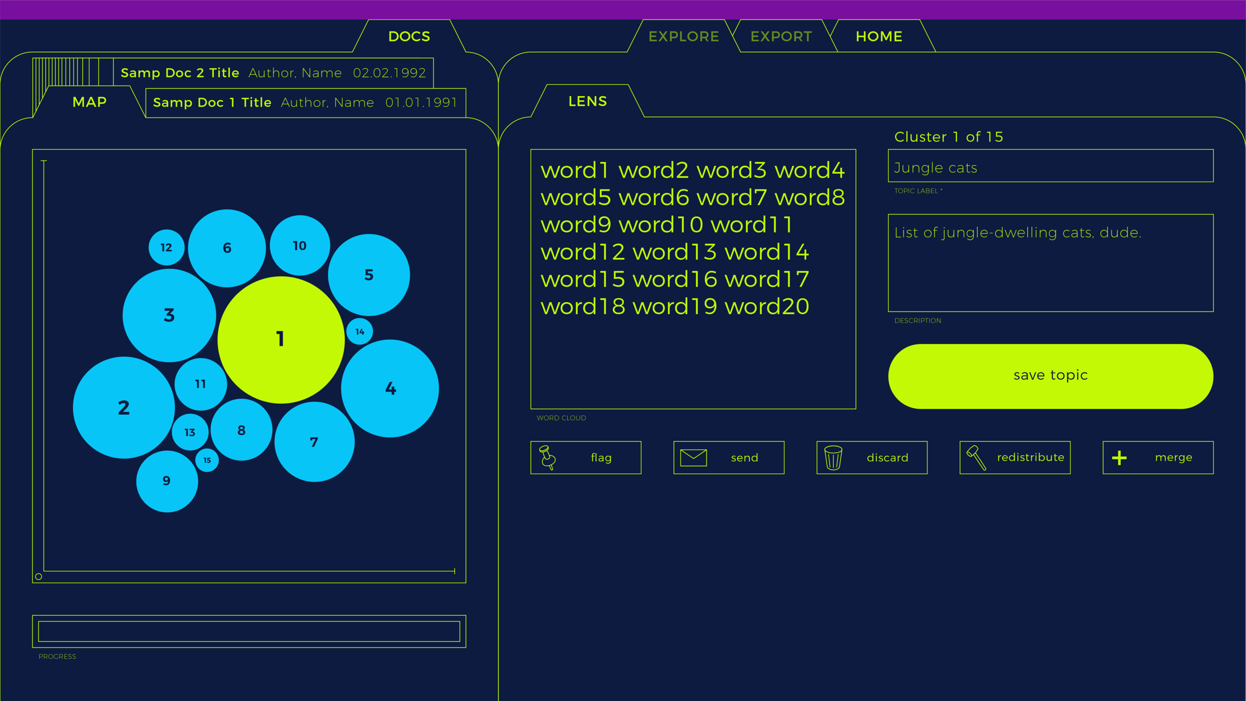
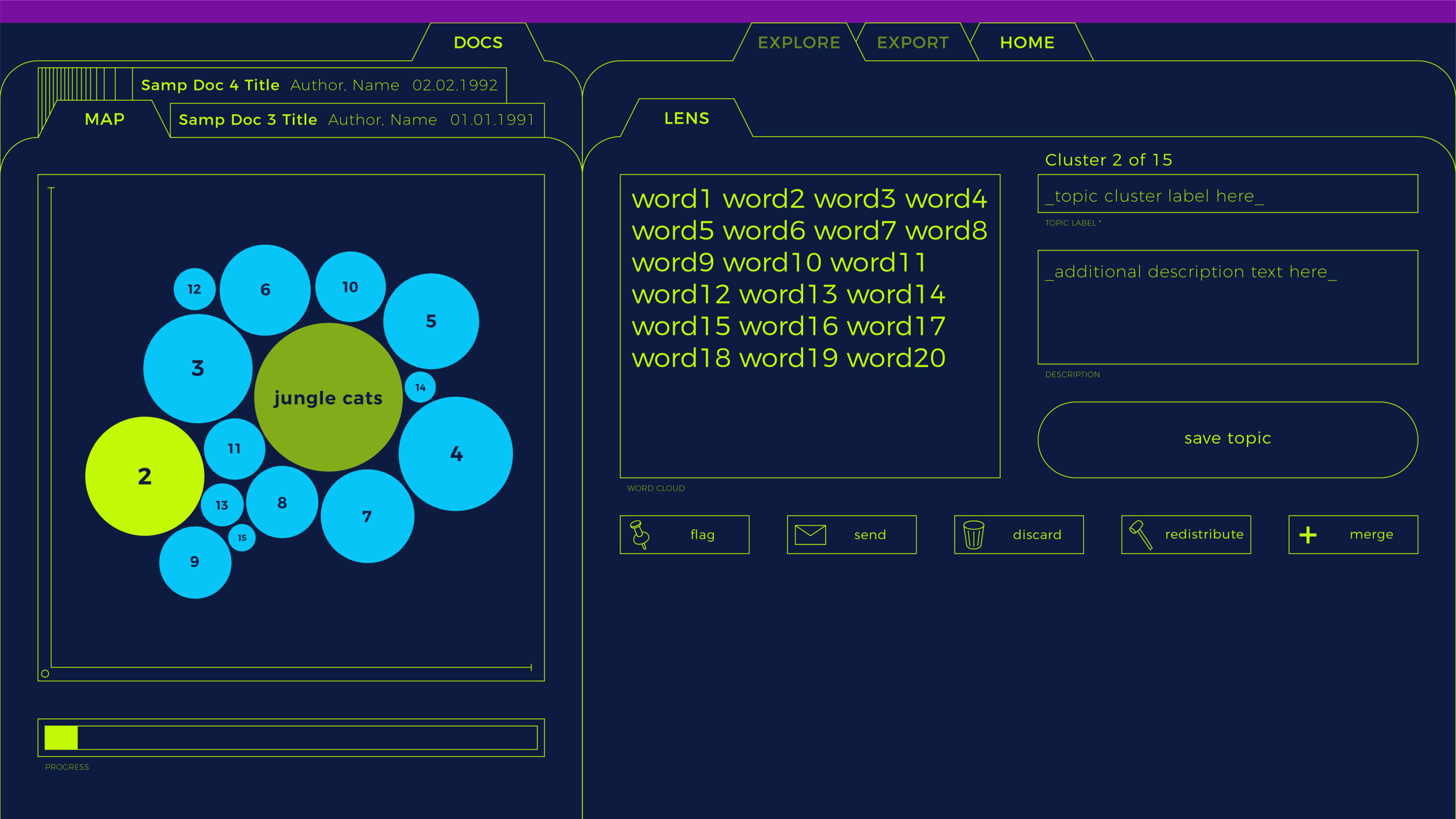
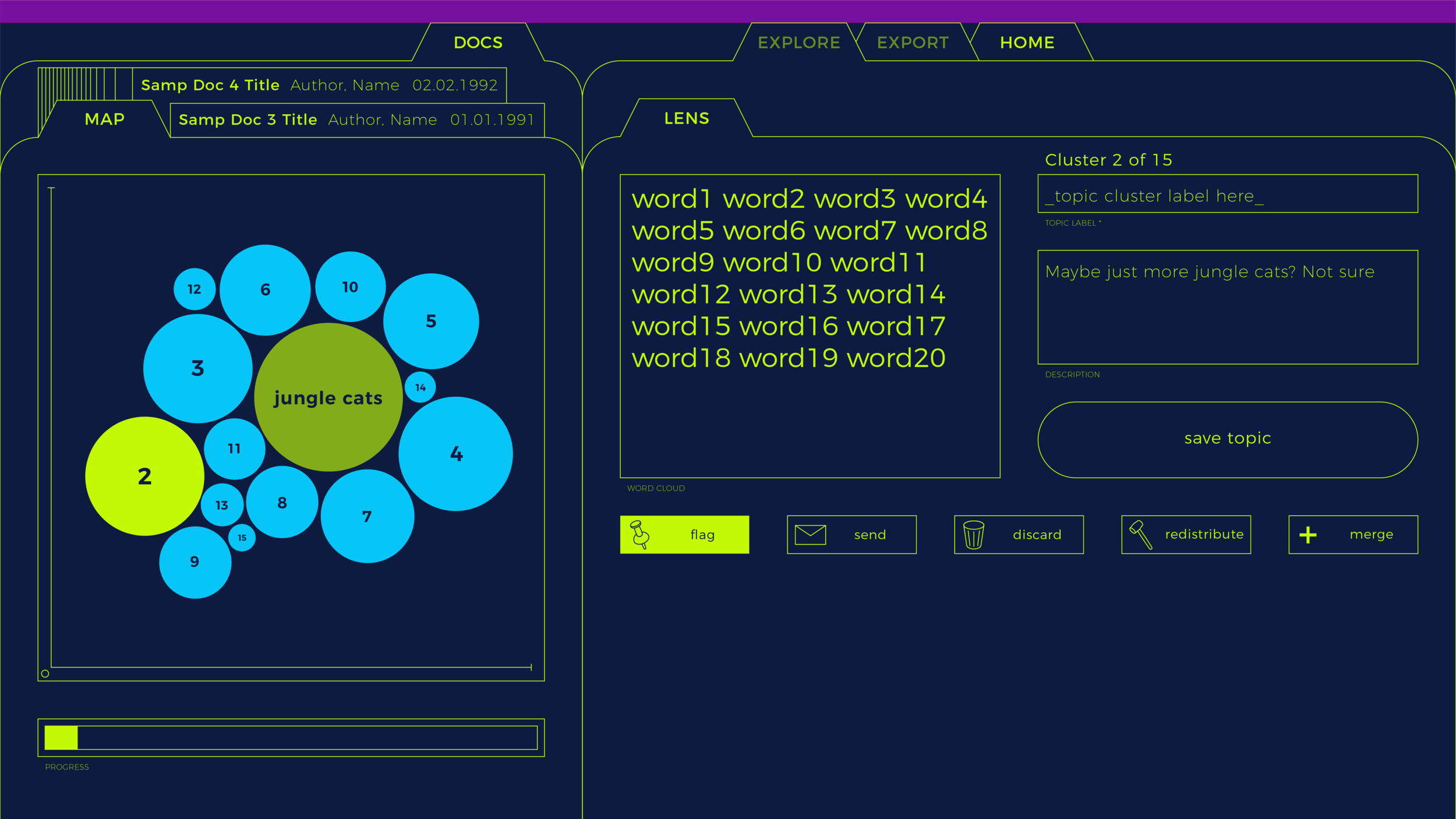
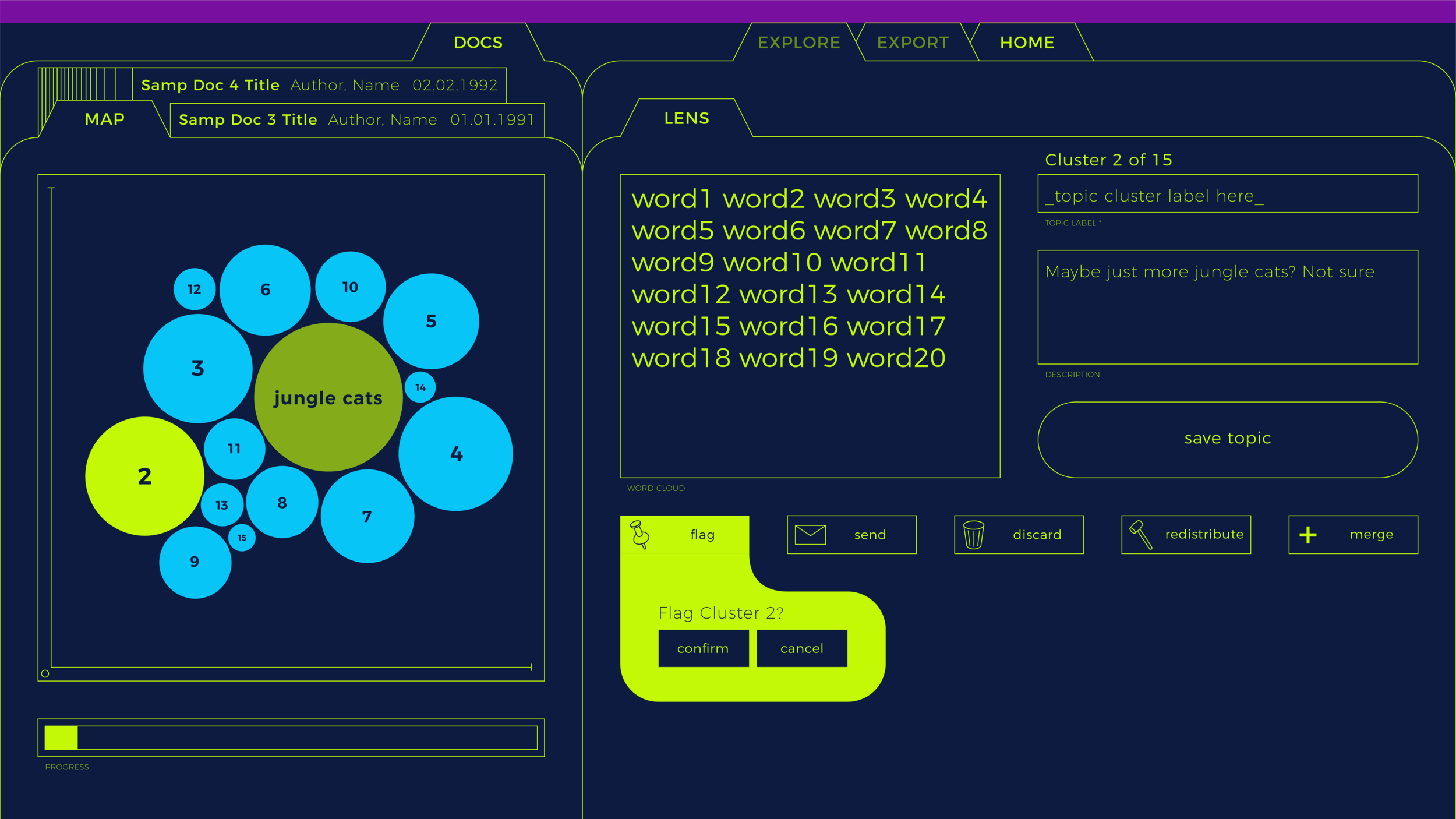
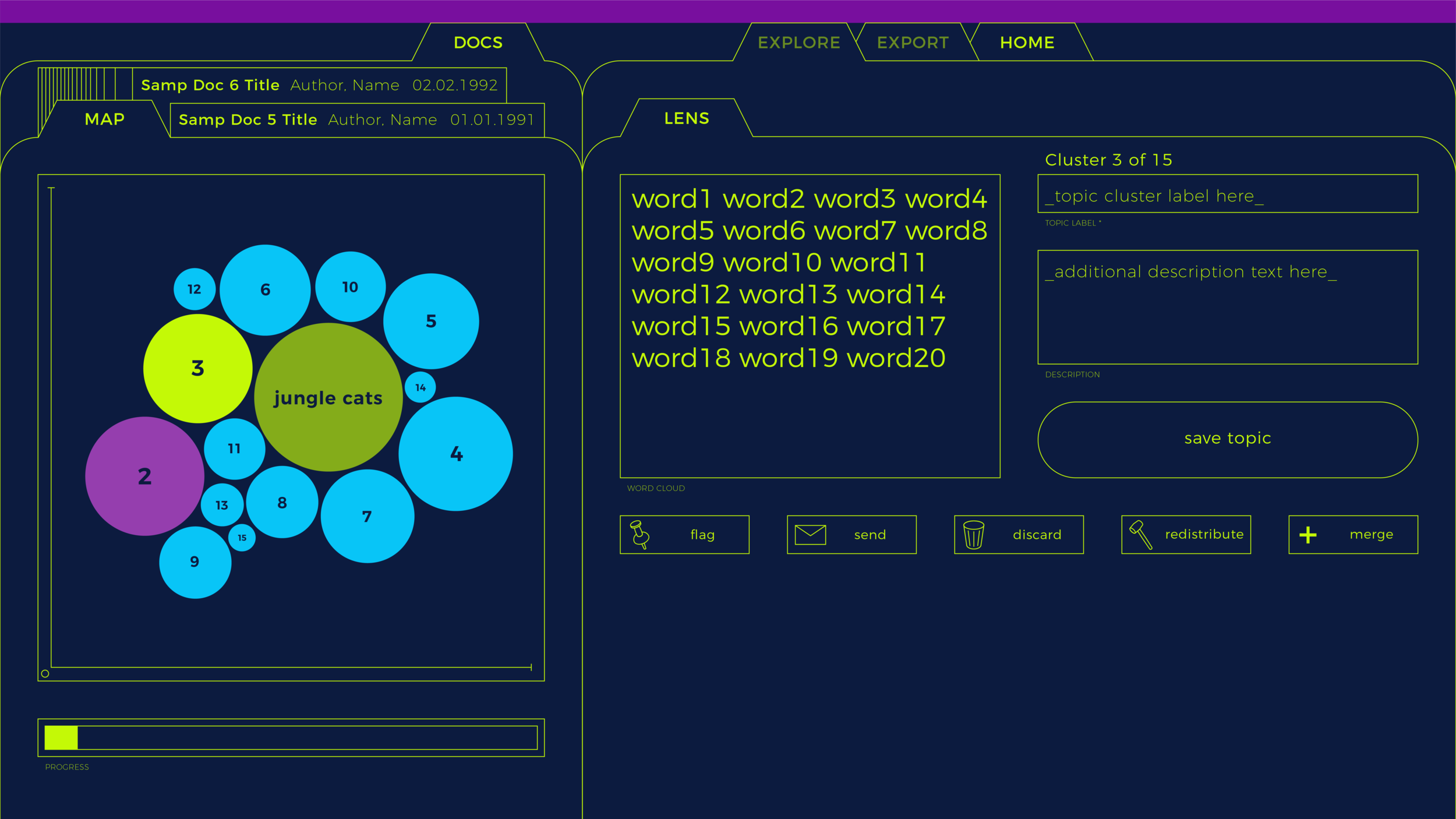
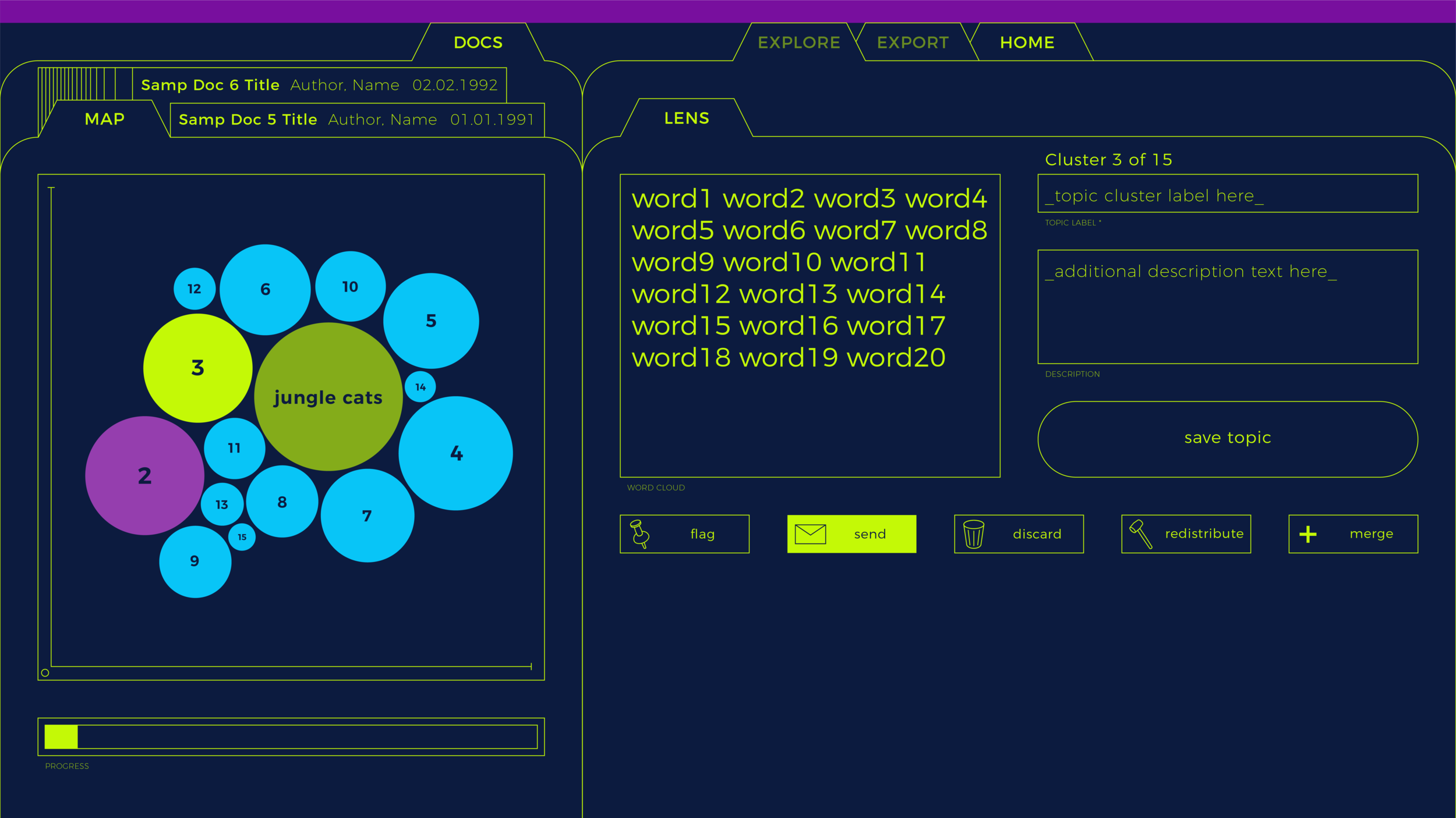
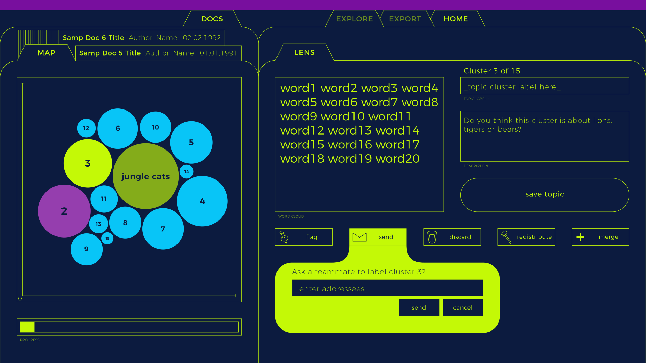
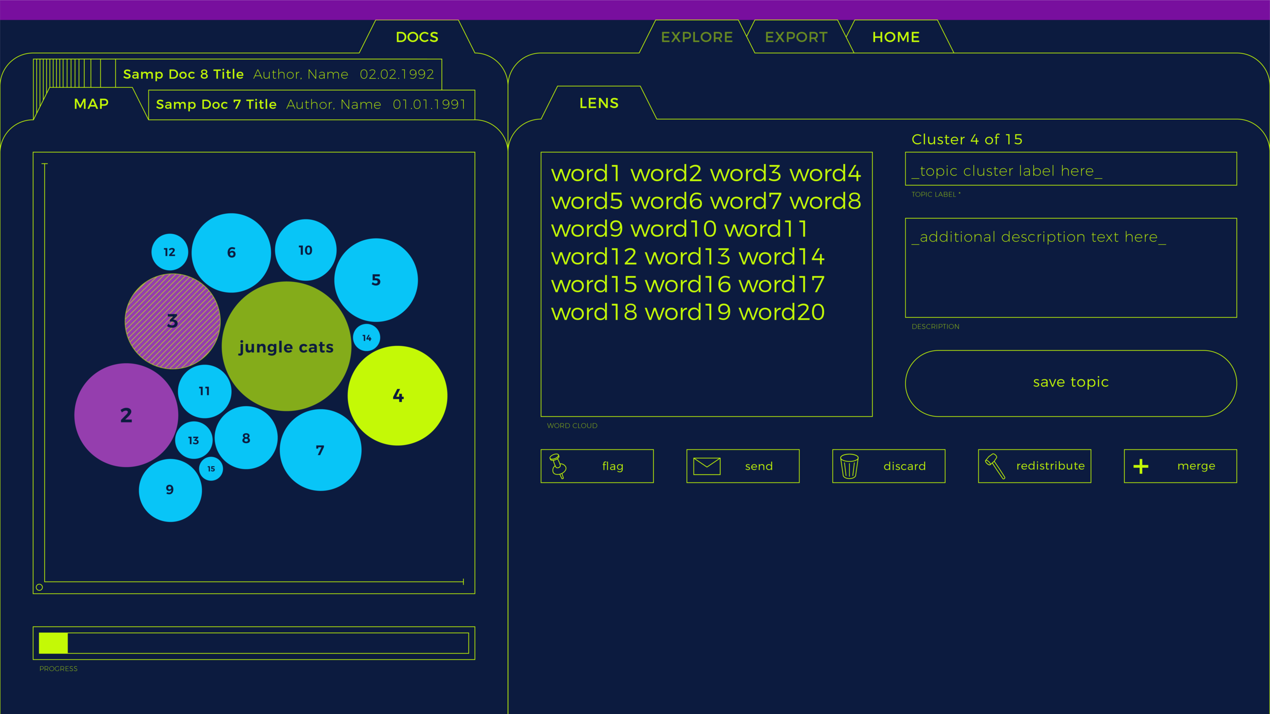
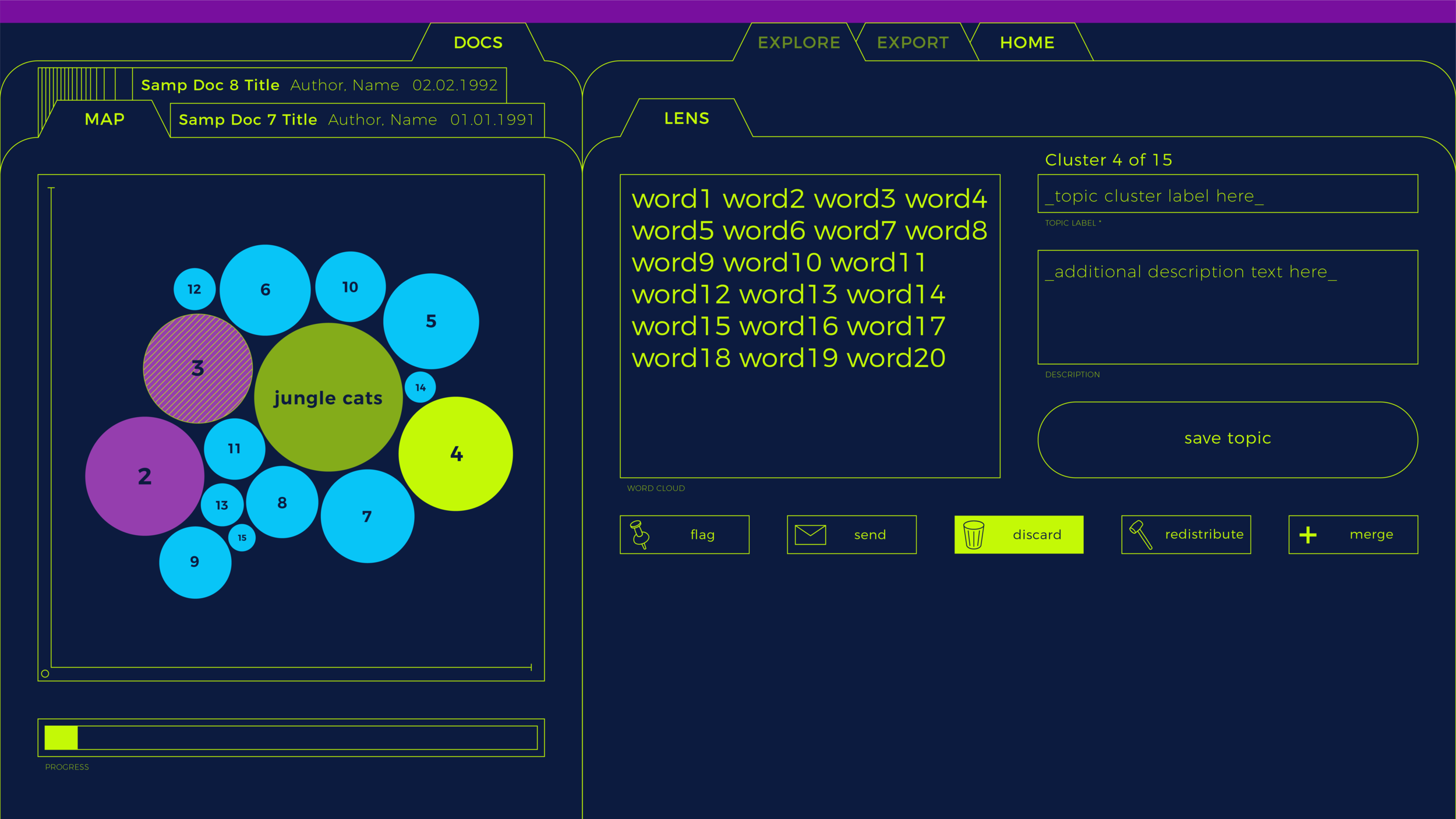
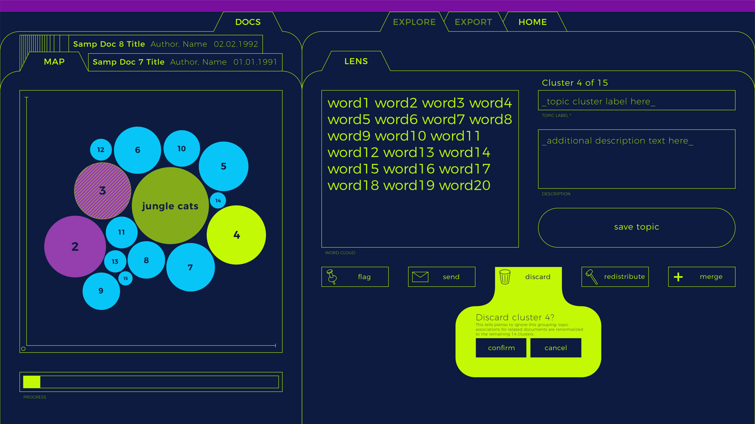
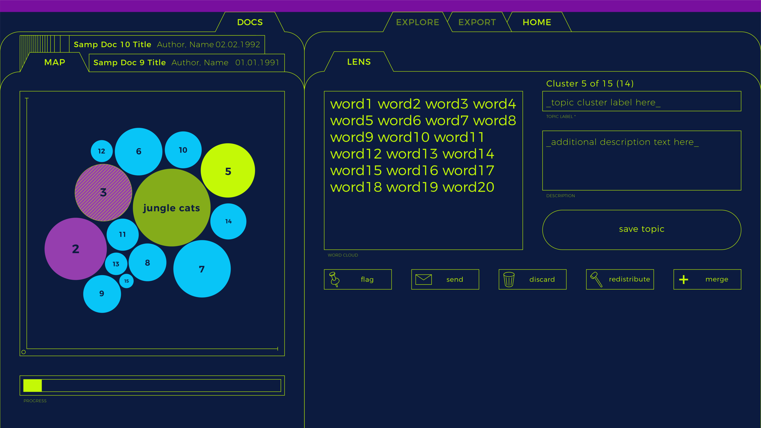
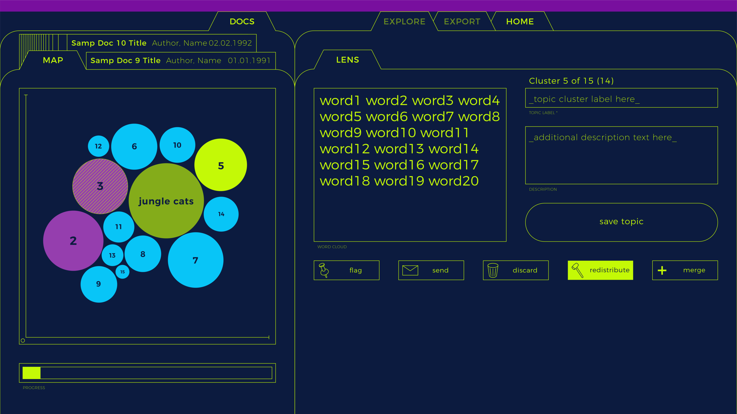
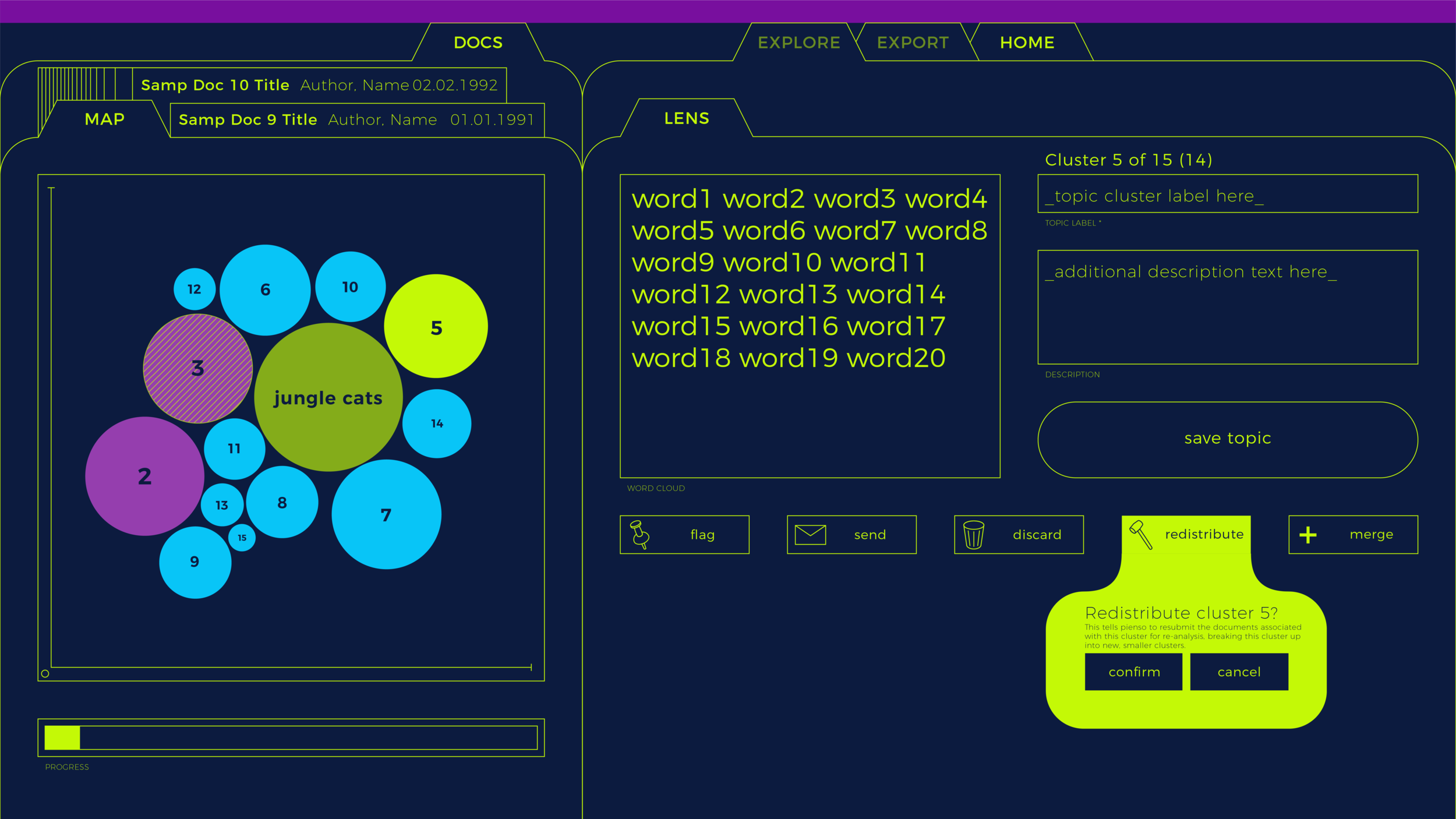
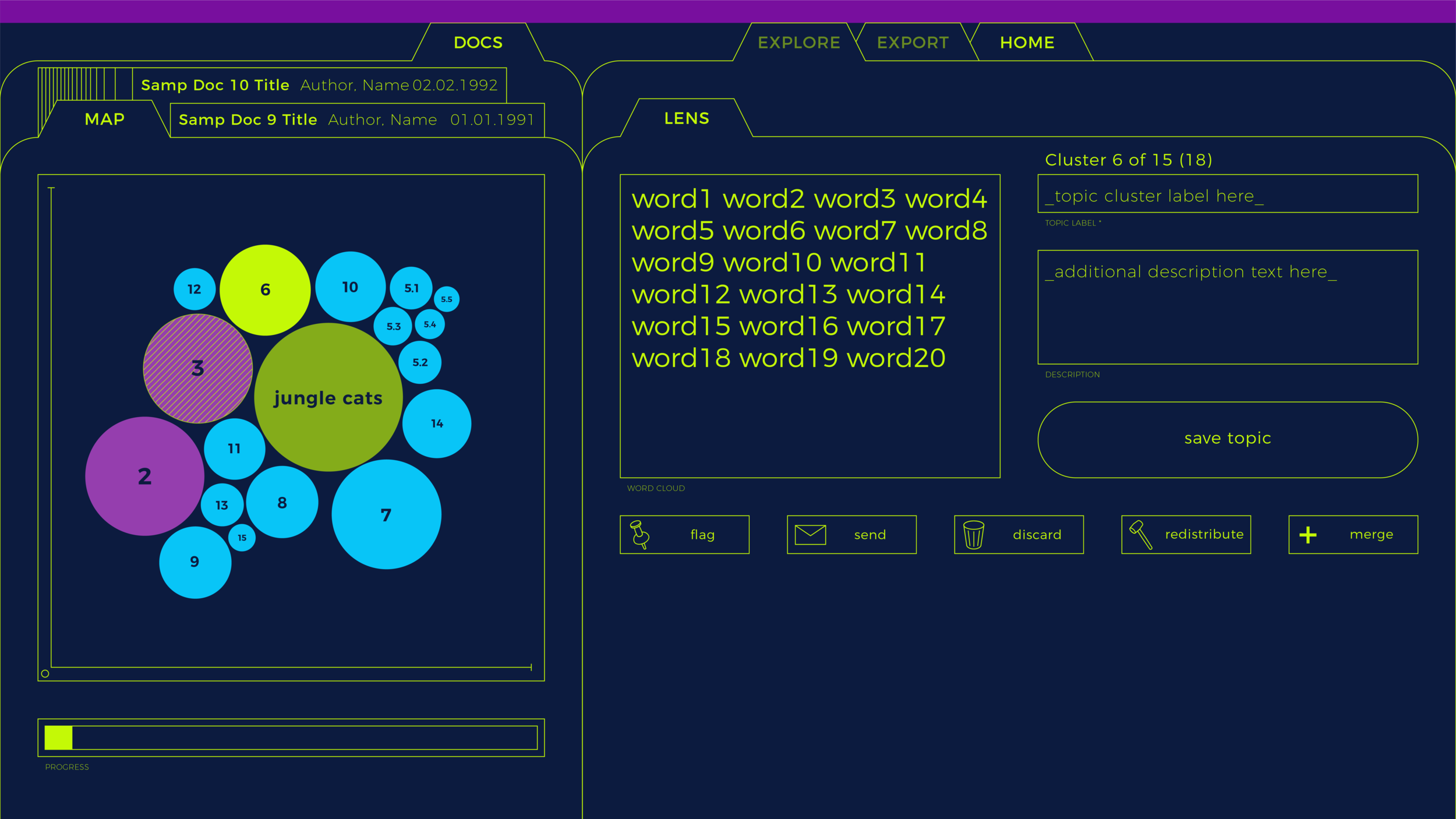
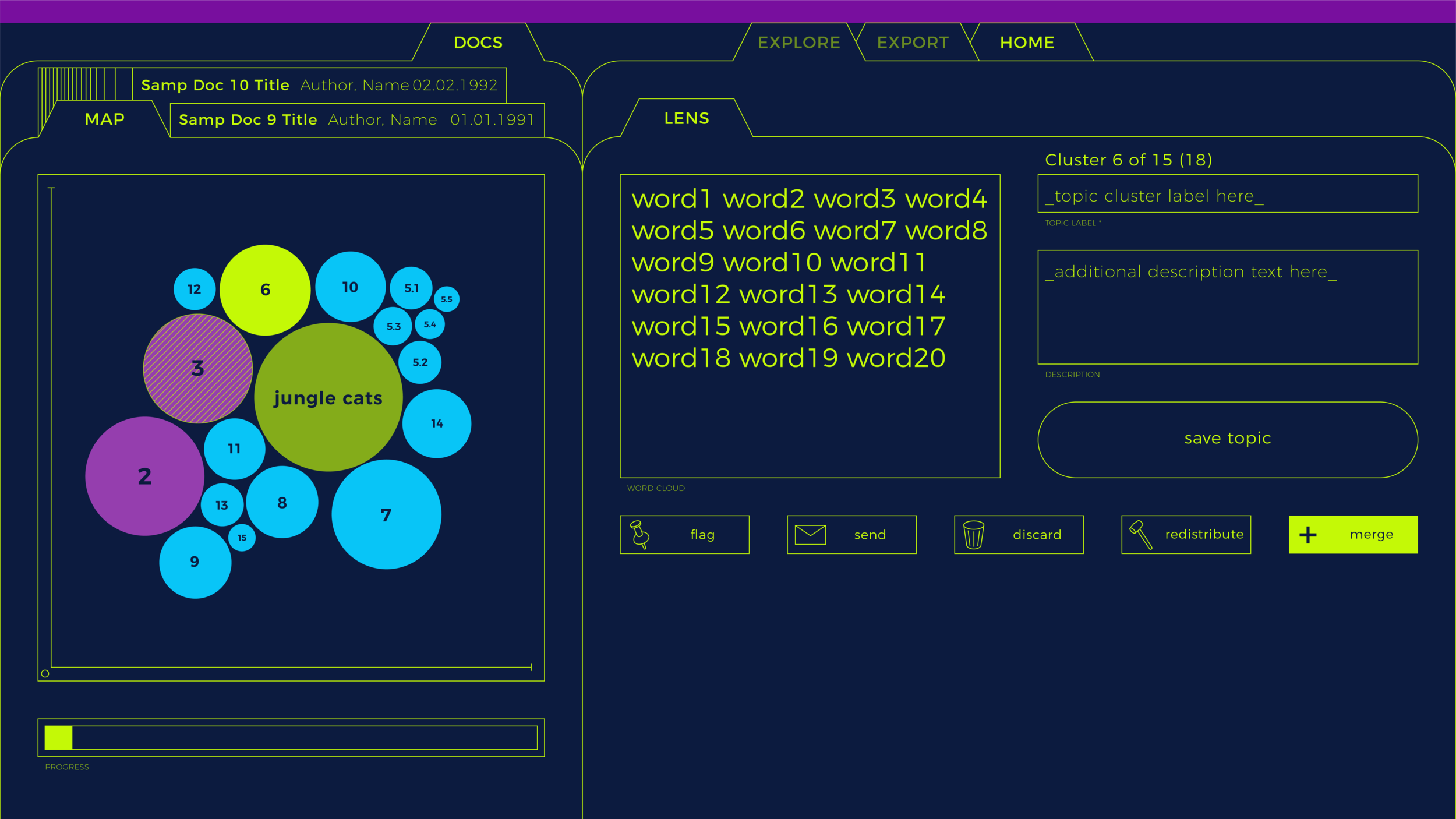
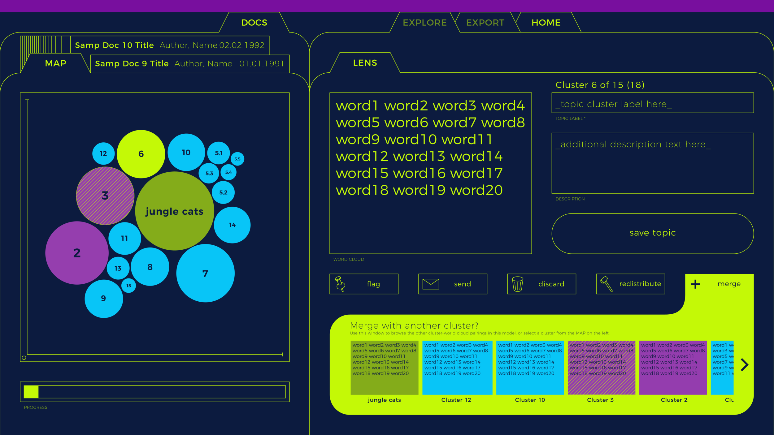
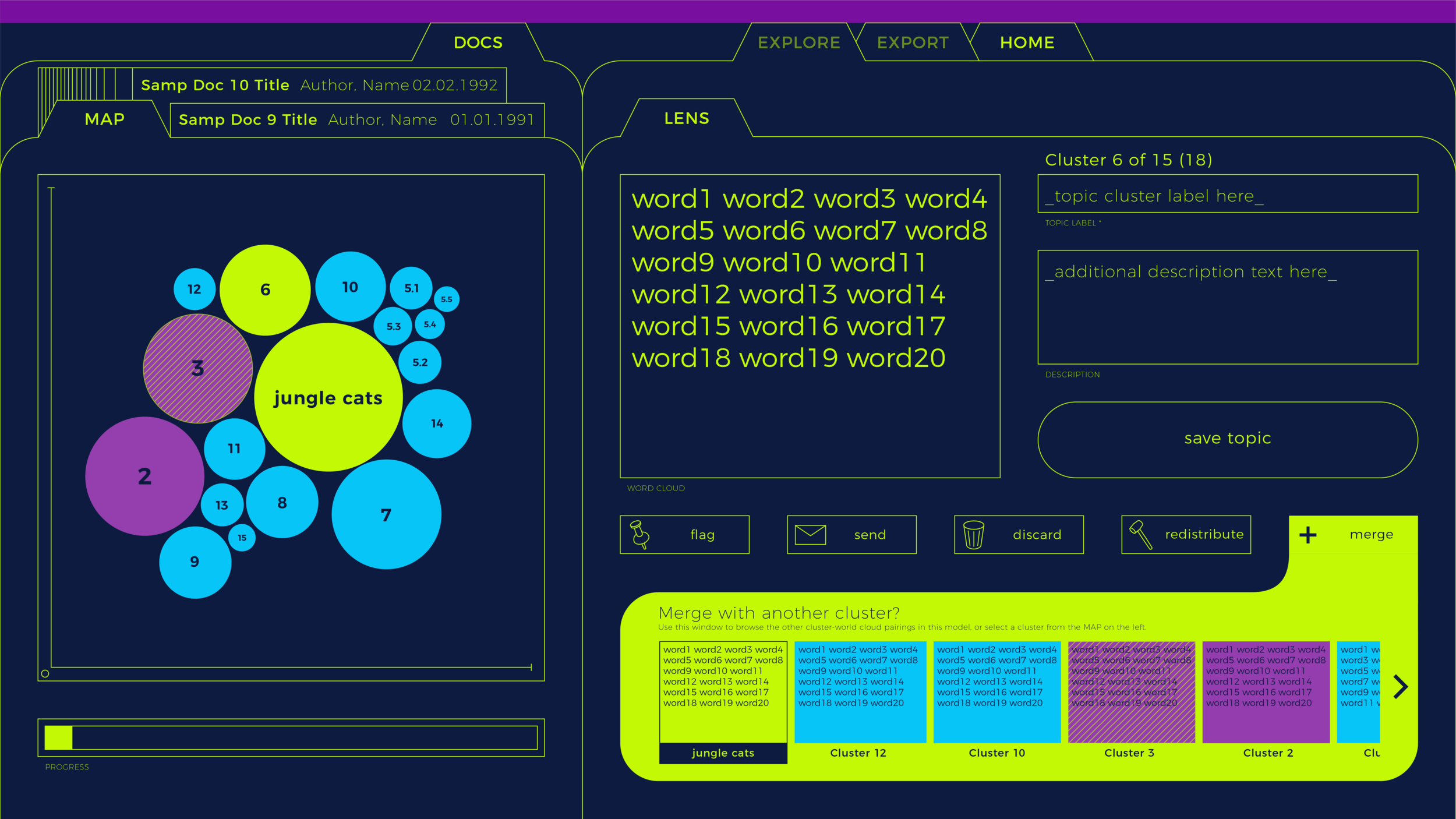
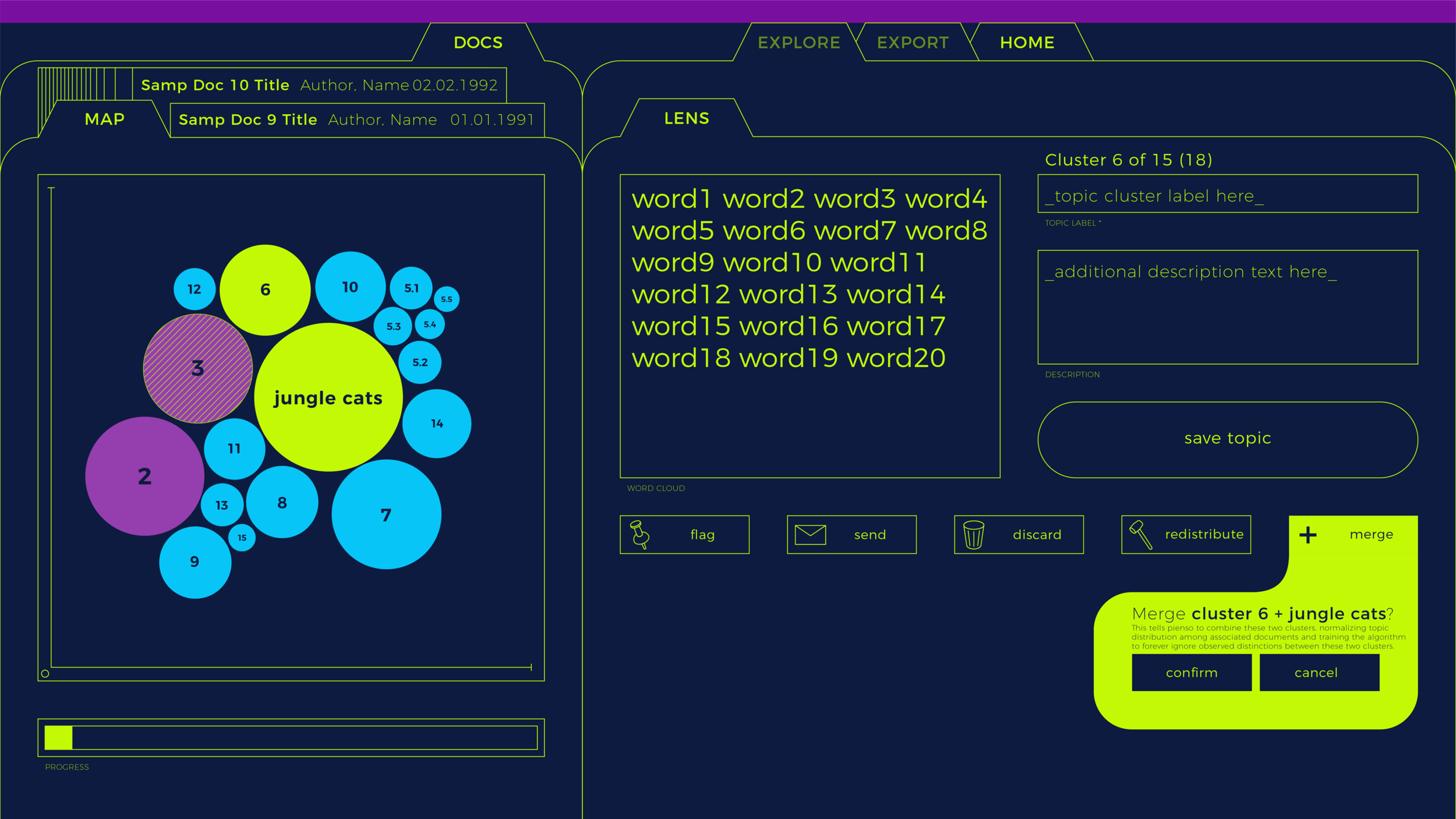
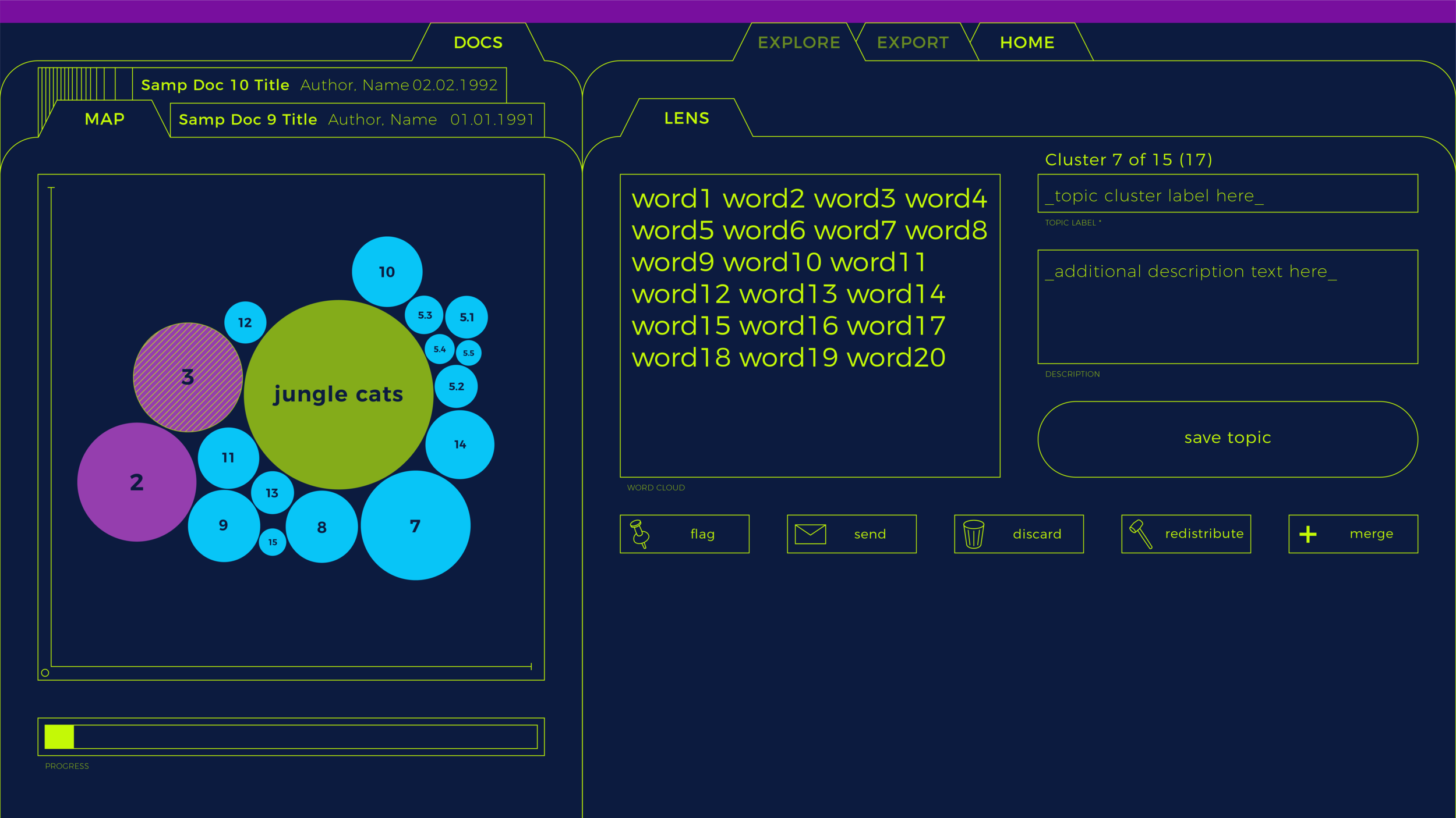
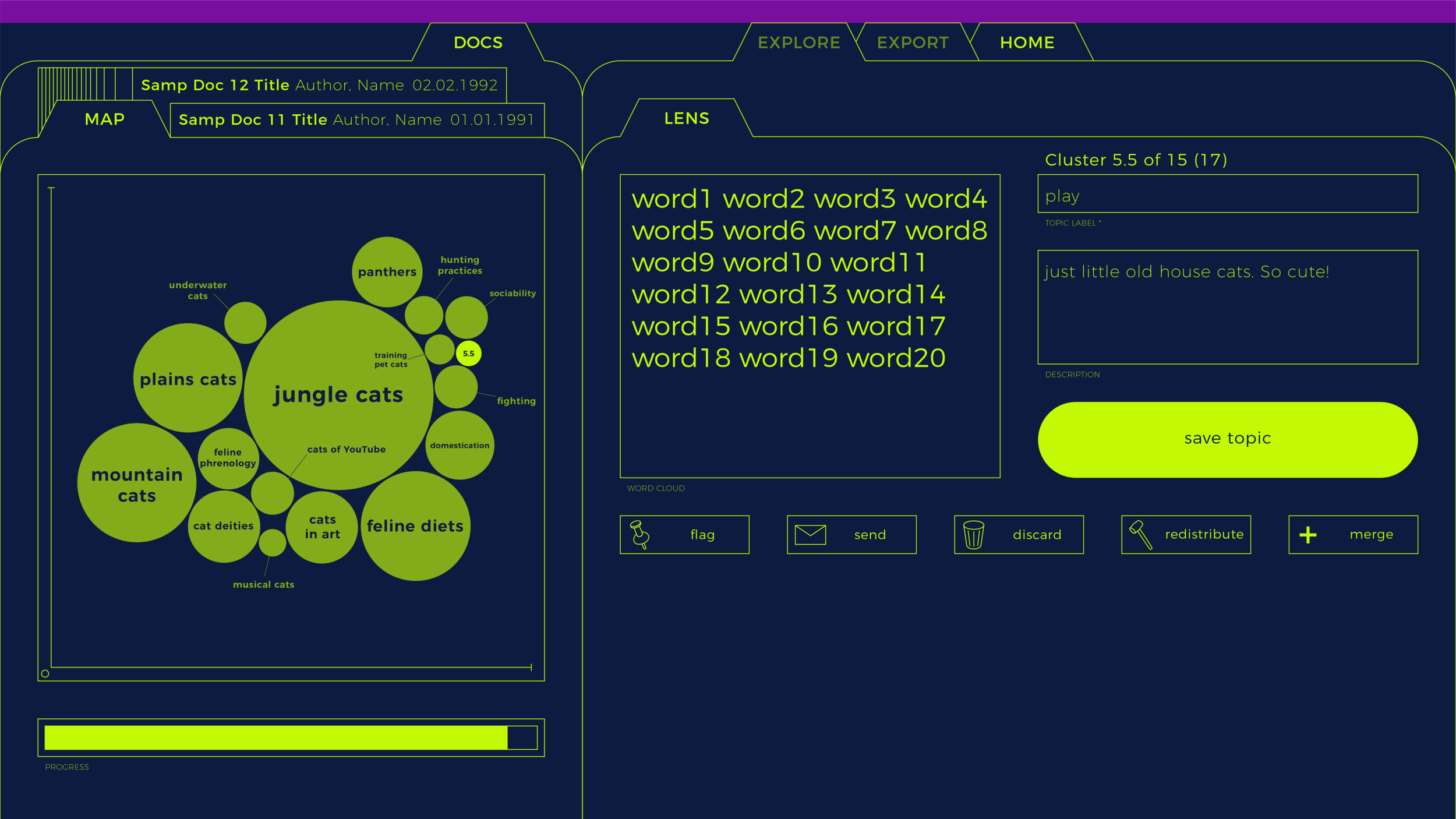
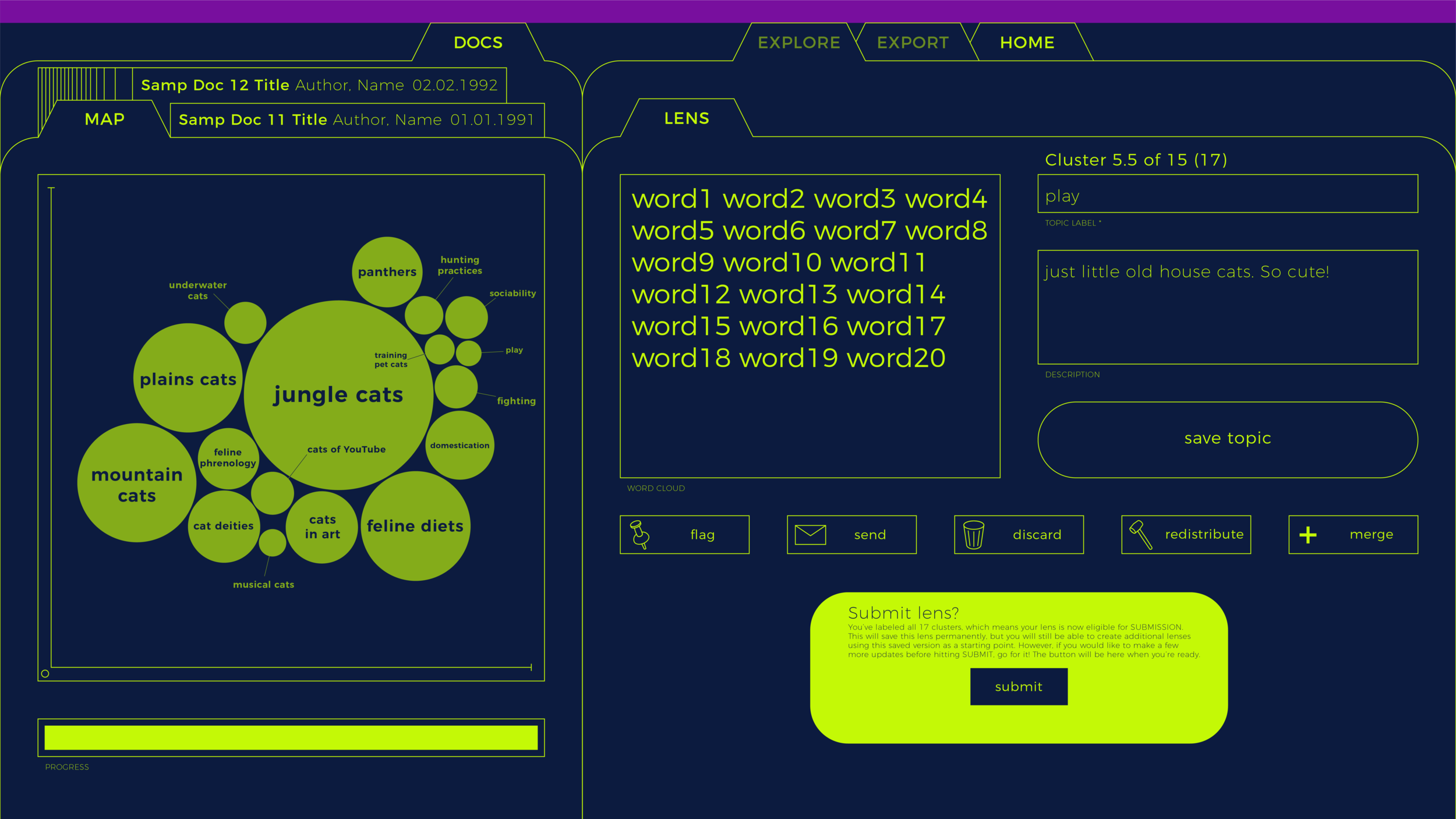
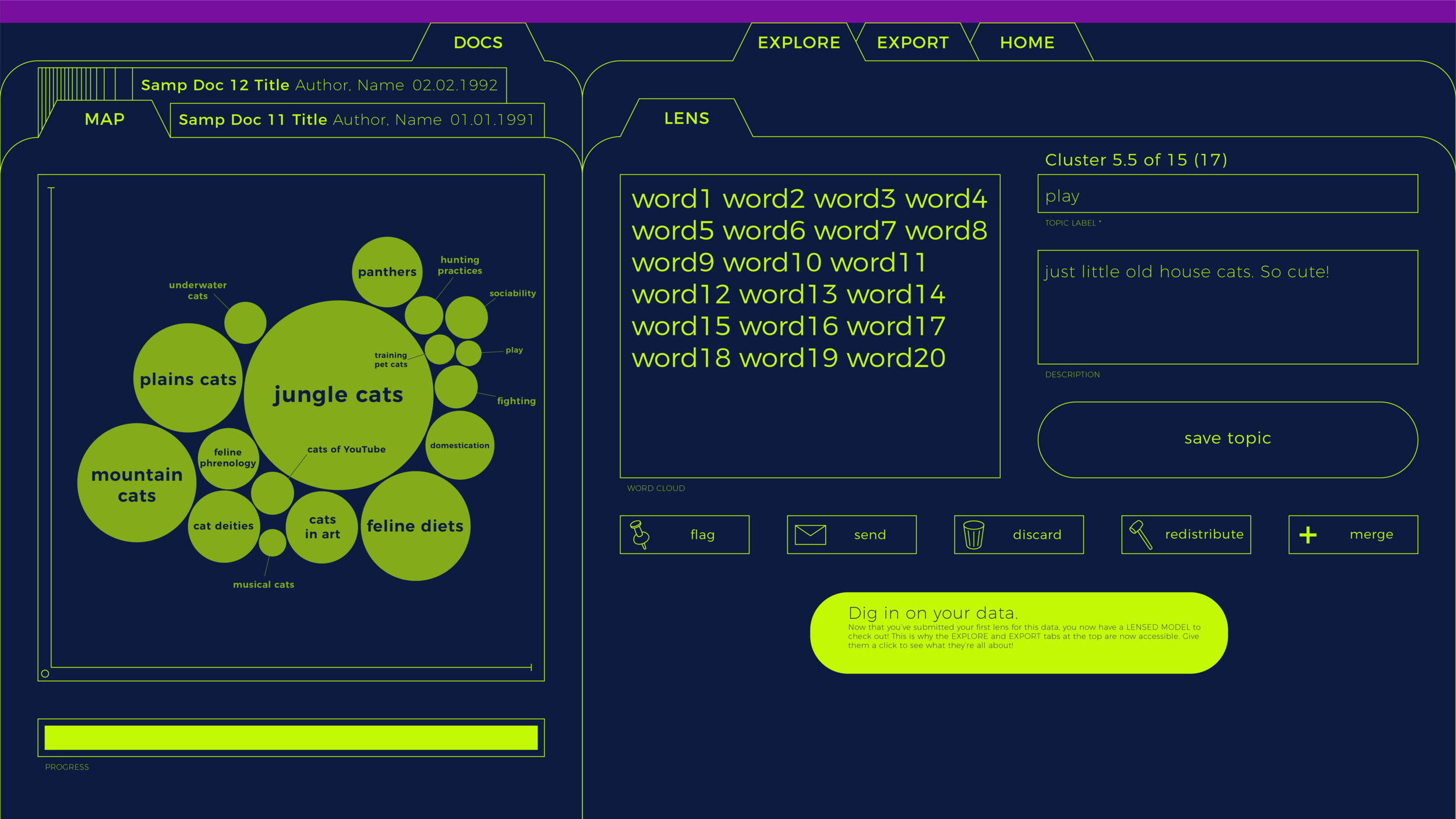
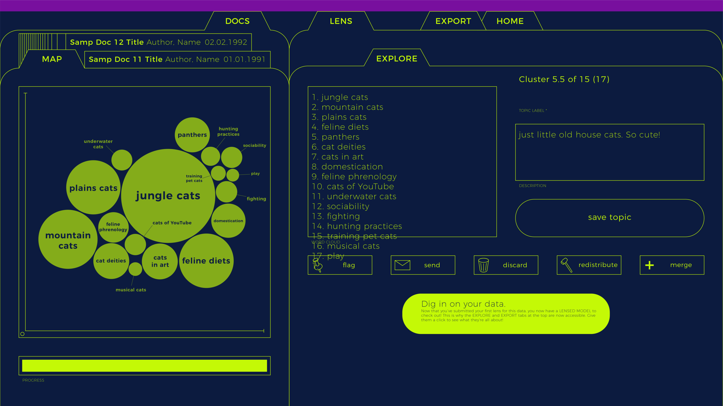
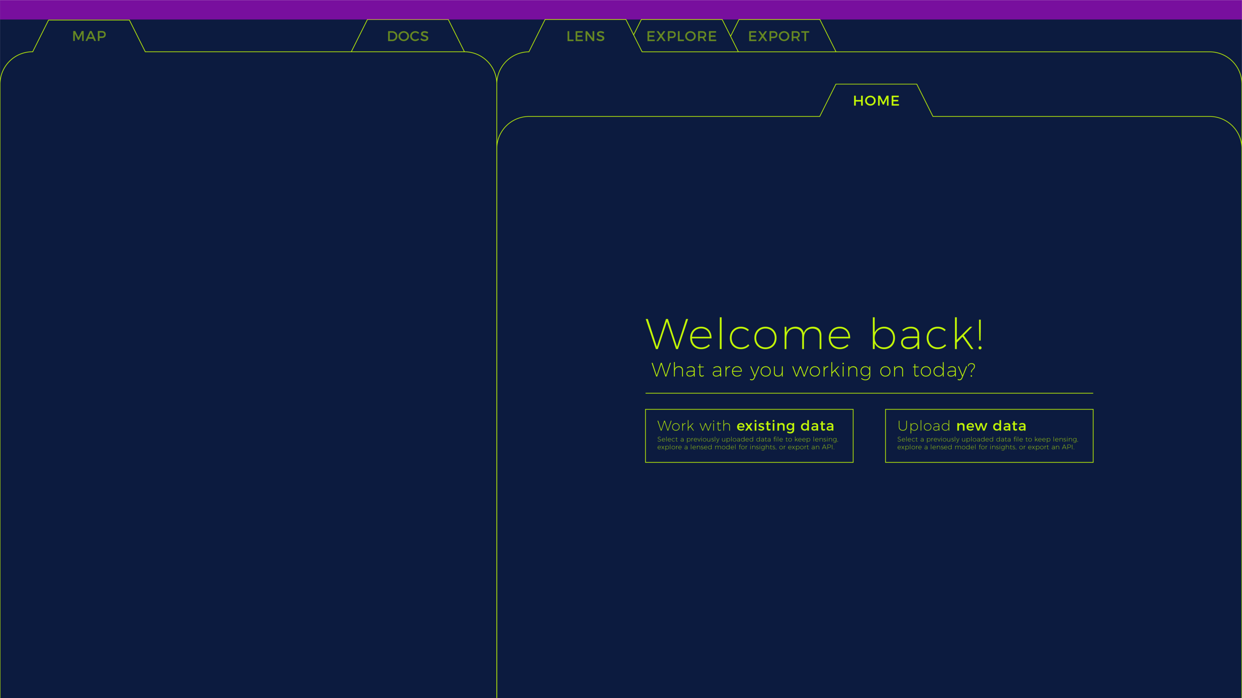
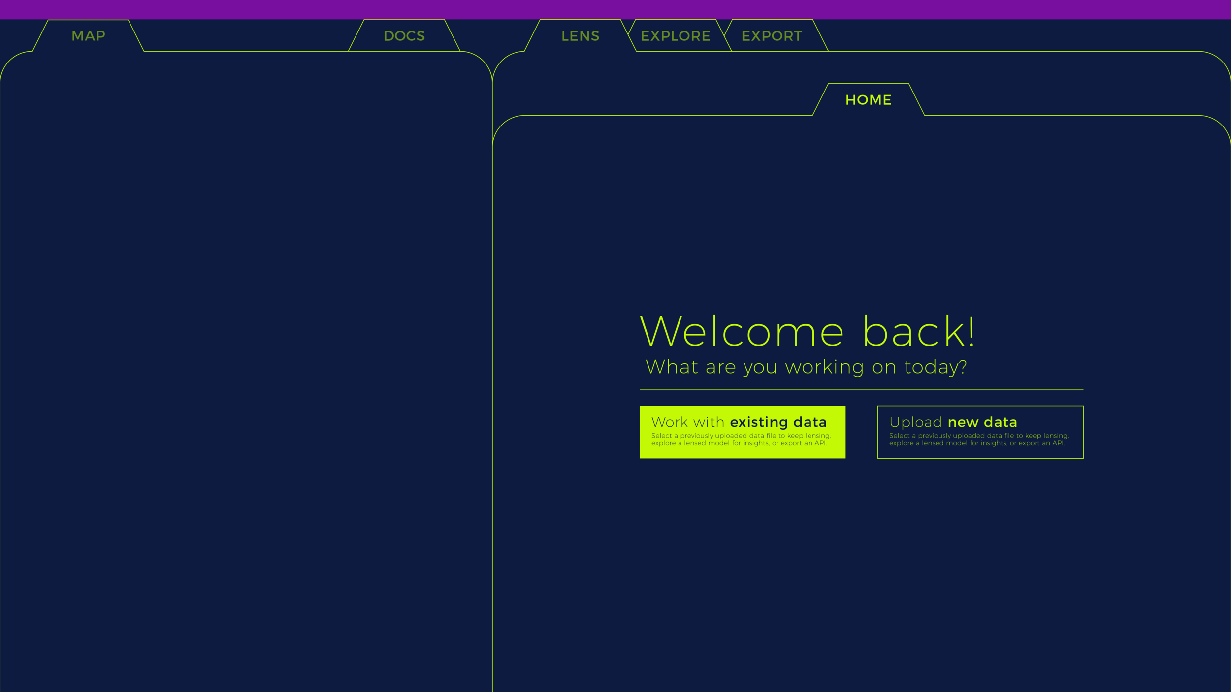
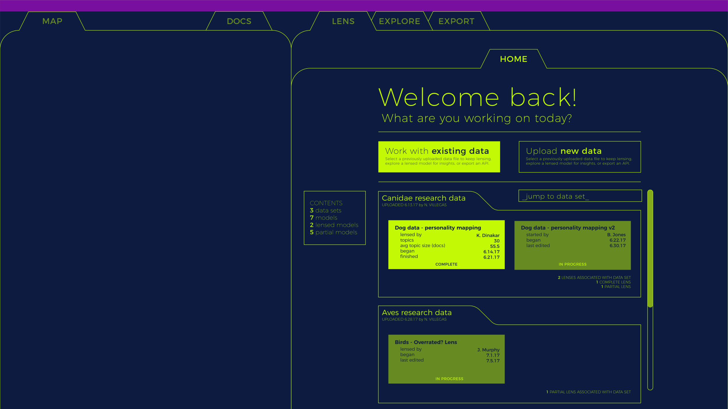
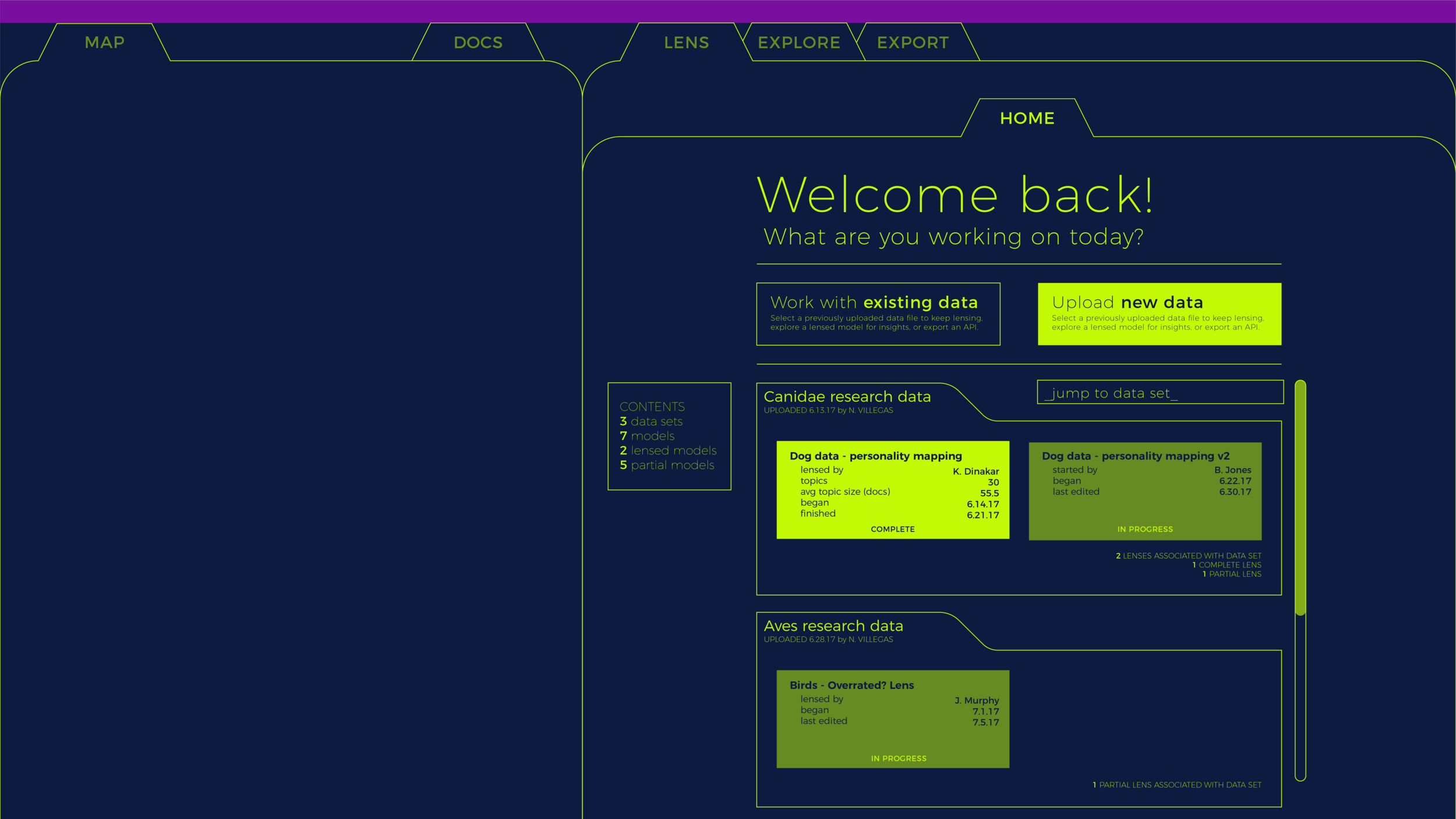
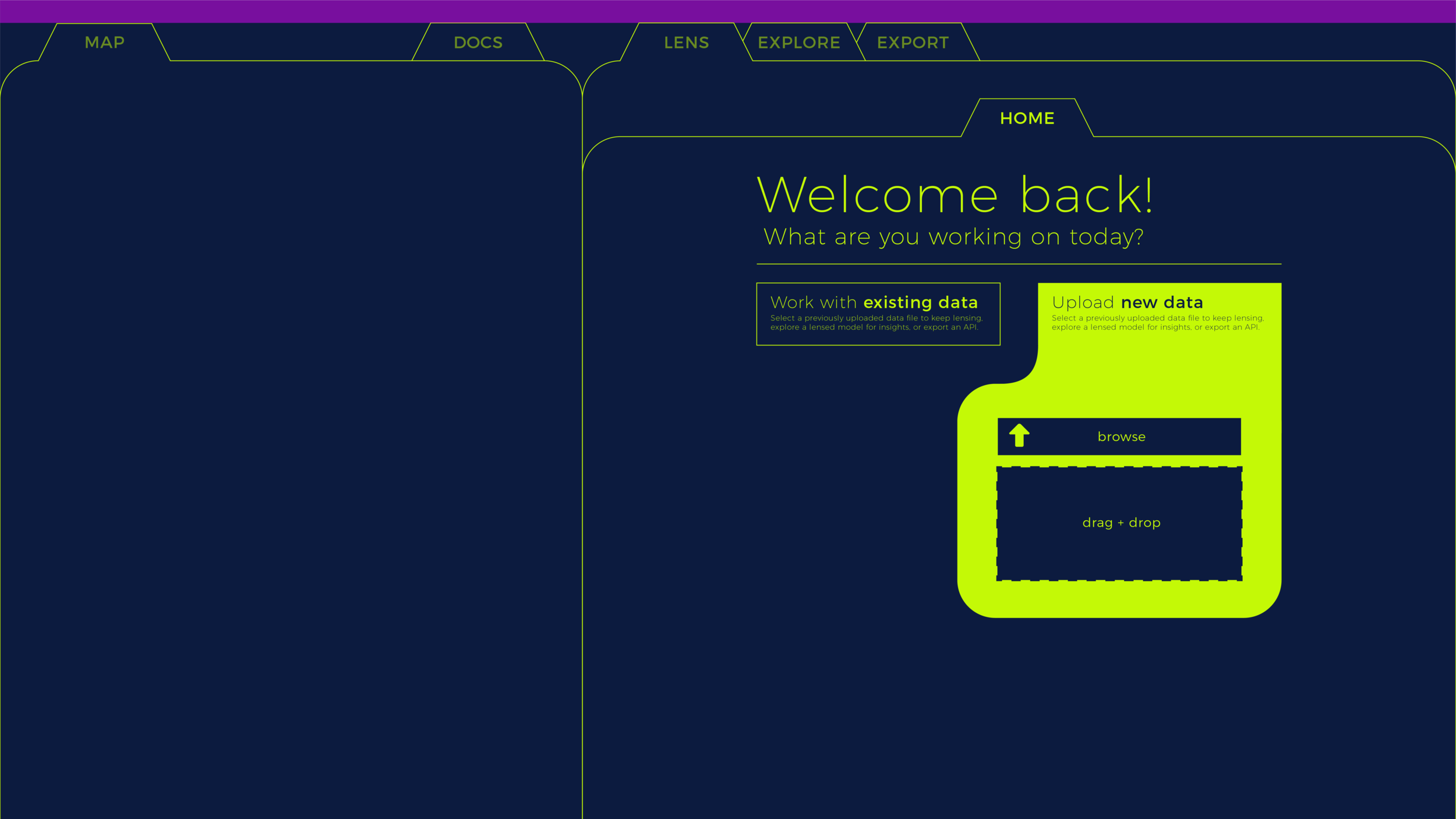
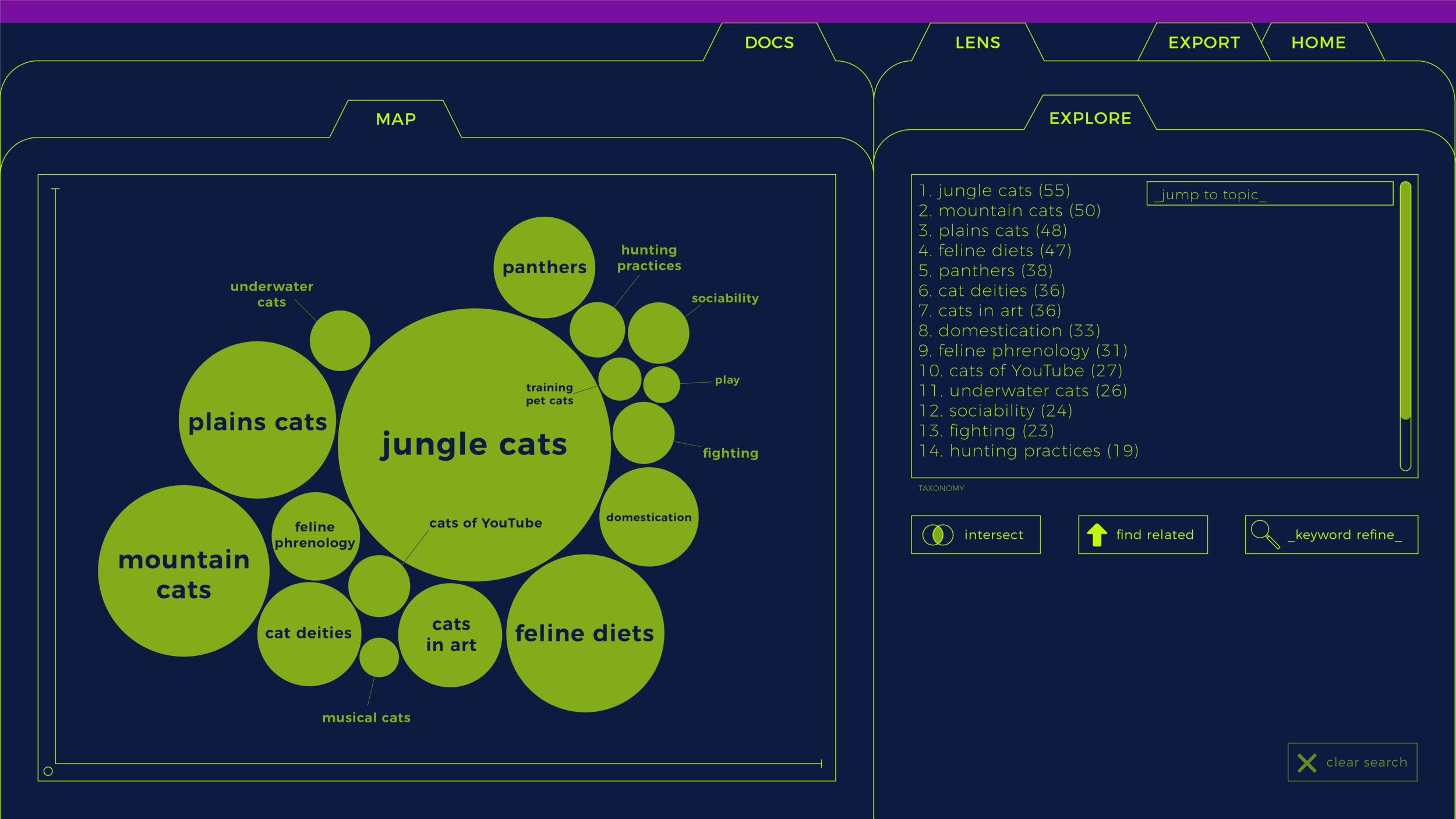
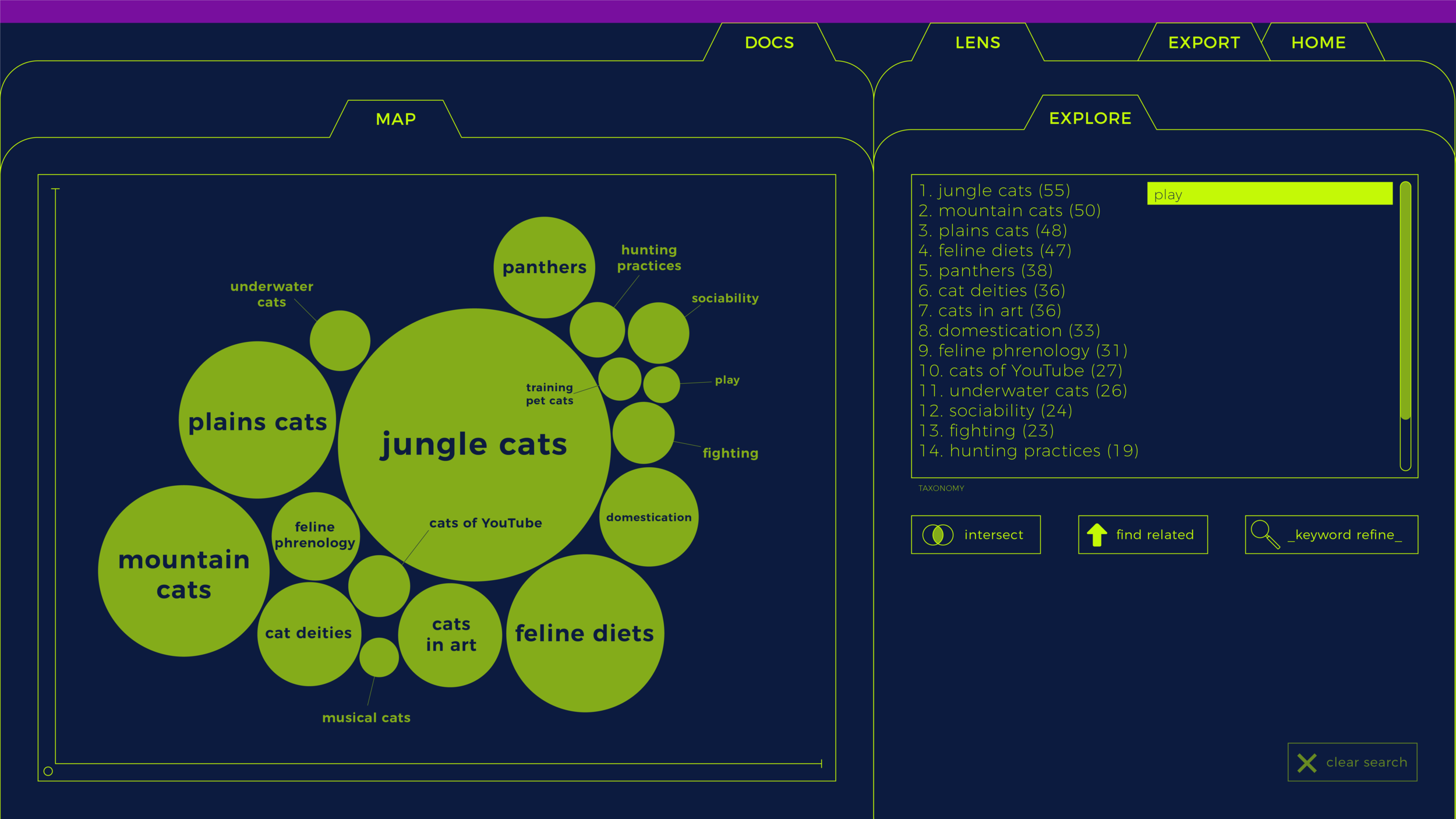
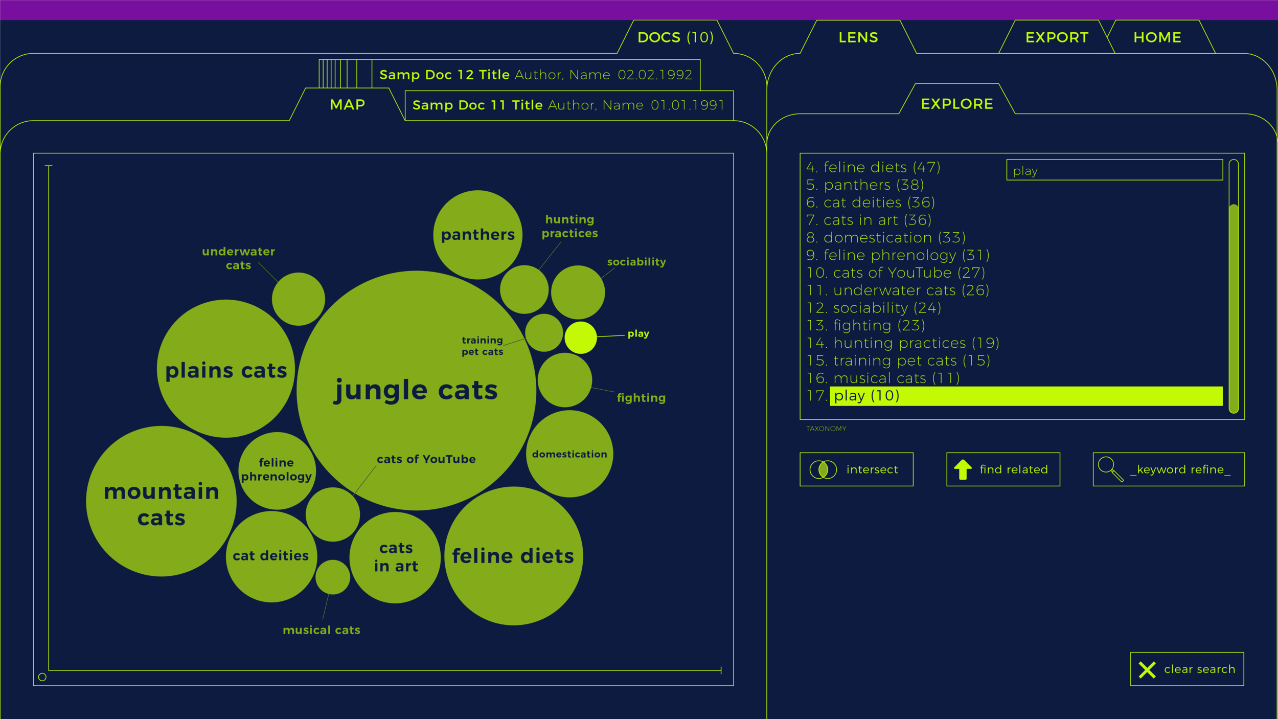
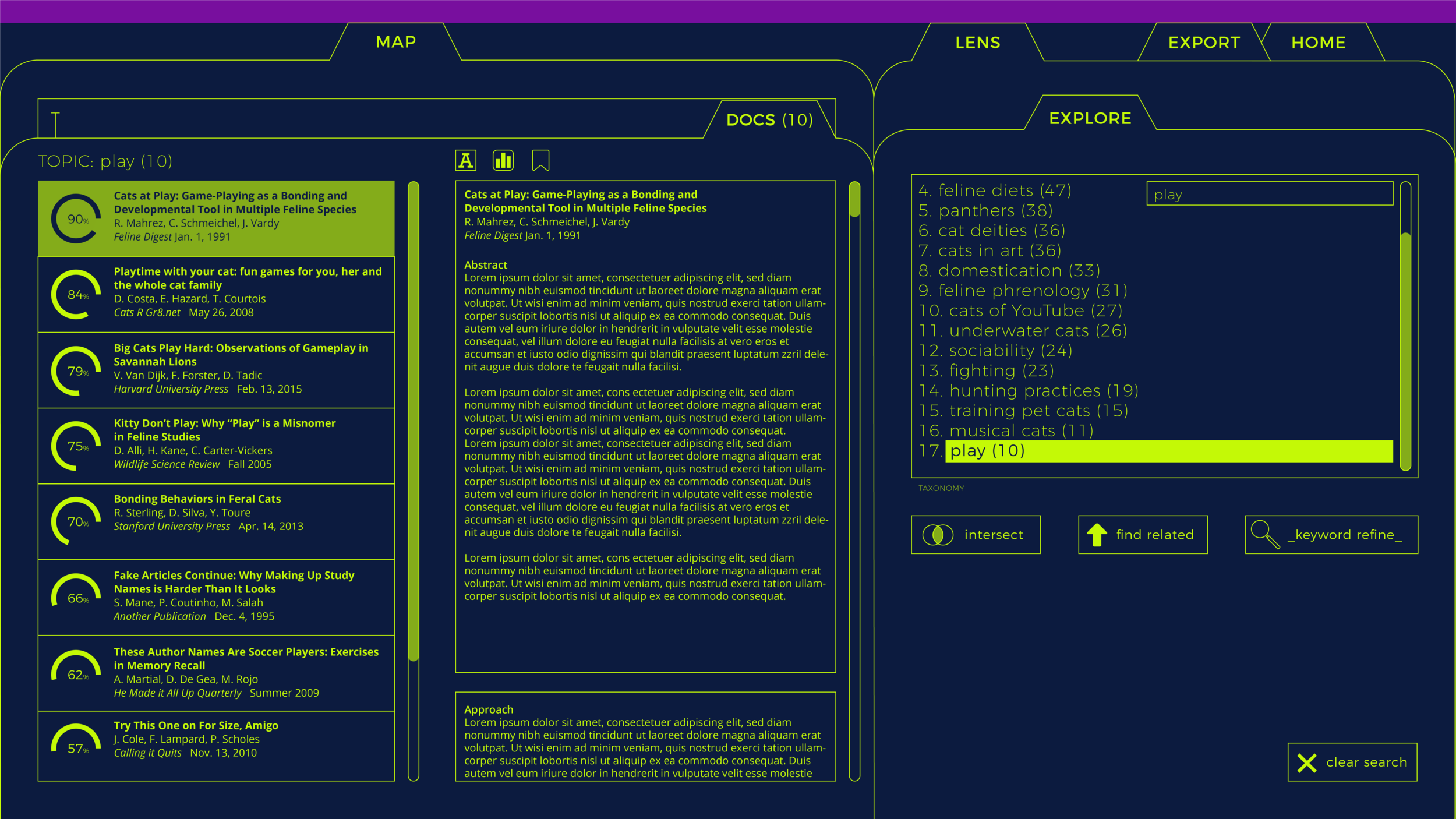
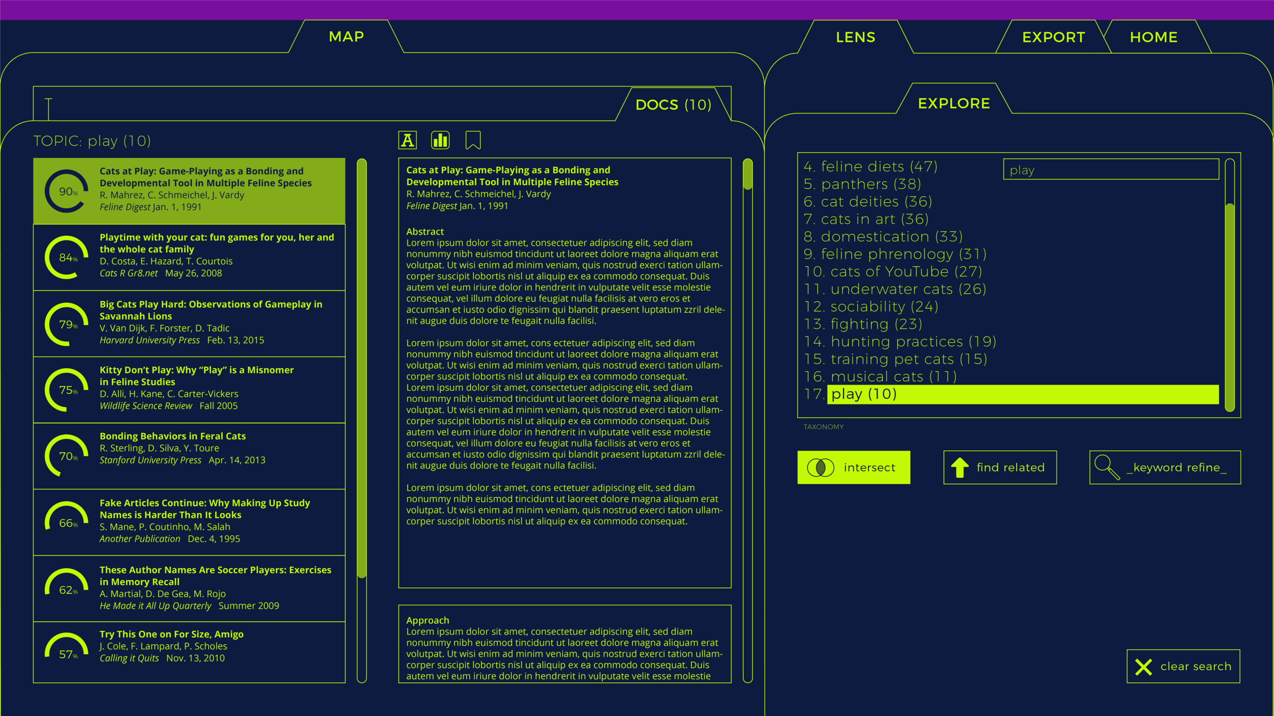
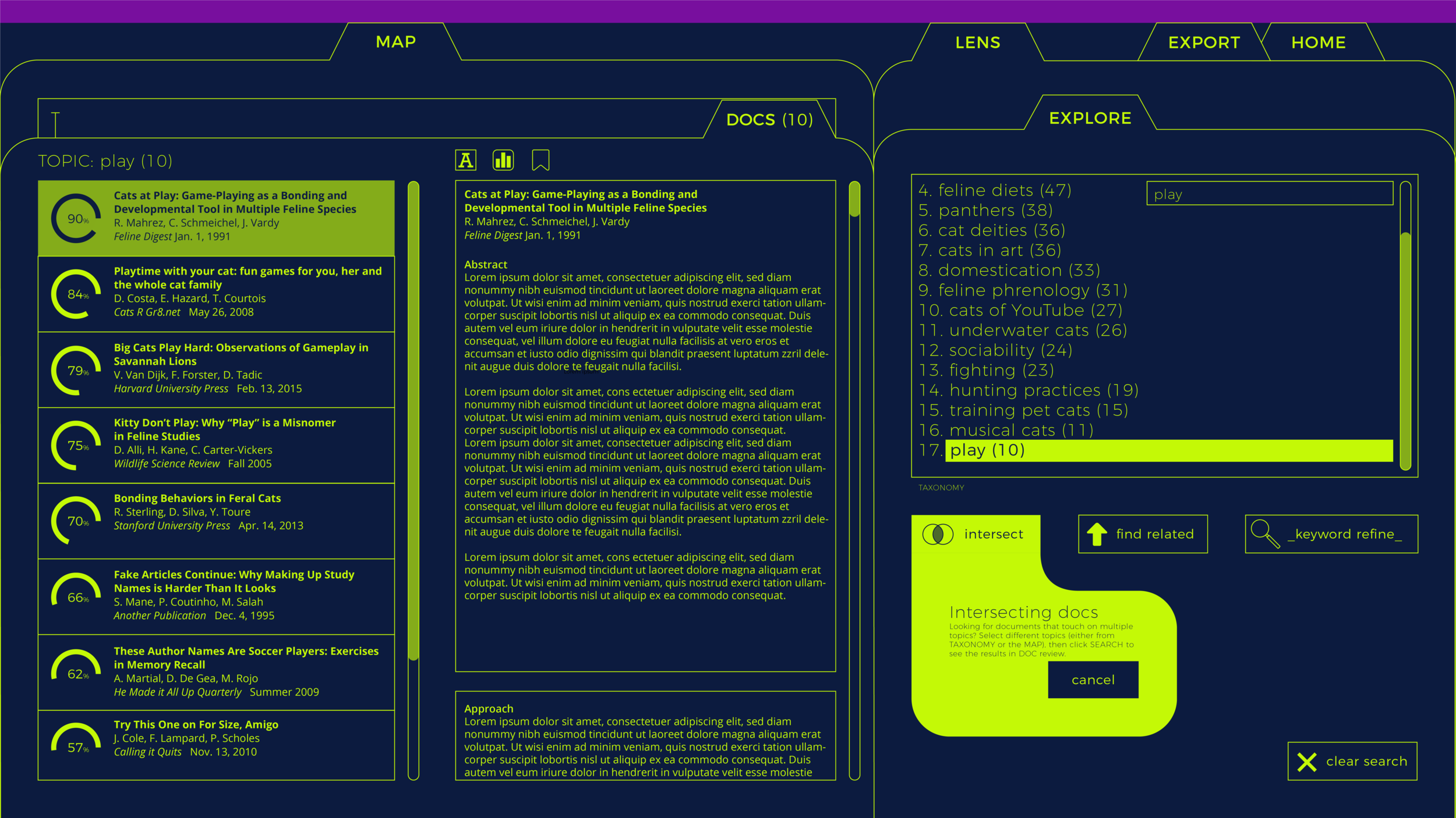
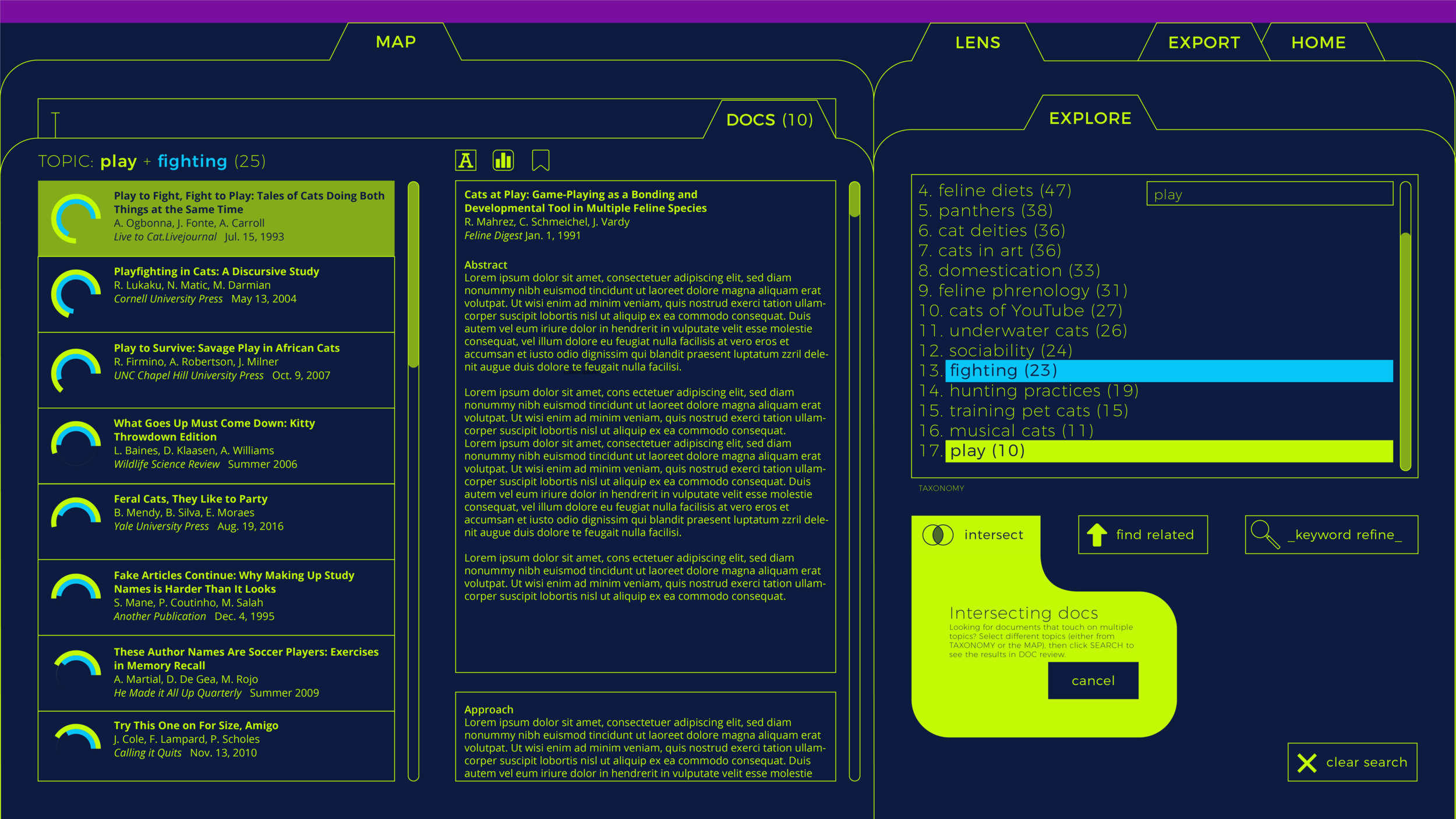
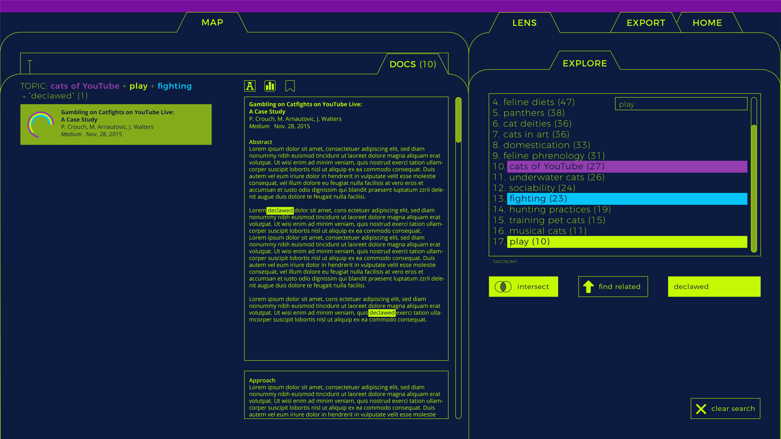
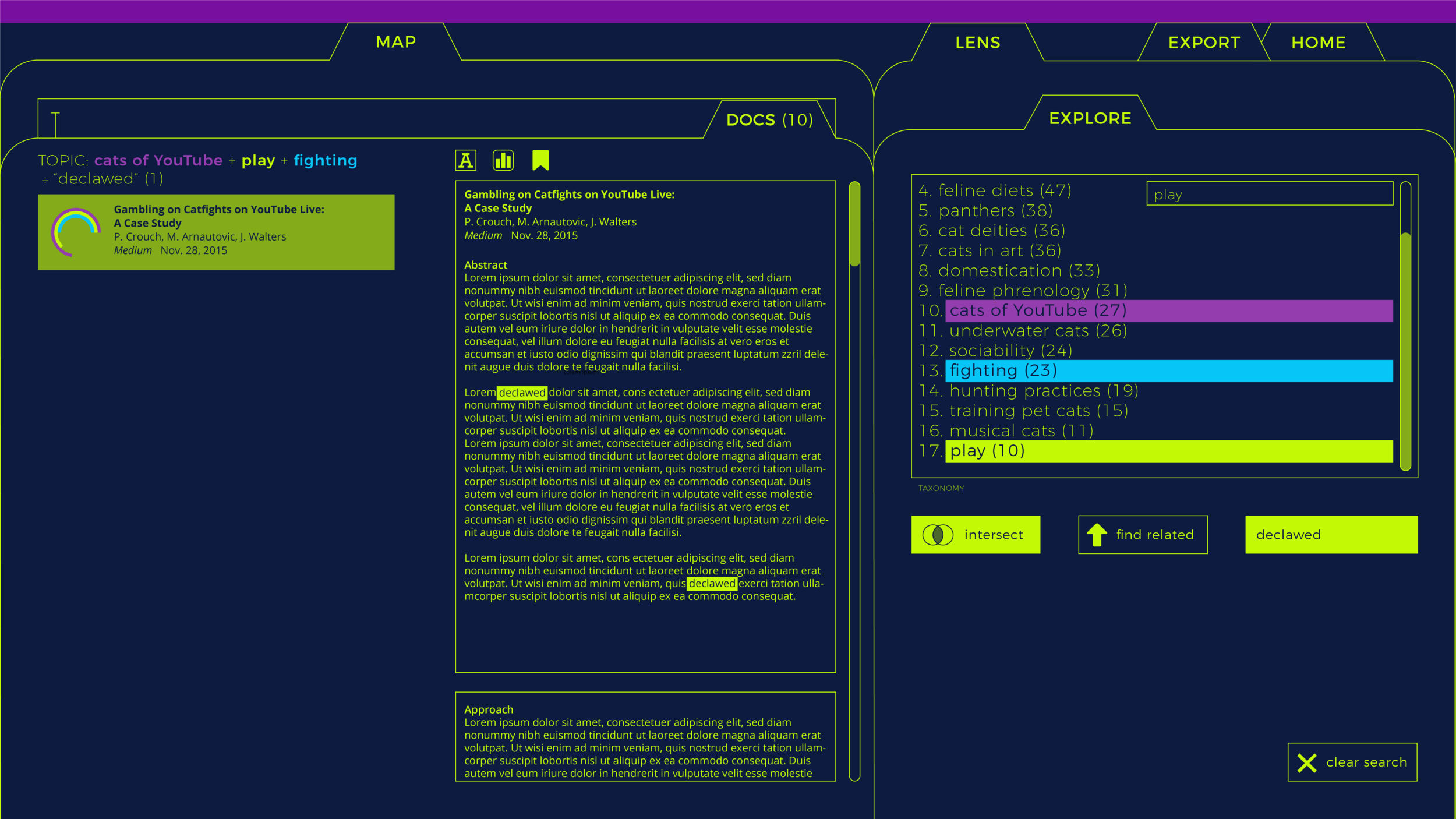
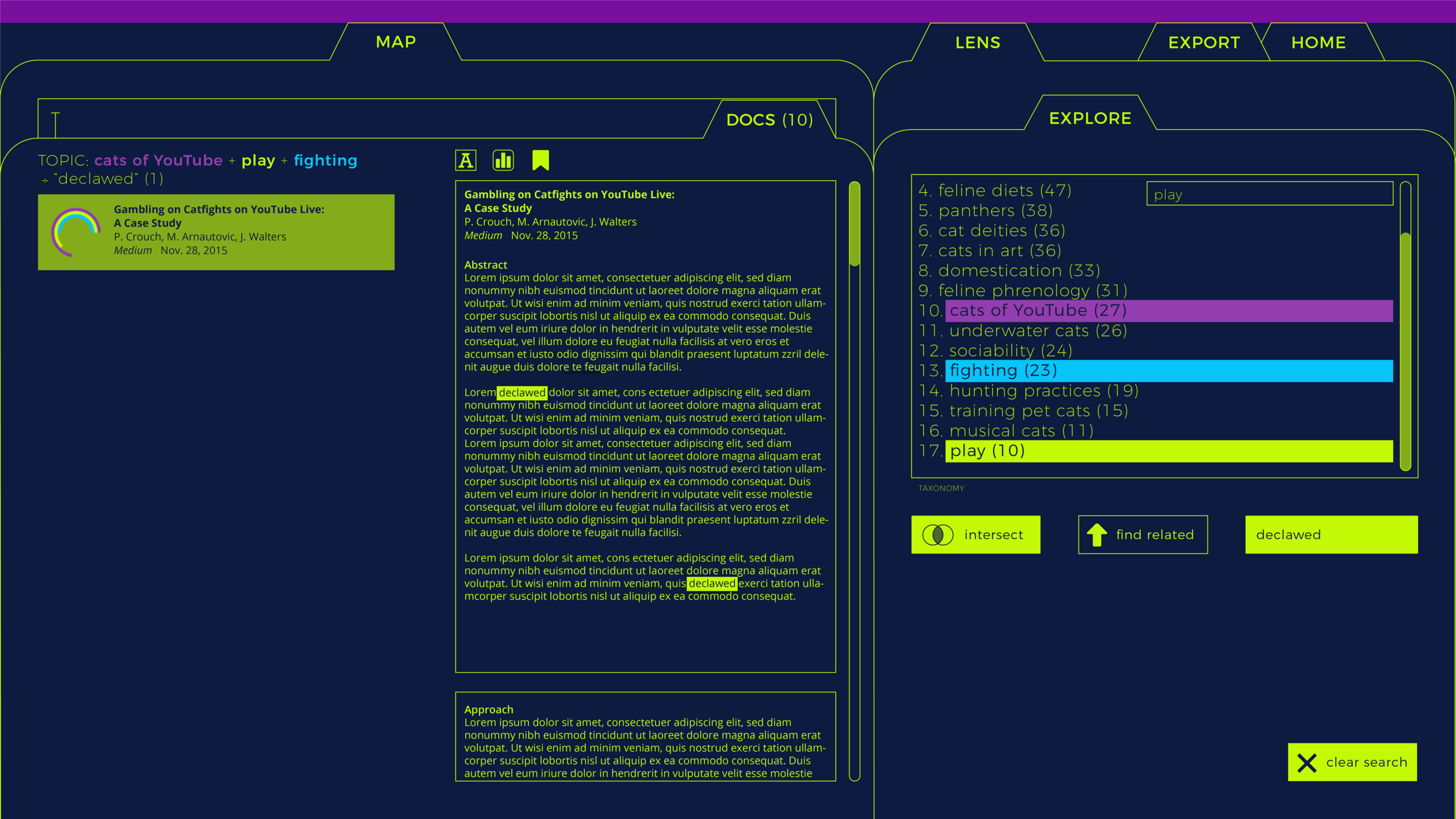
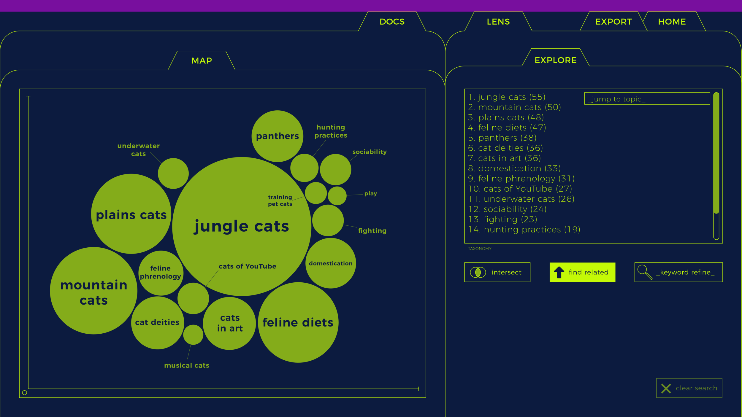
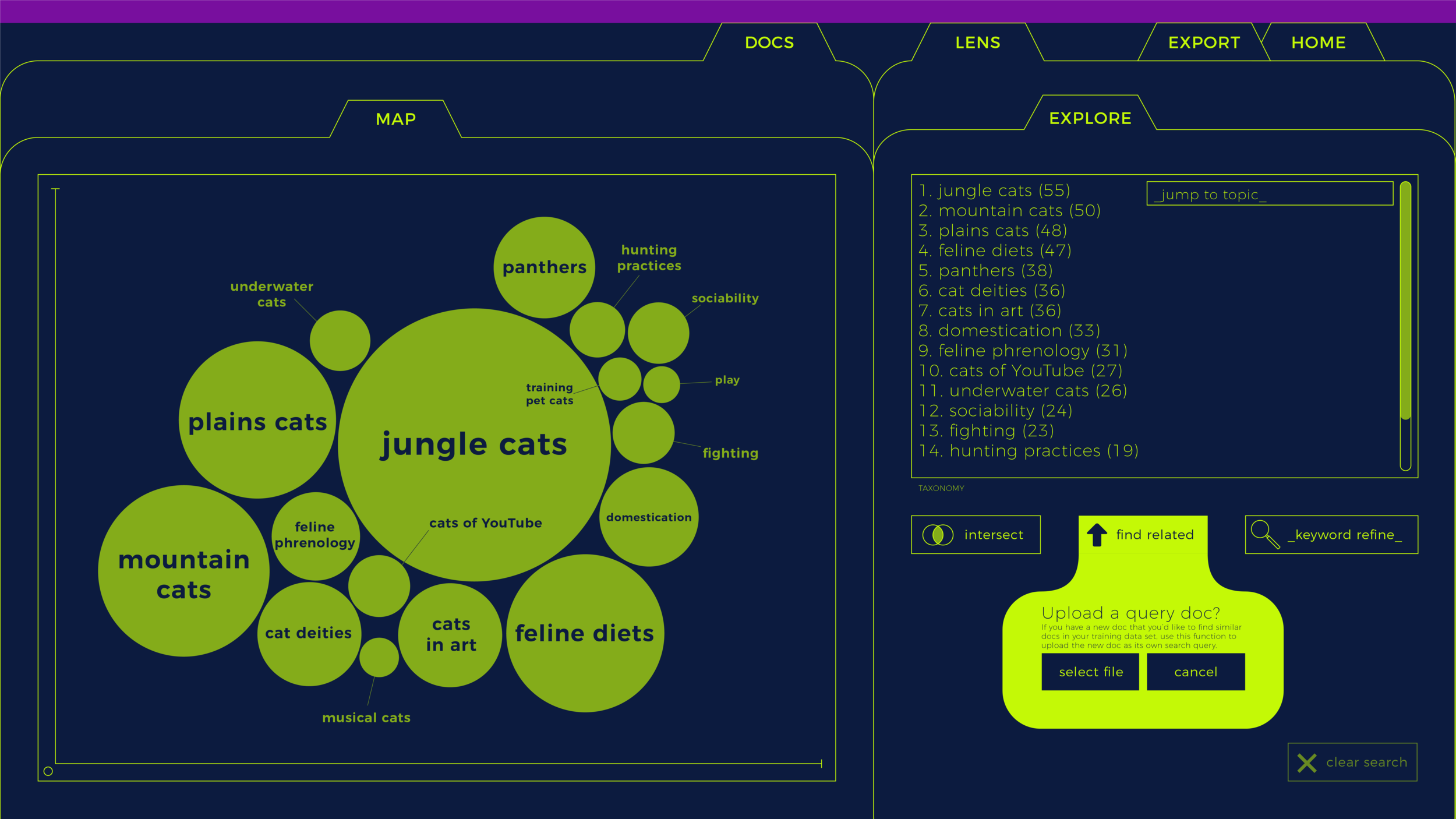
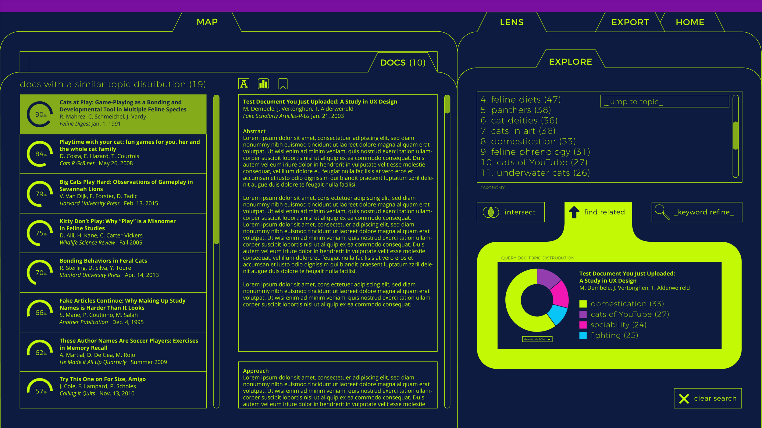
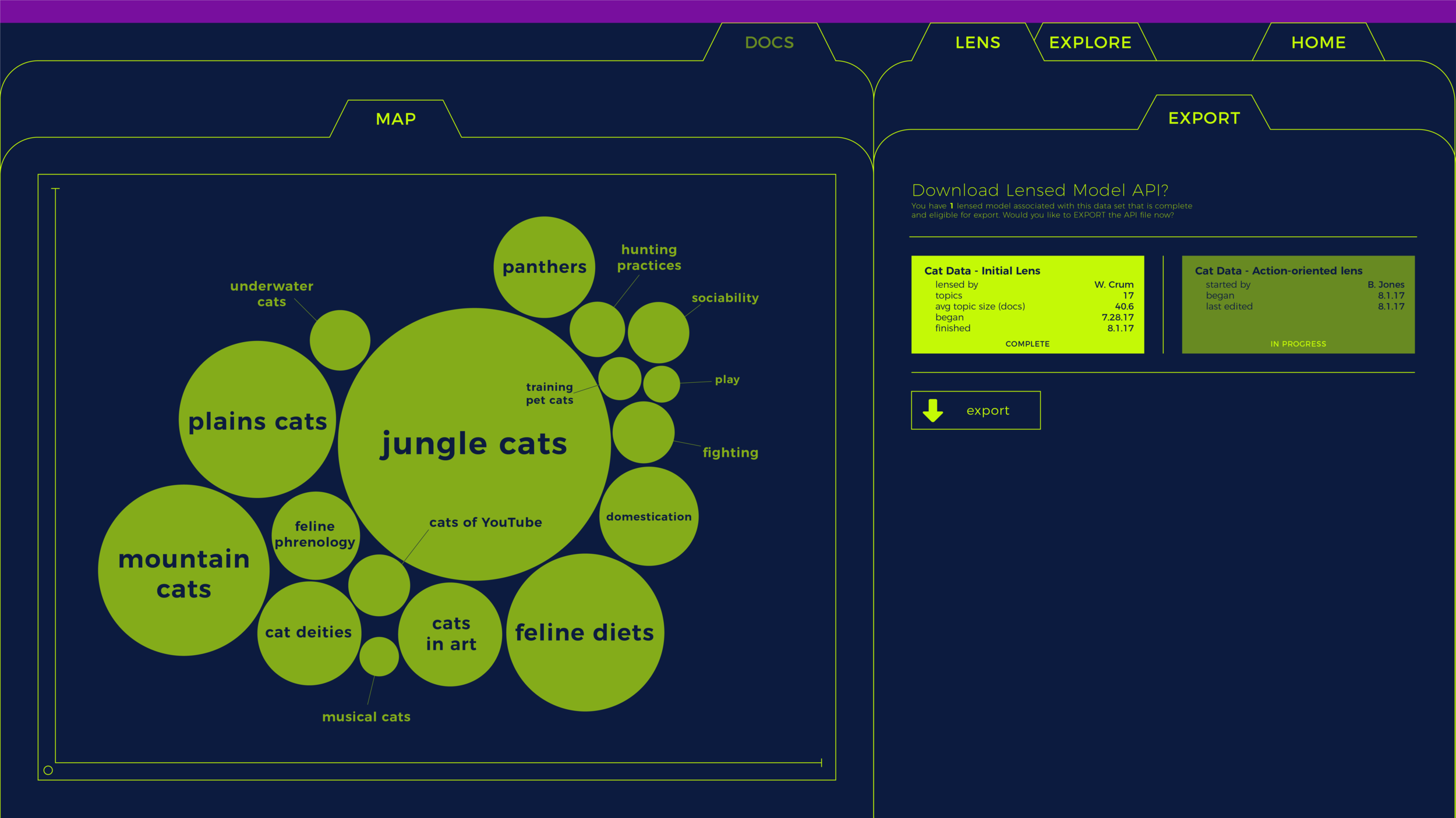
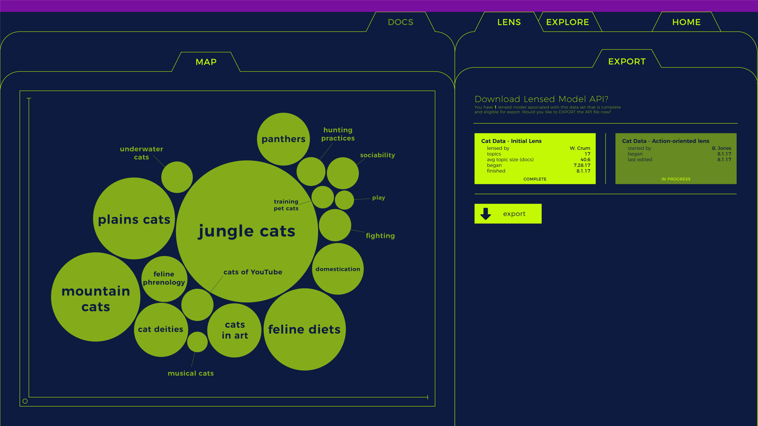
Before the end of my short tenure, I put together two different wireframes (shown in slideshows above and below this text) to show how my recommended user flow could look using different navigational paradigms. The first option (above) uses circles of various sizes to indicate both the relative scale and "relatedness" of different topic clusters, and a familiar tabbed navigational structure for toggling between lensing, data exploration, and more. The second option (below) deemphasizes this information, and instead renders the to-be-labeled clusters as a grid of equally sized rectangles. Clicked, each one expands into a cluster-specific "work-station" — as the user moves through each cluster, they change color to reflect their completion state.
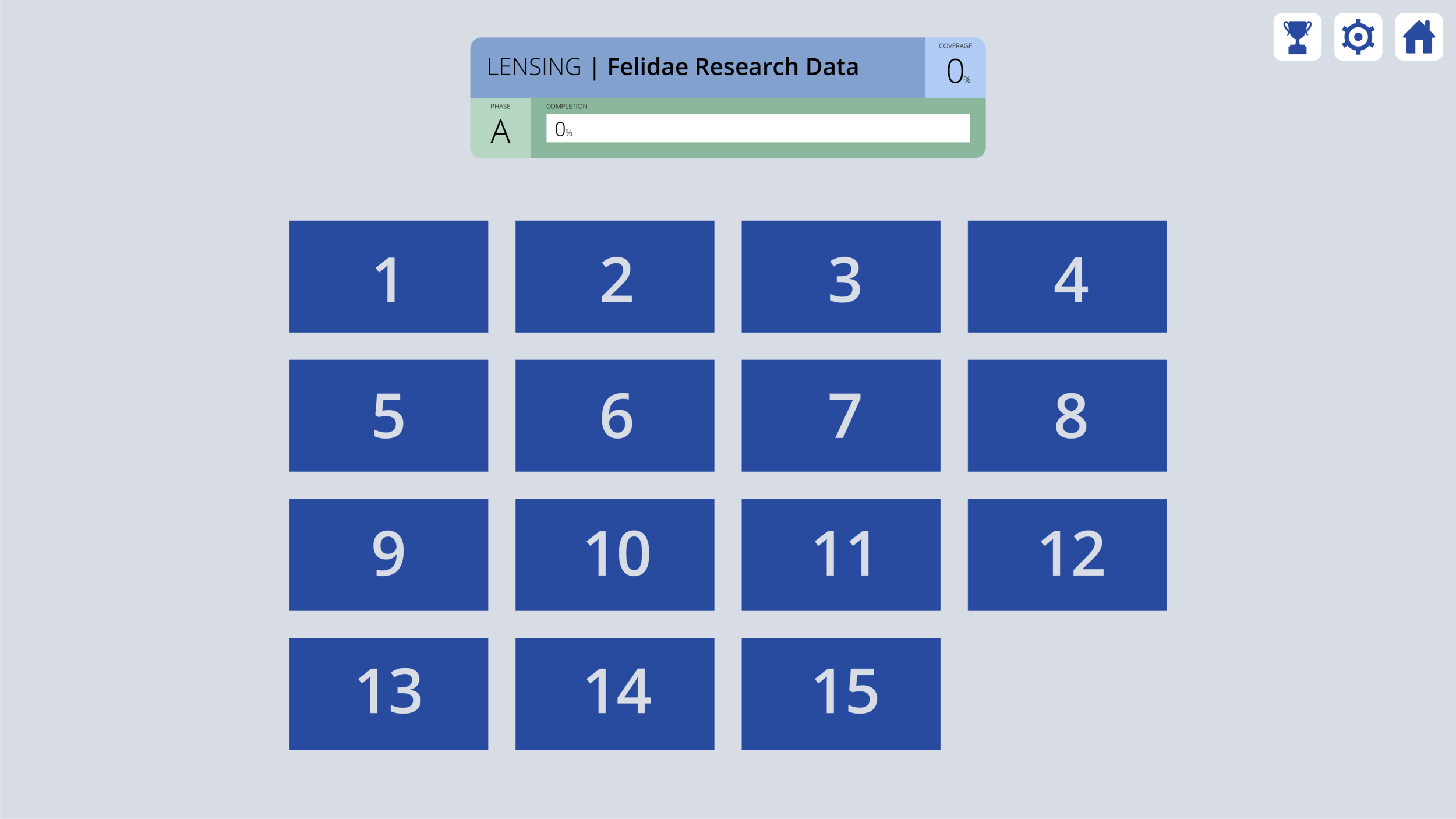


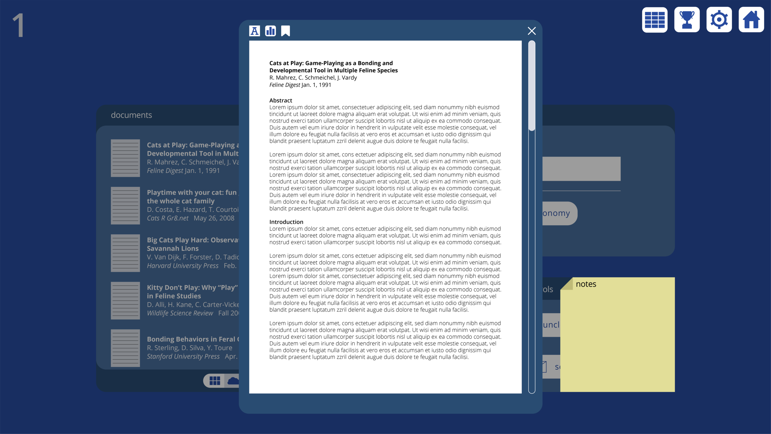
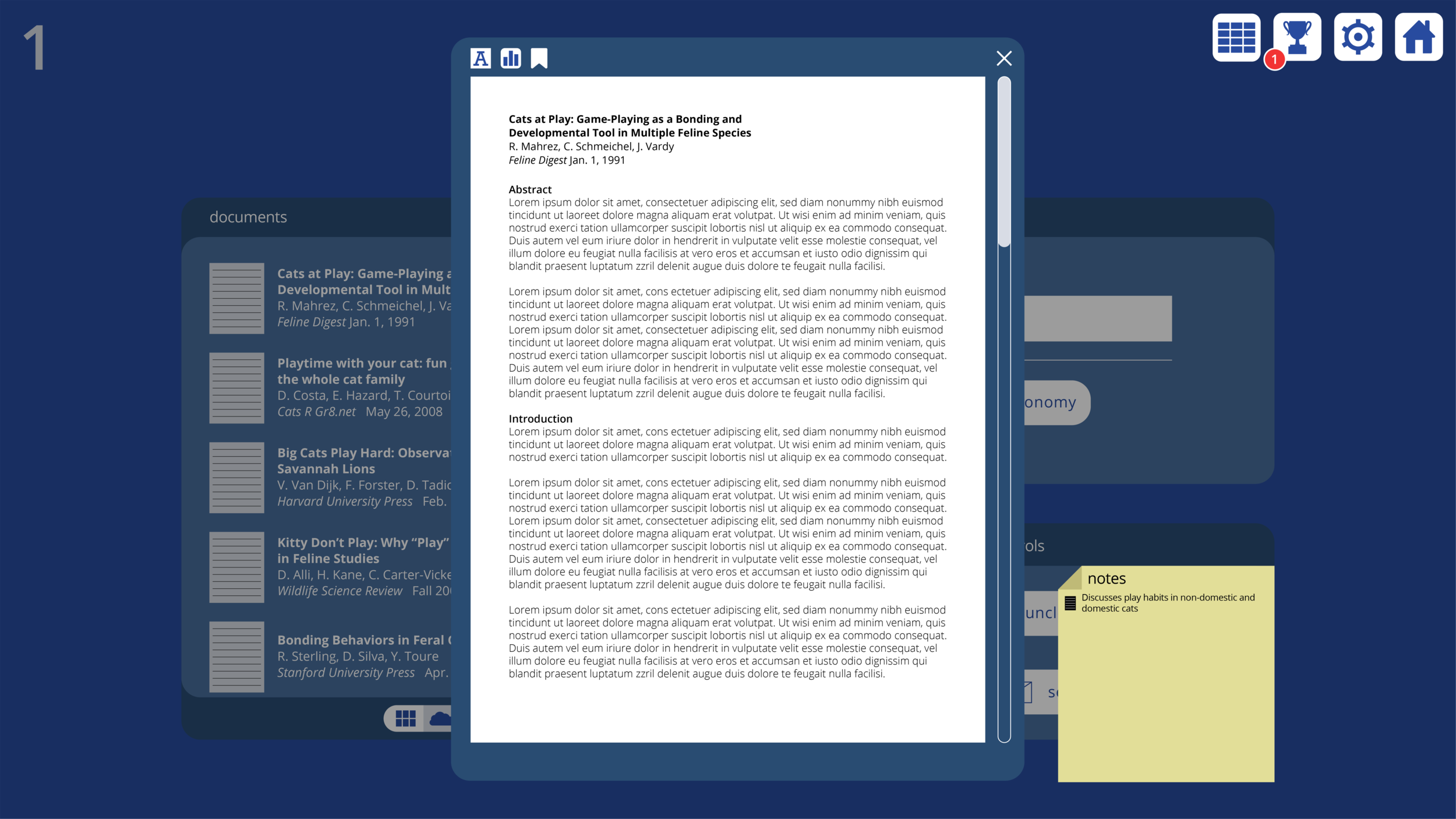
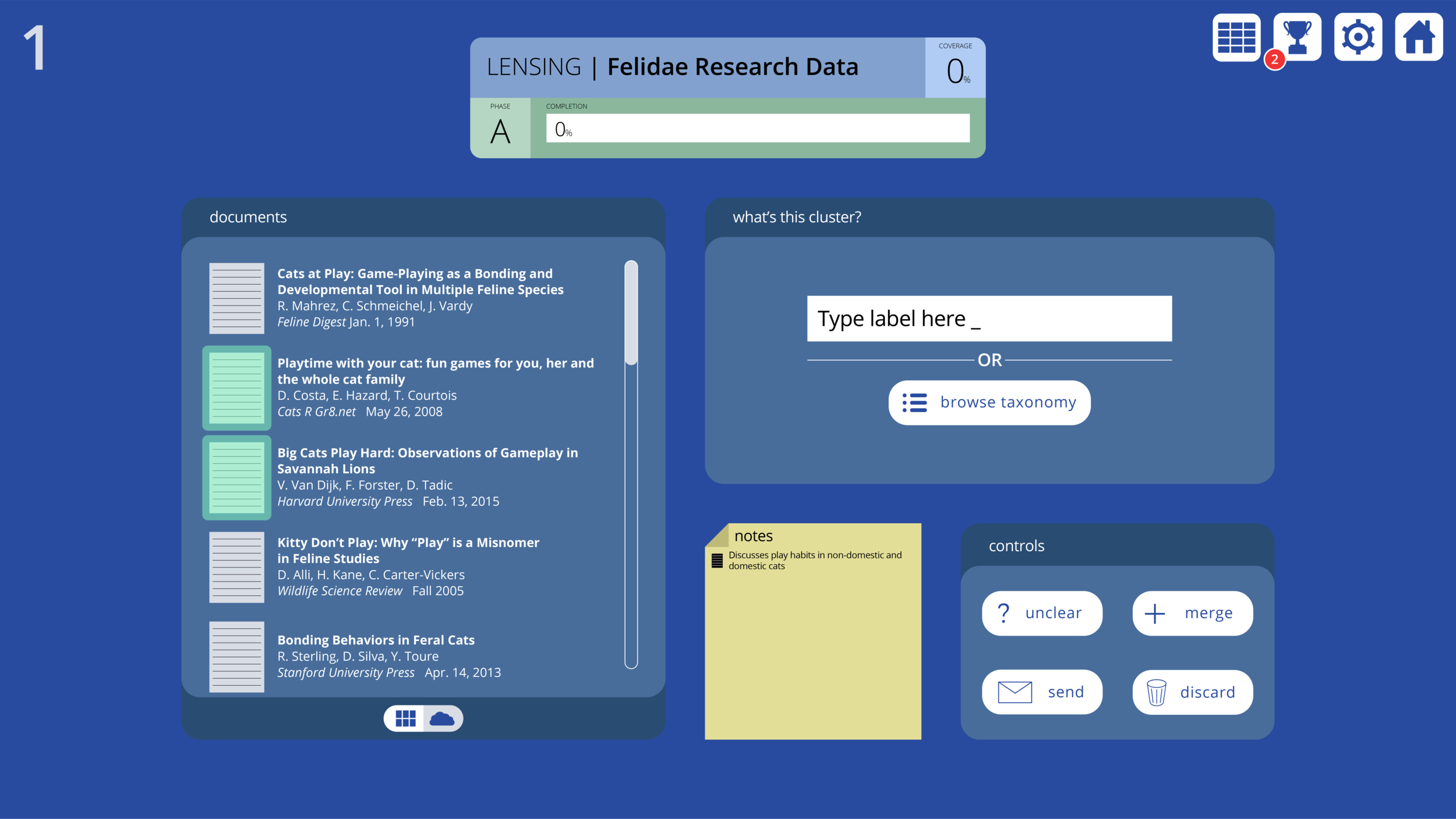

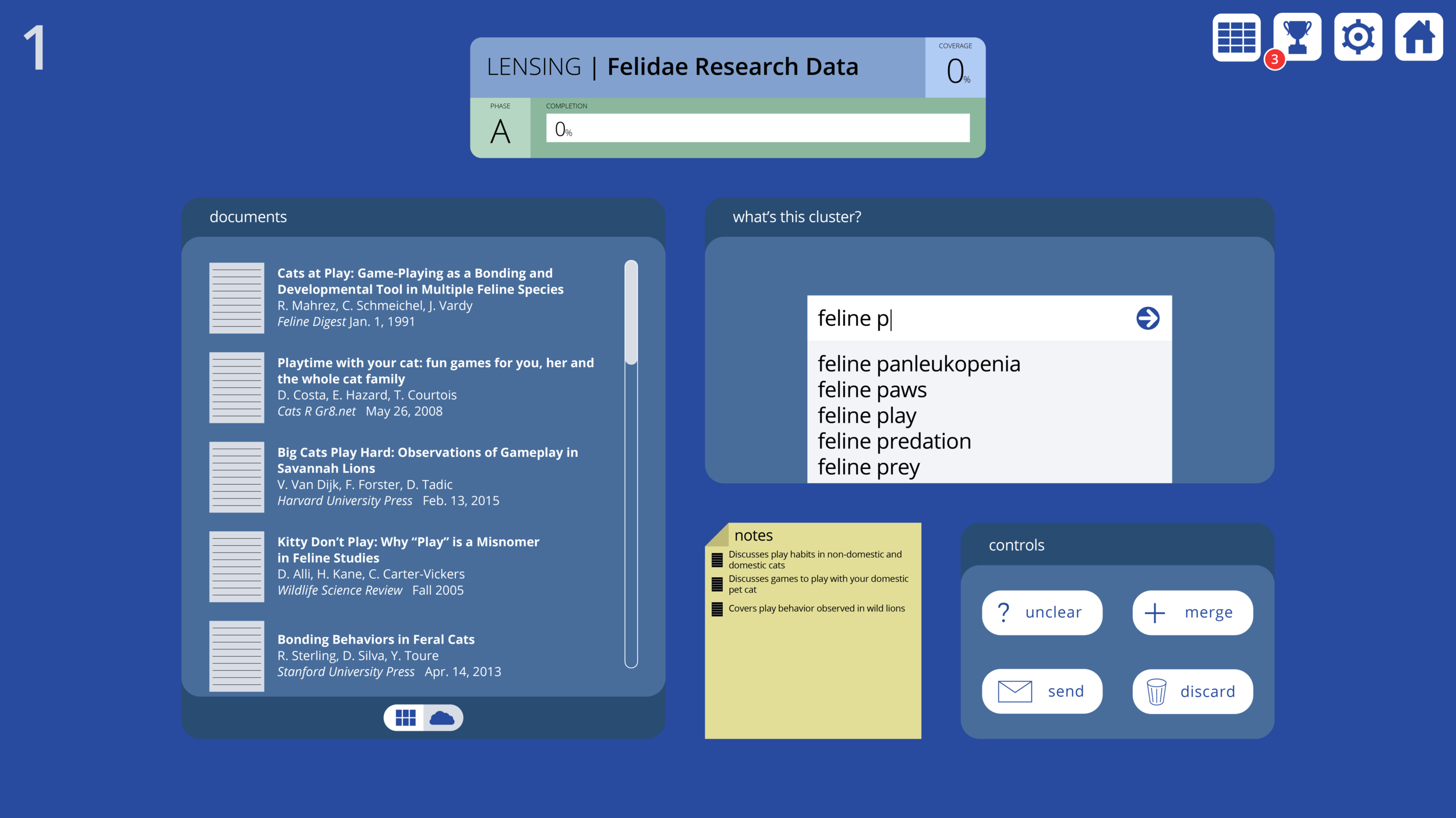

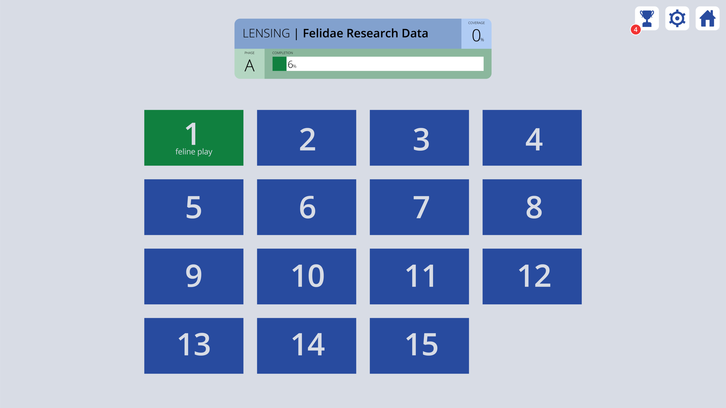
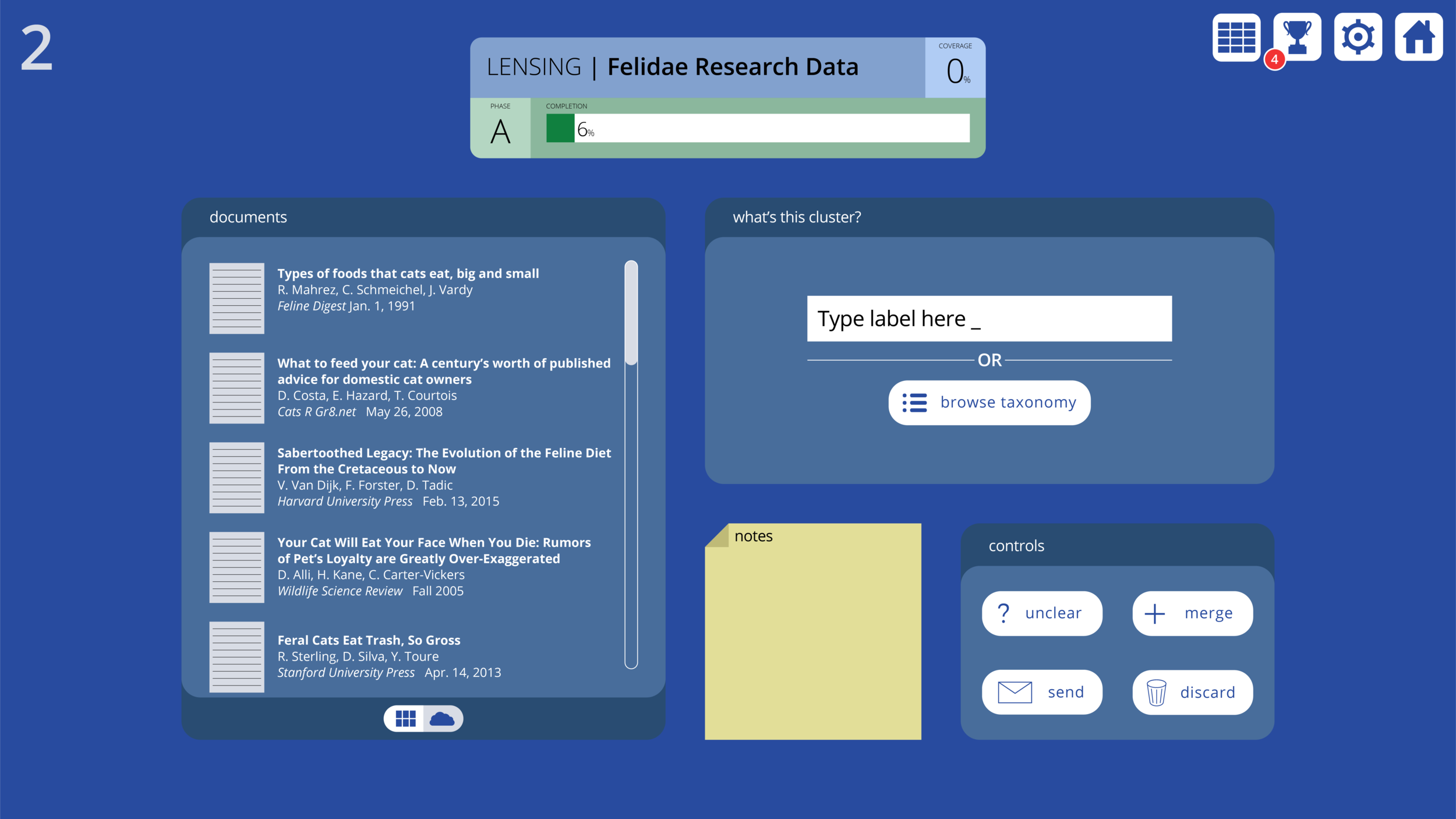
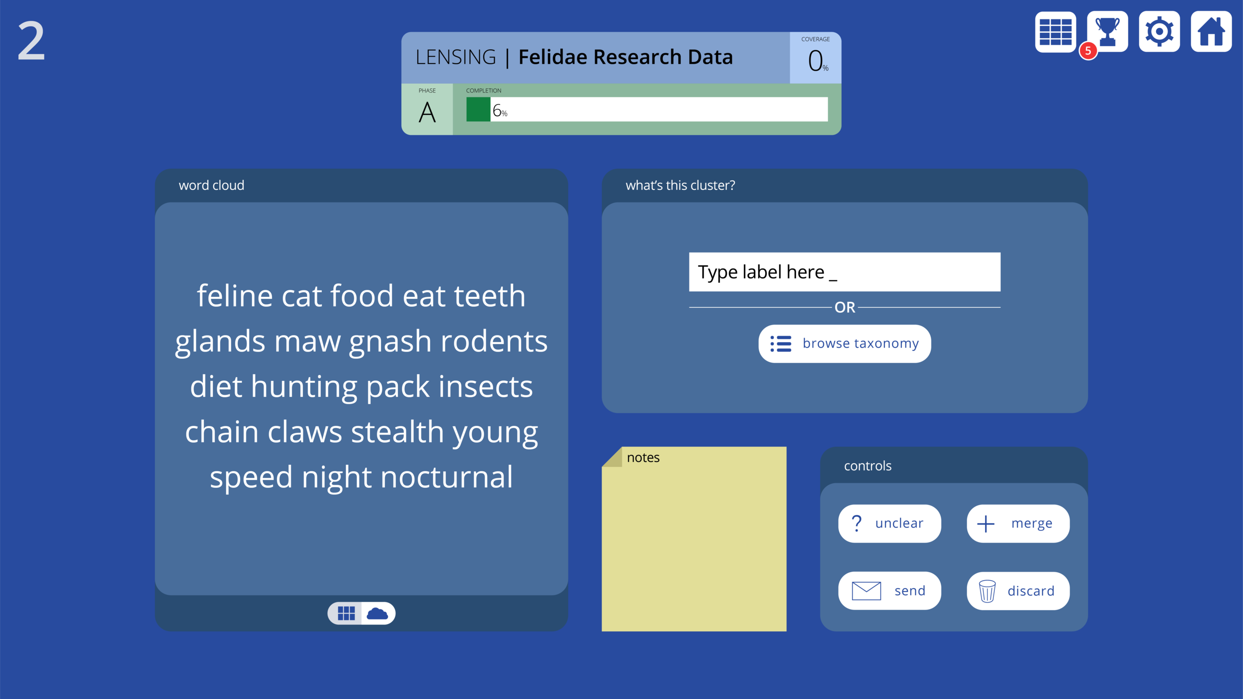

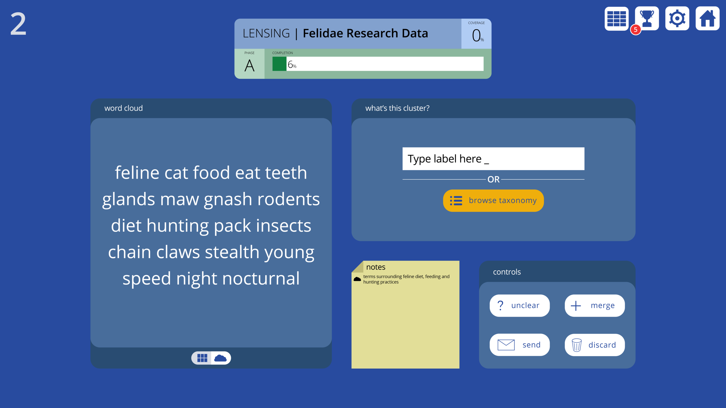
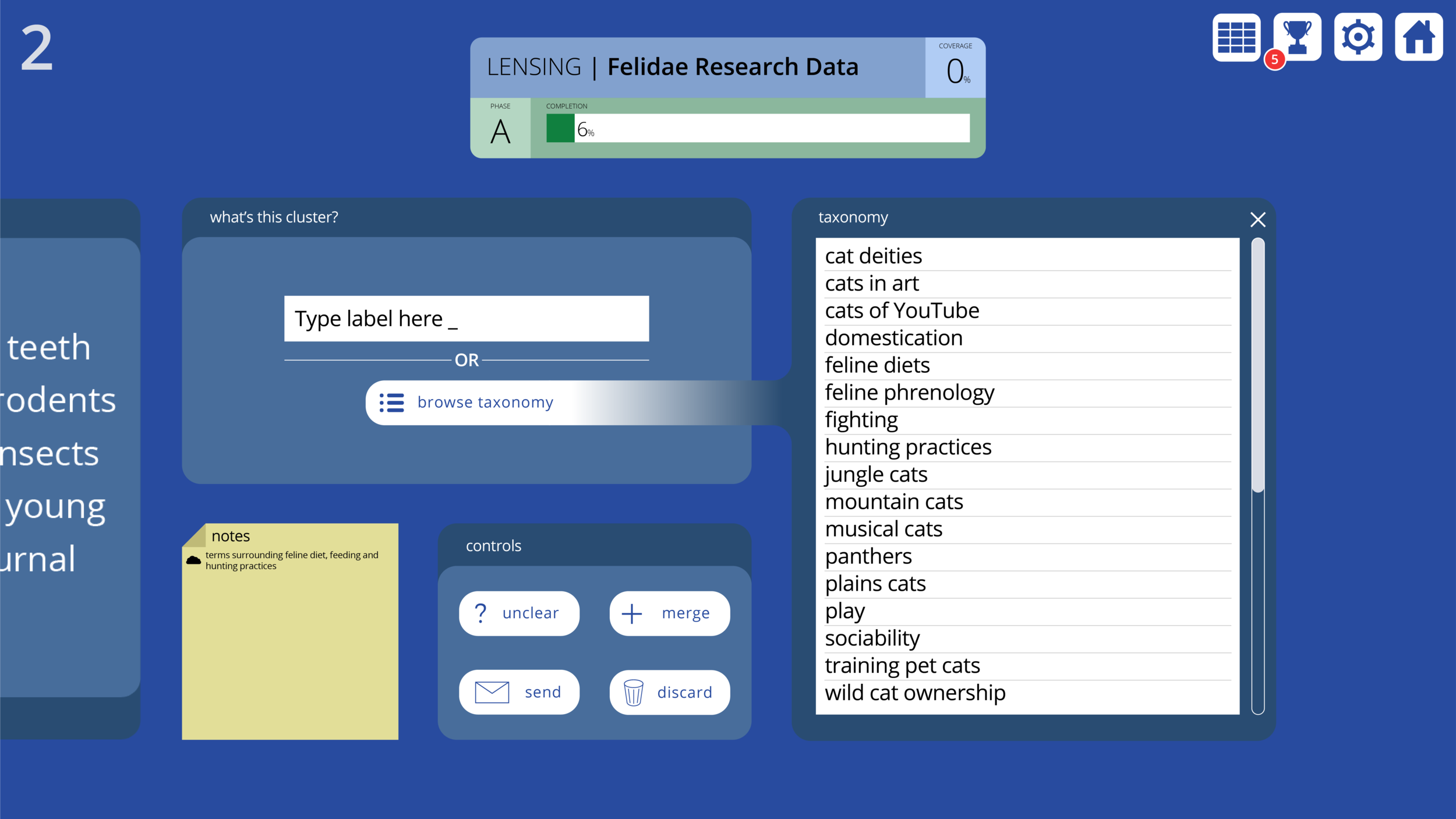
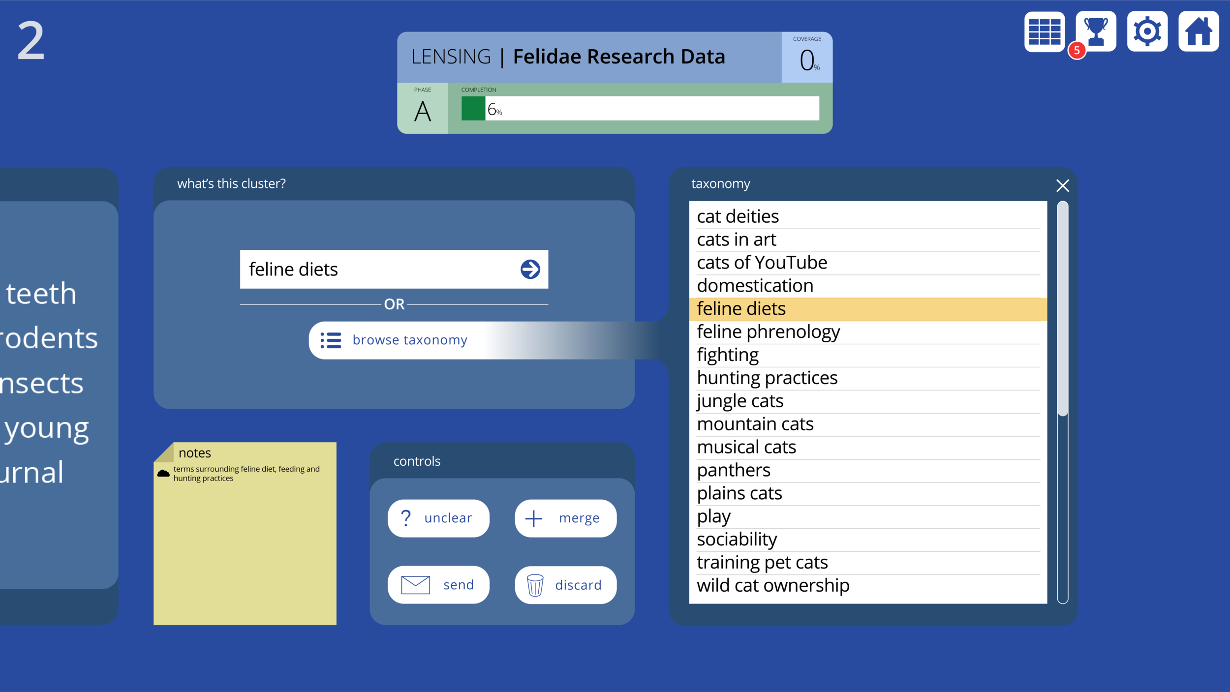

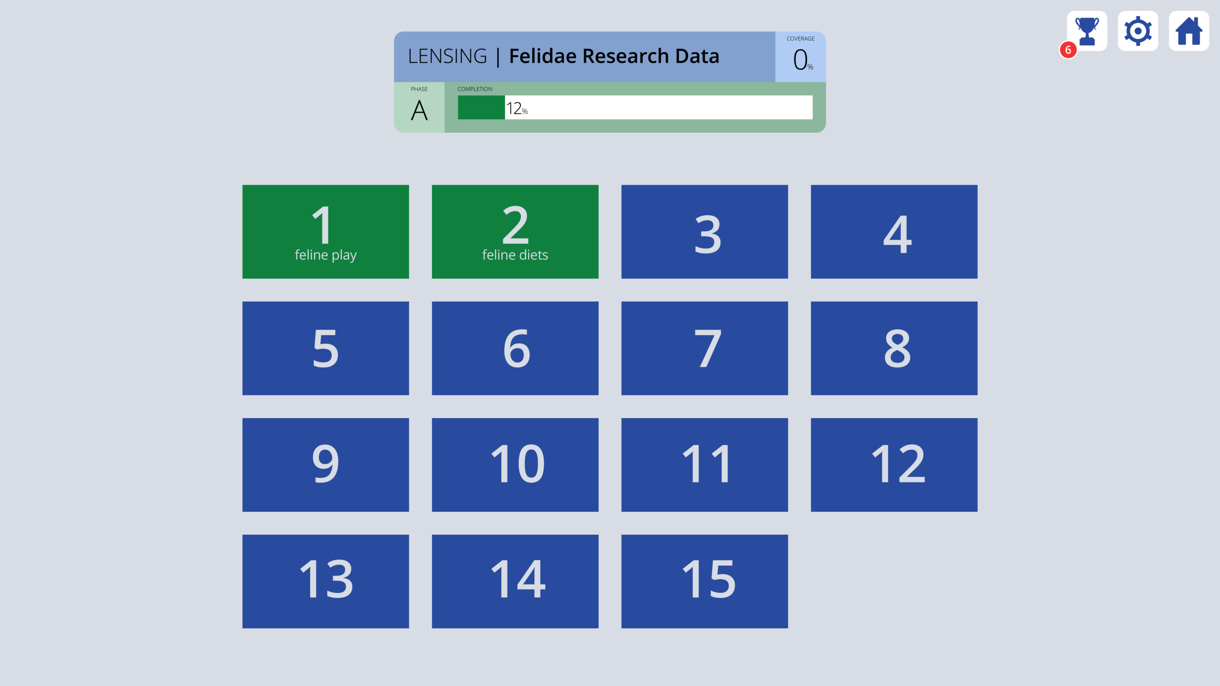


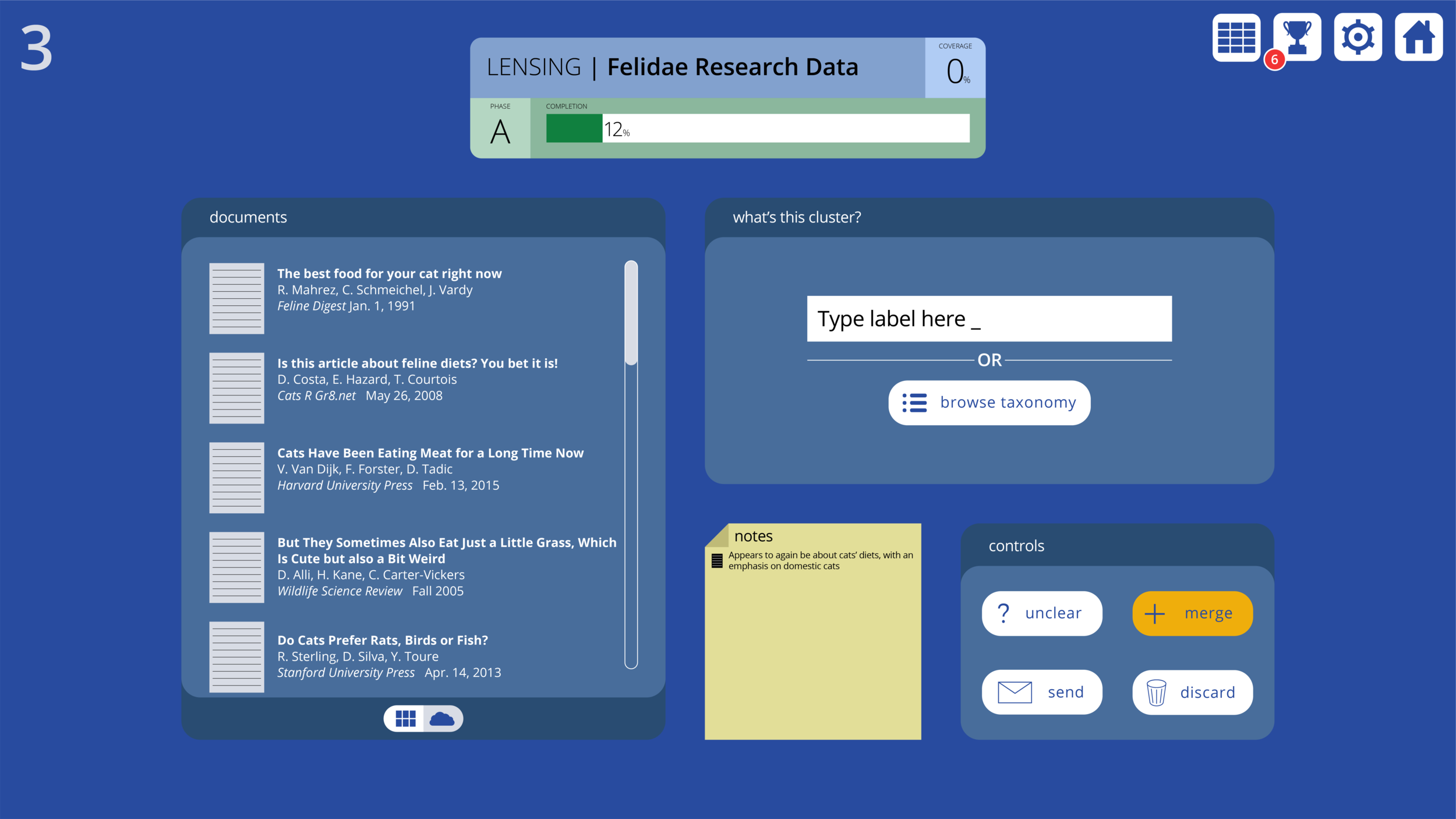
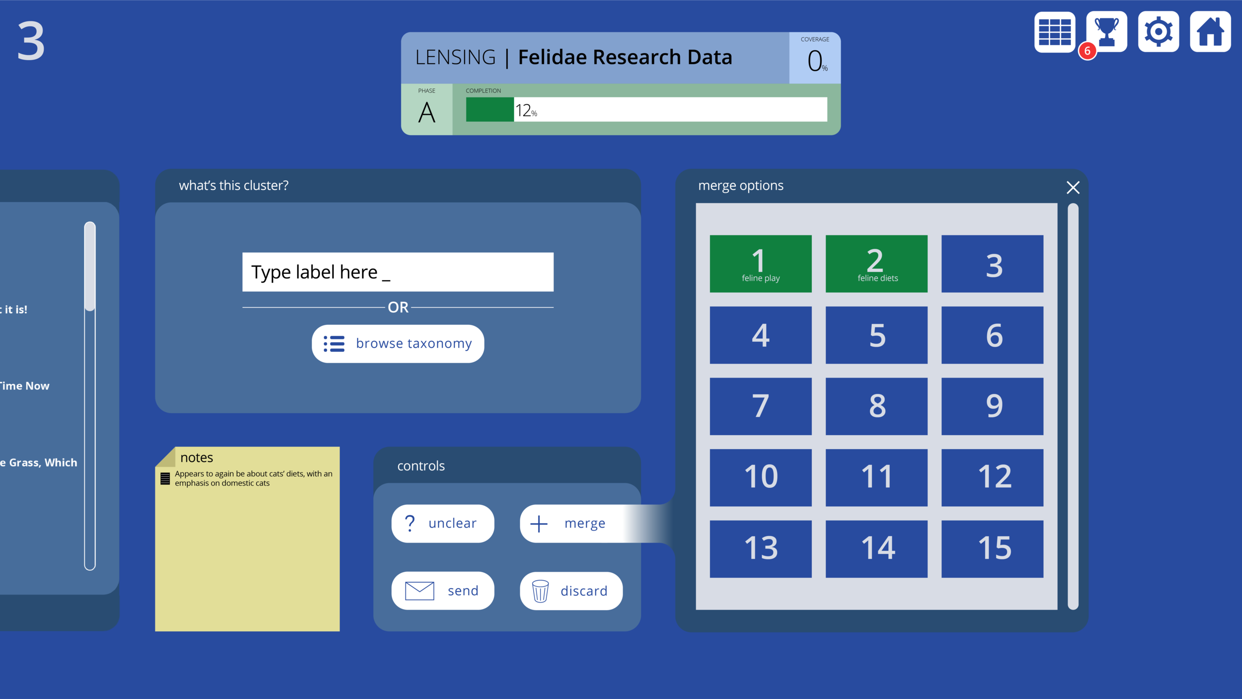
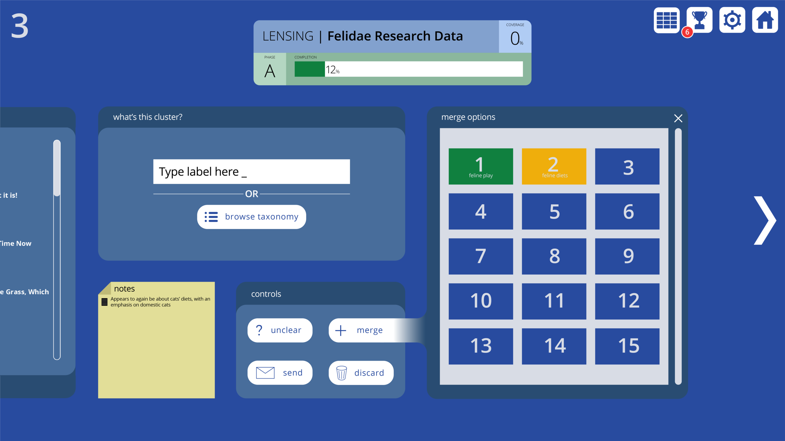
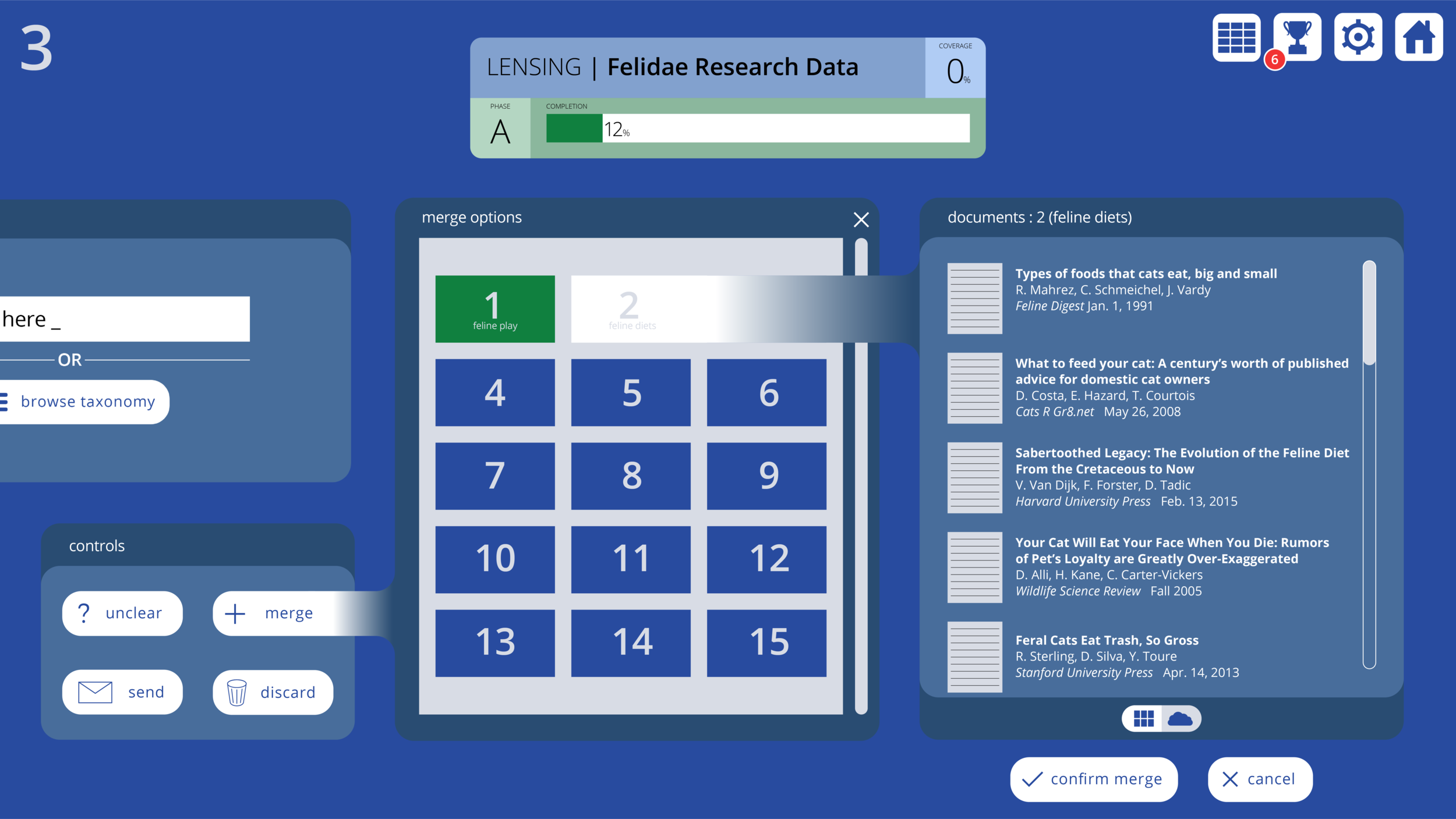
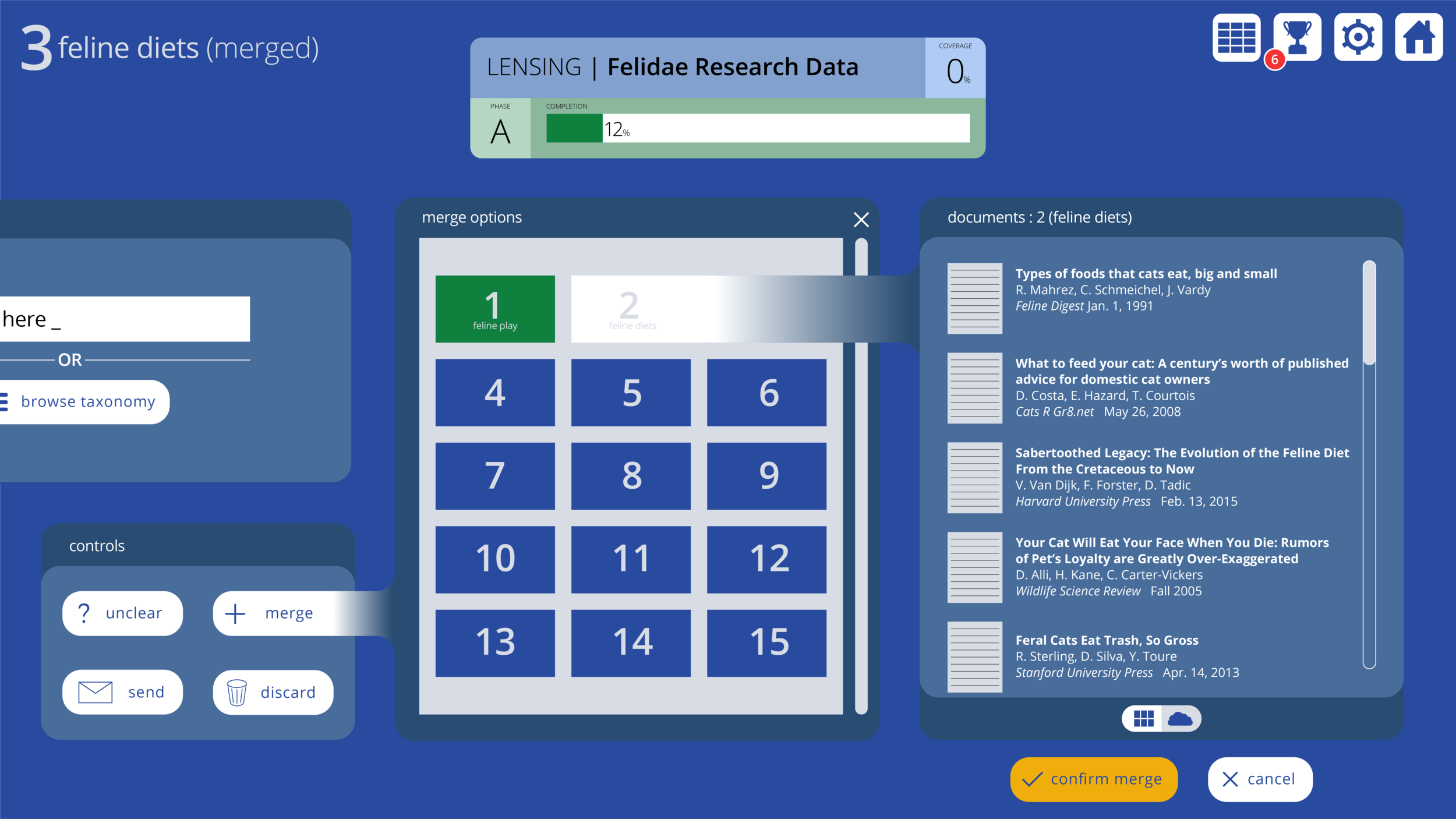
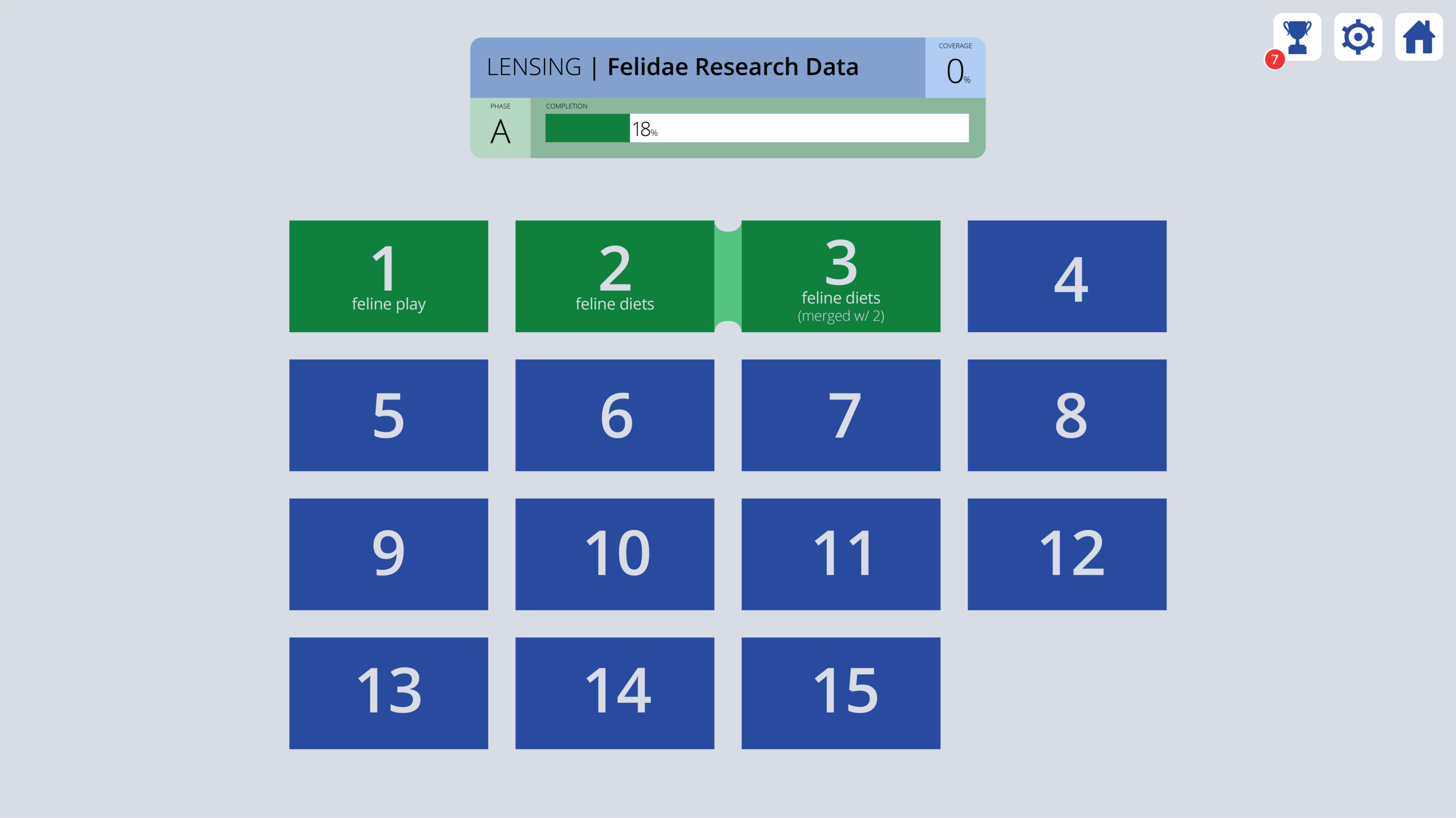
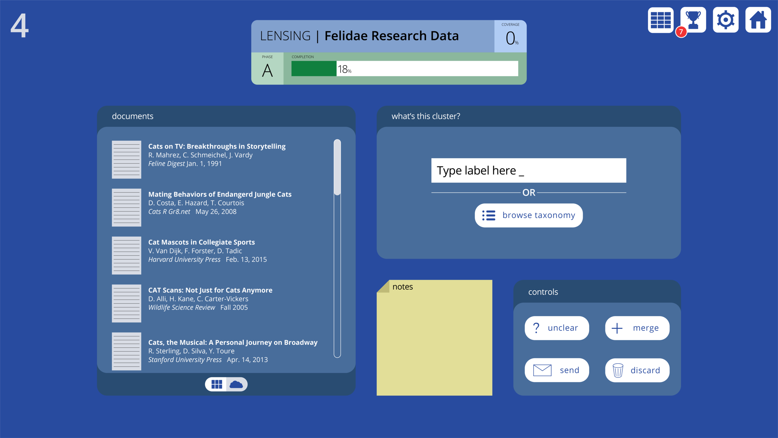
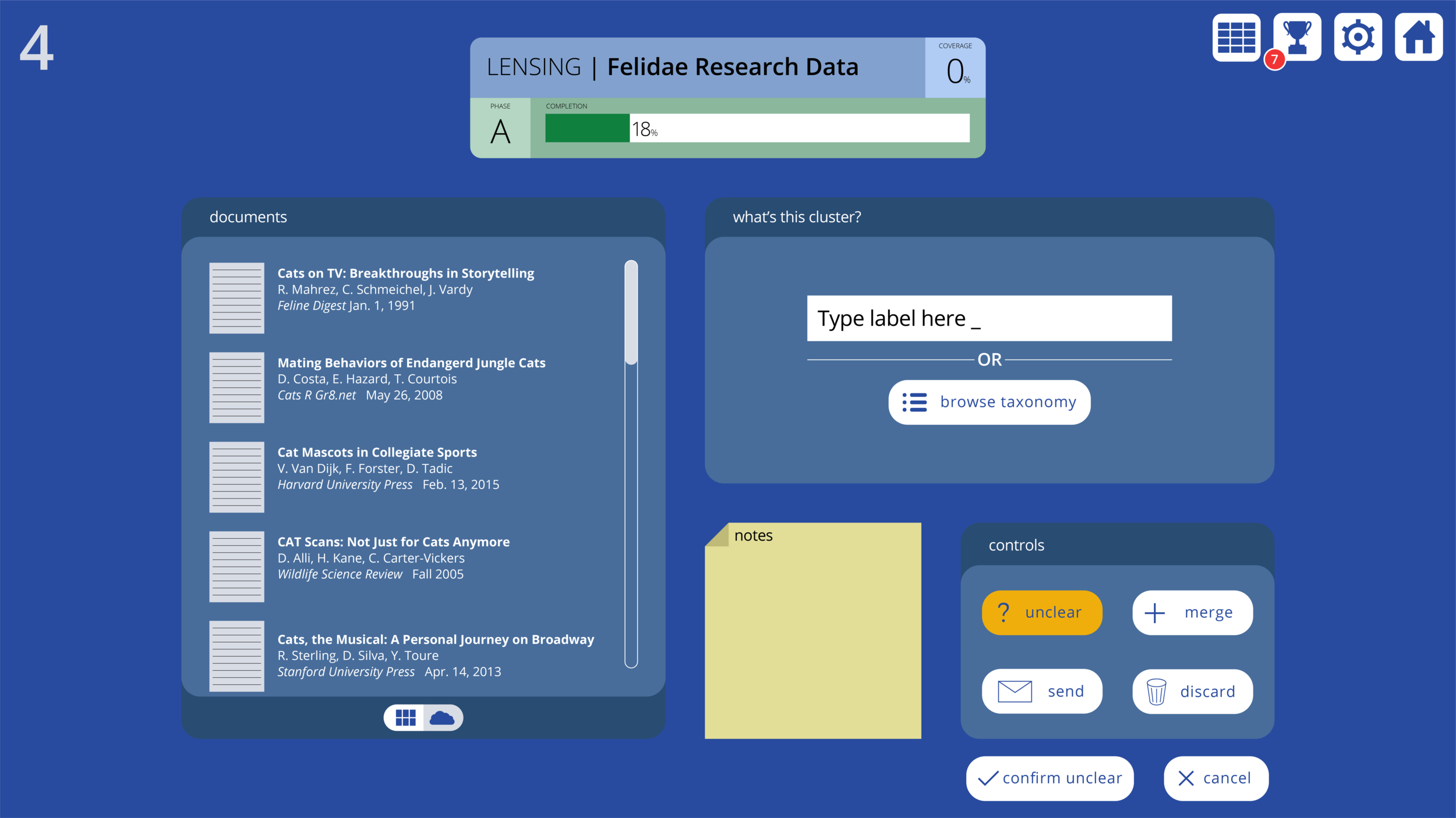
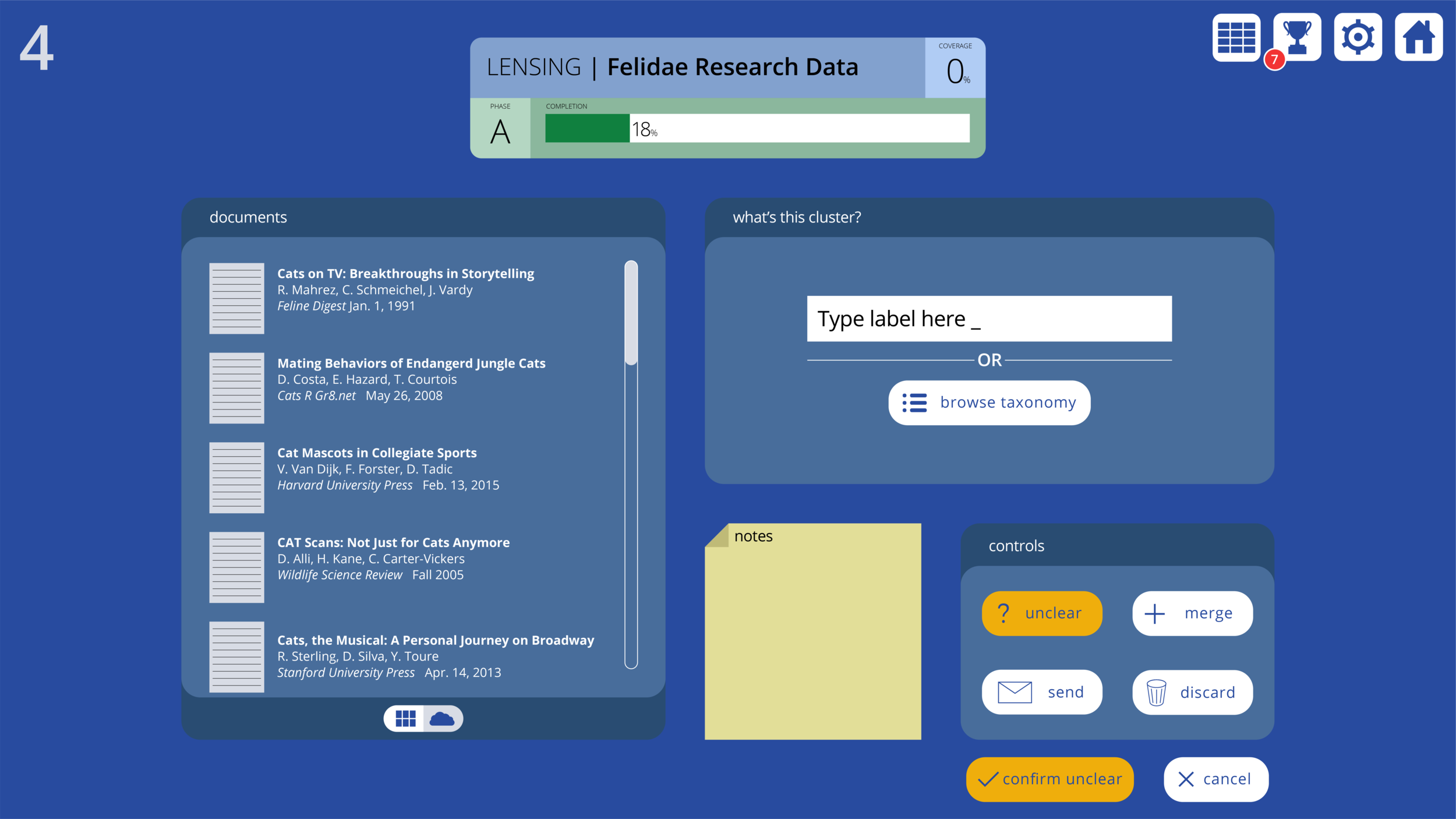
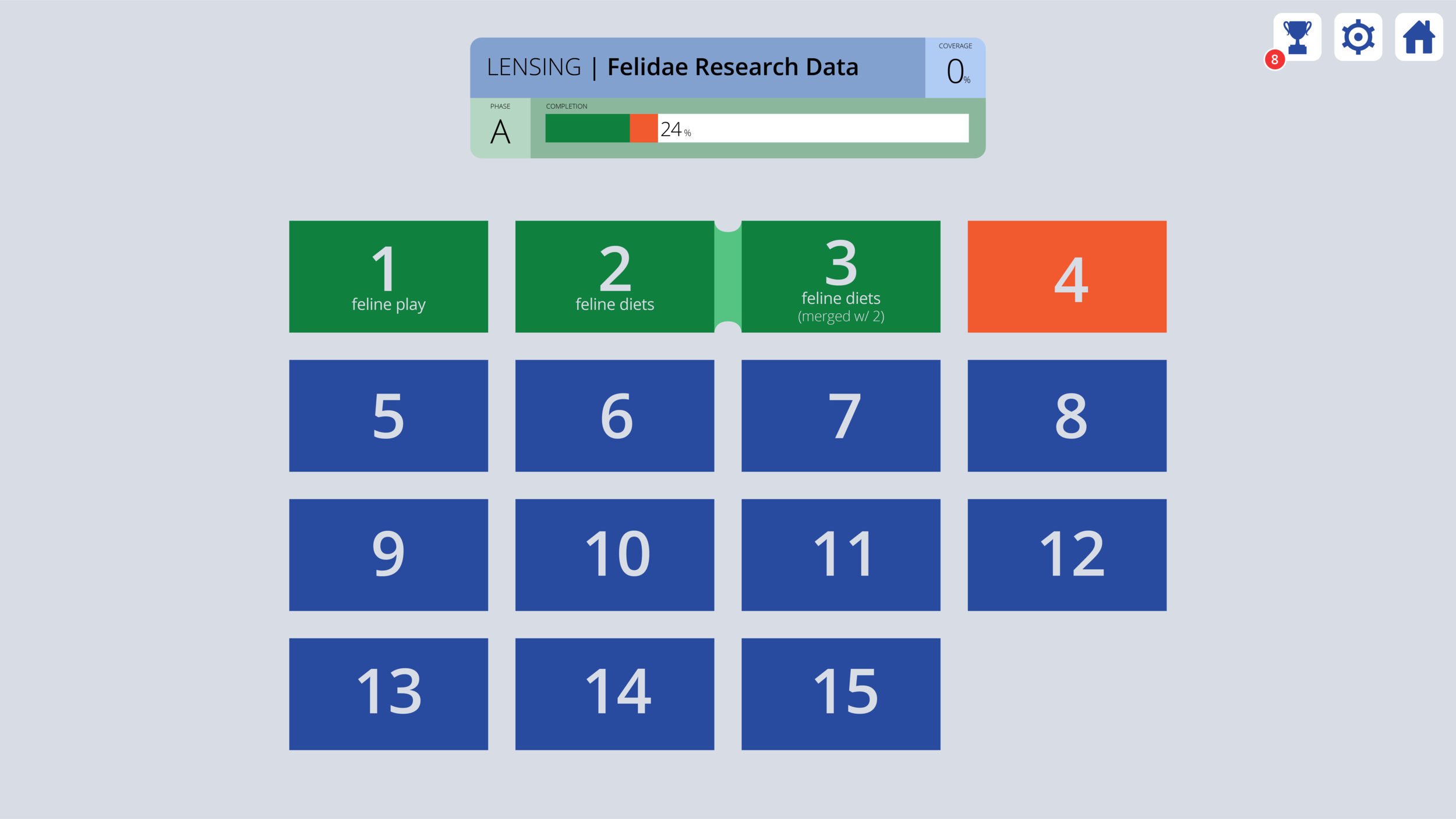

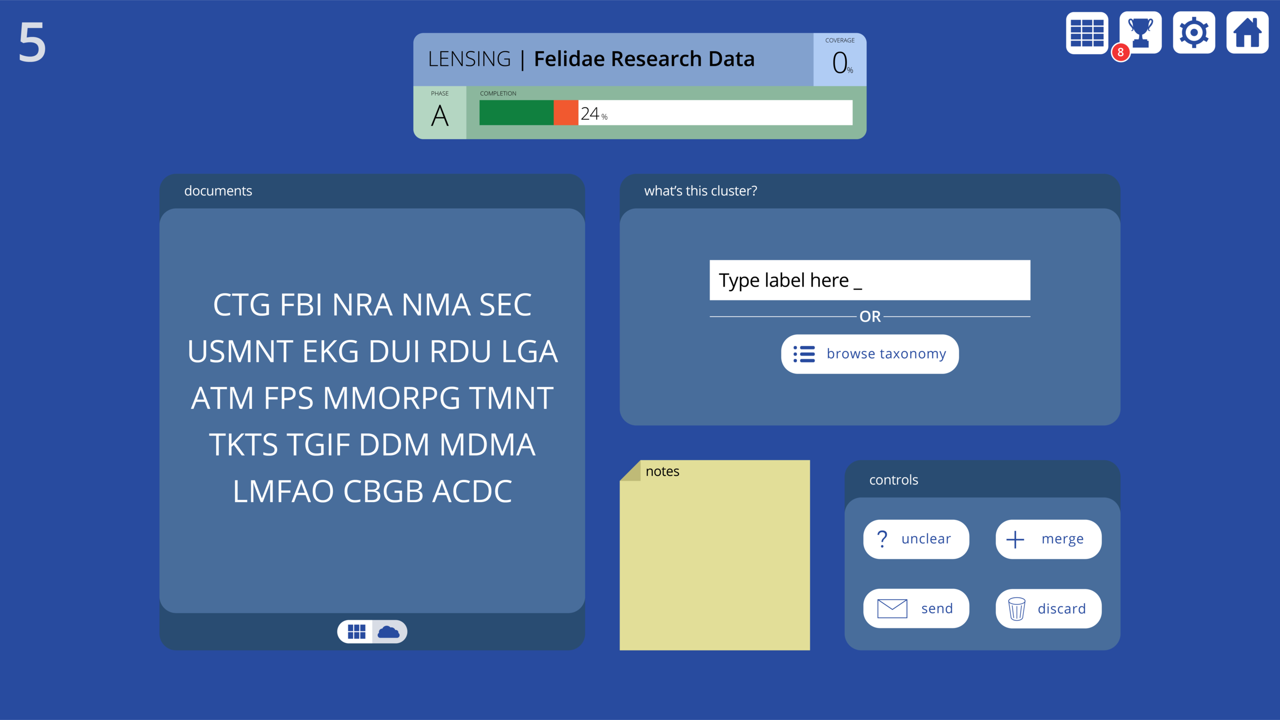
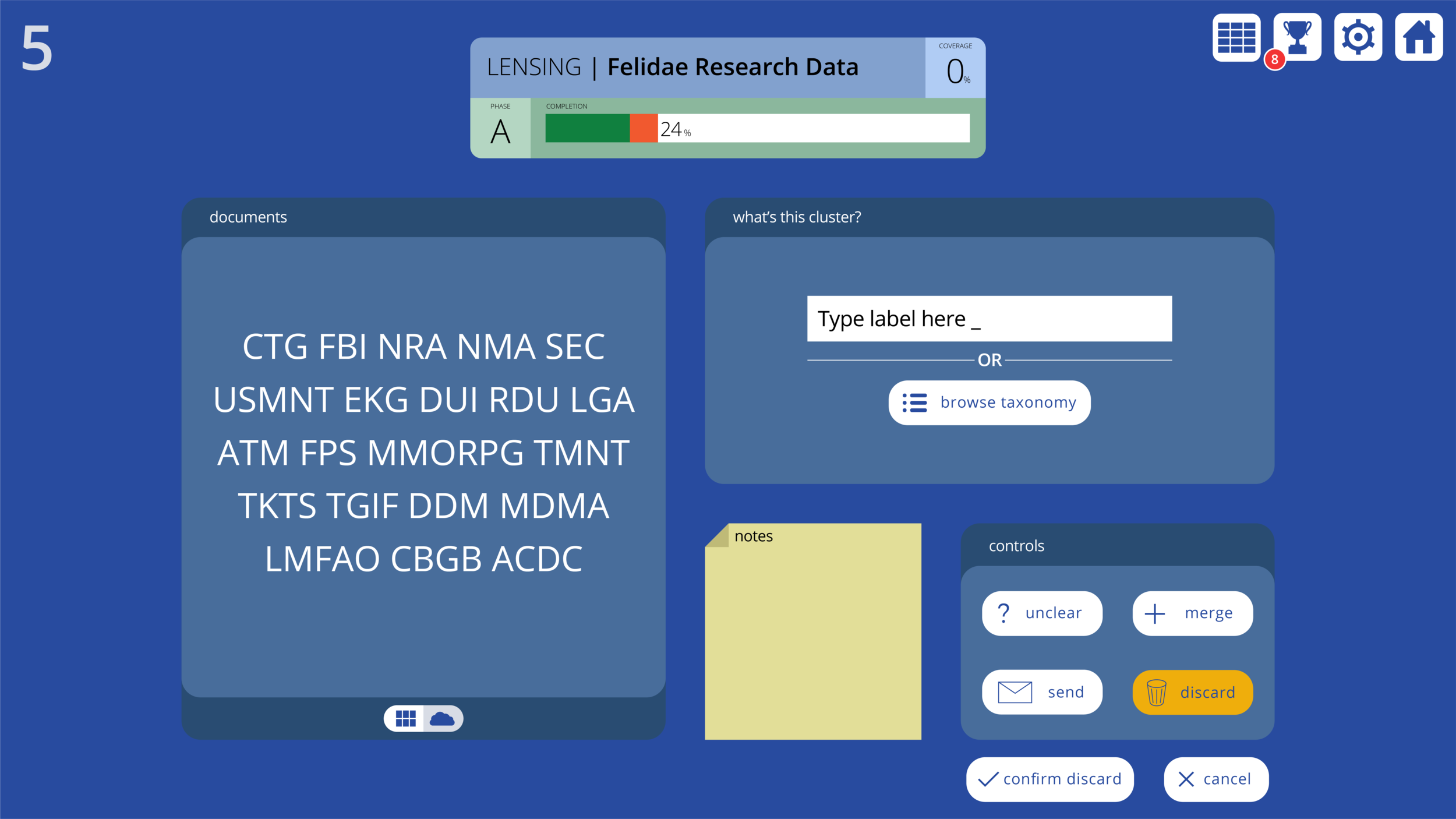
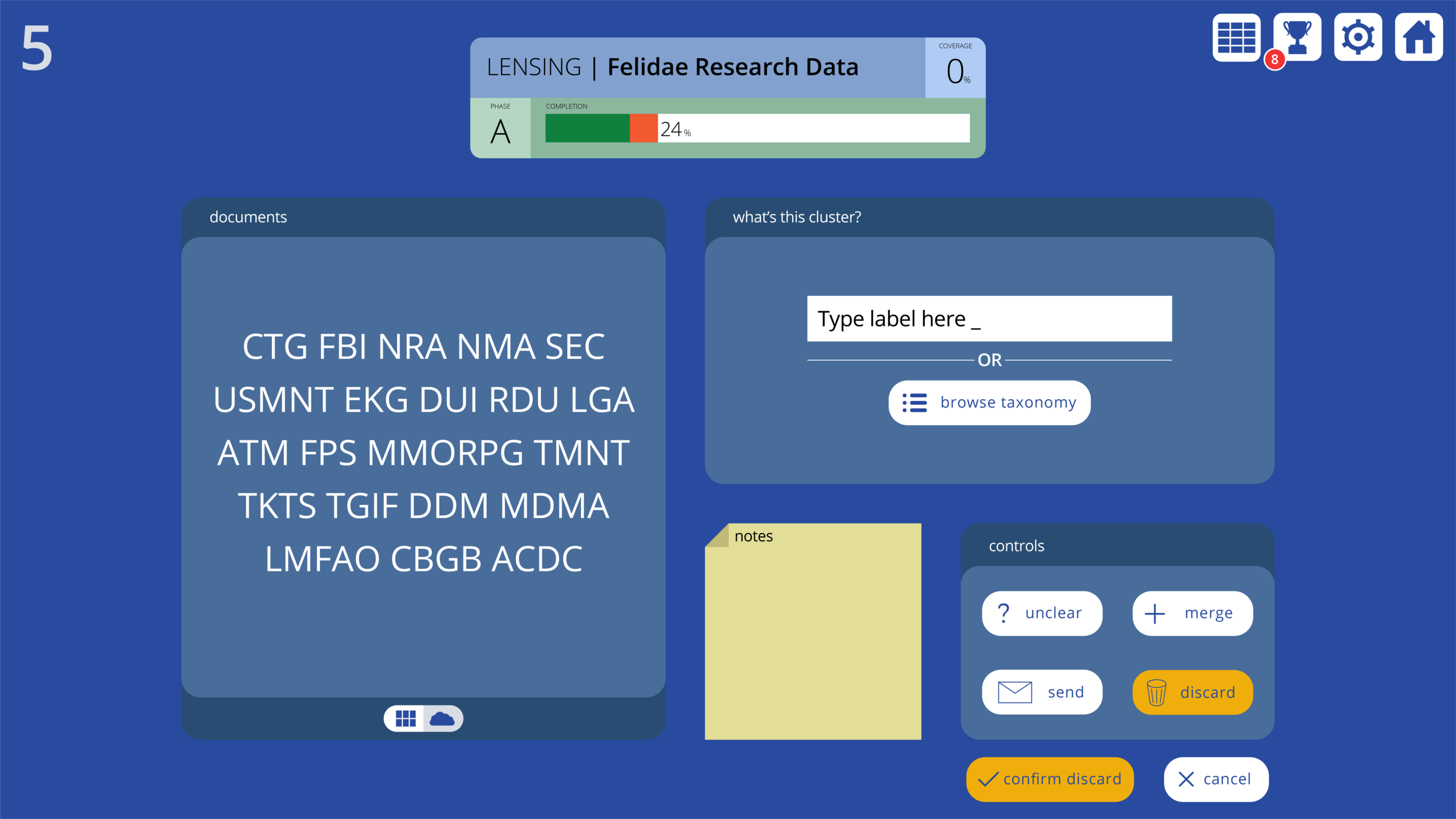
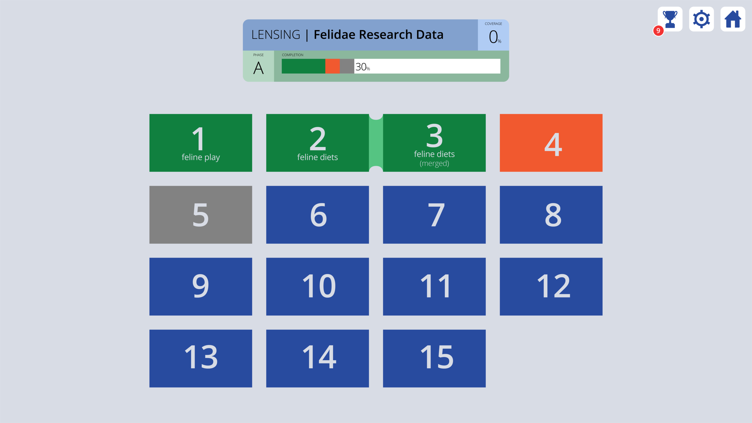
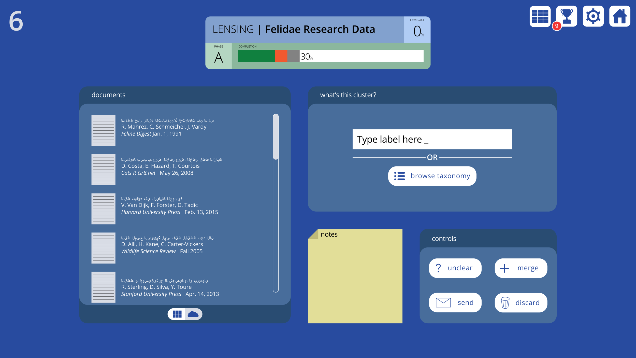
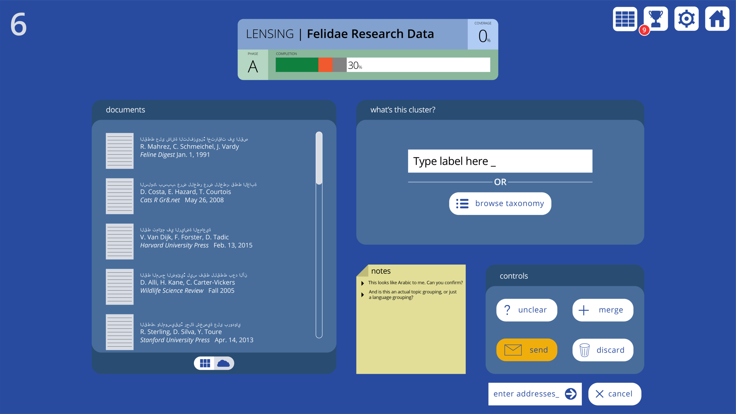

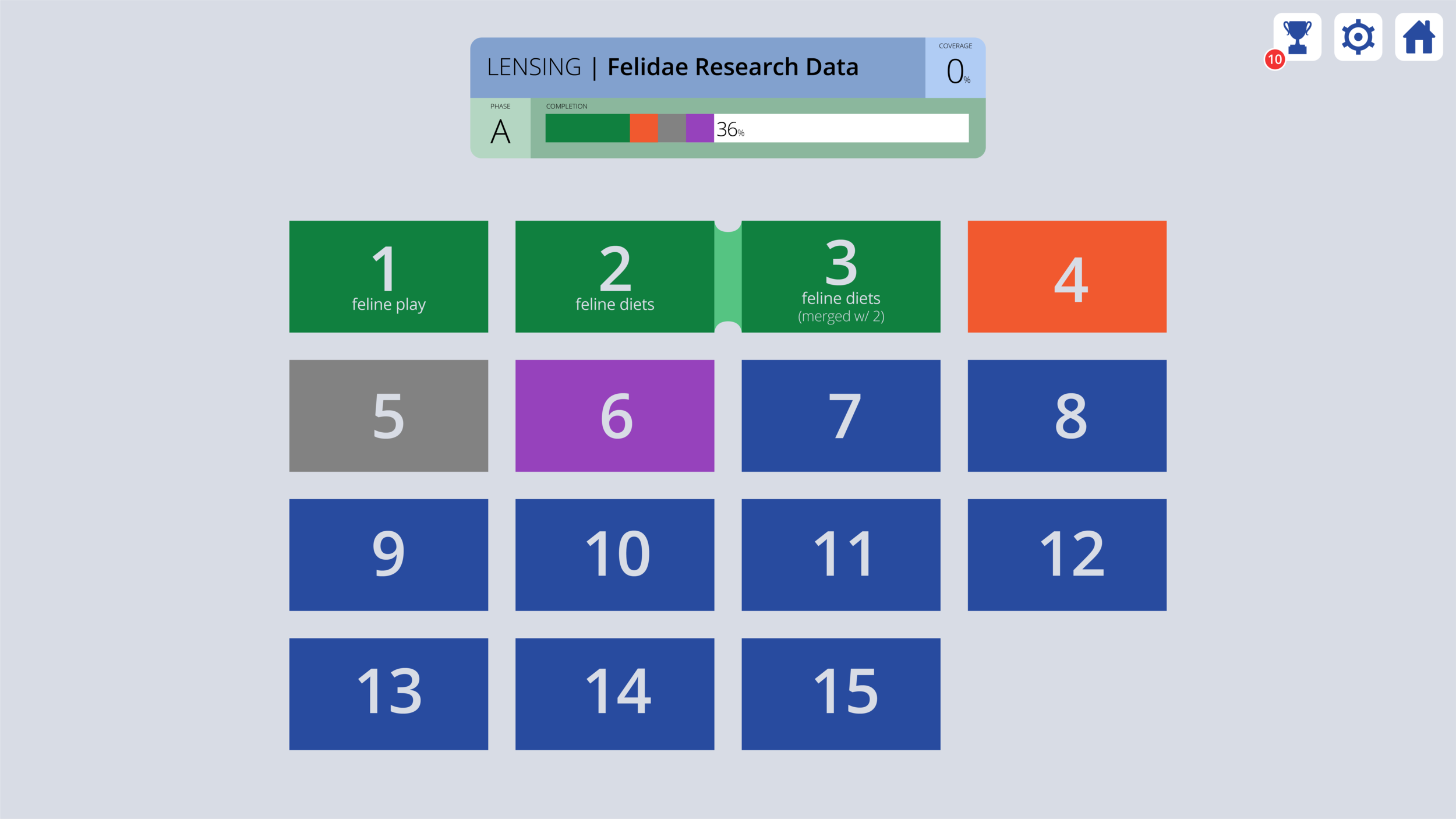
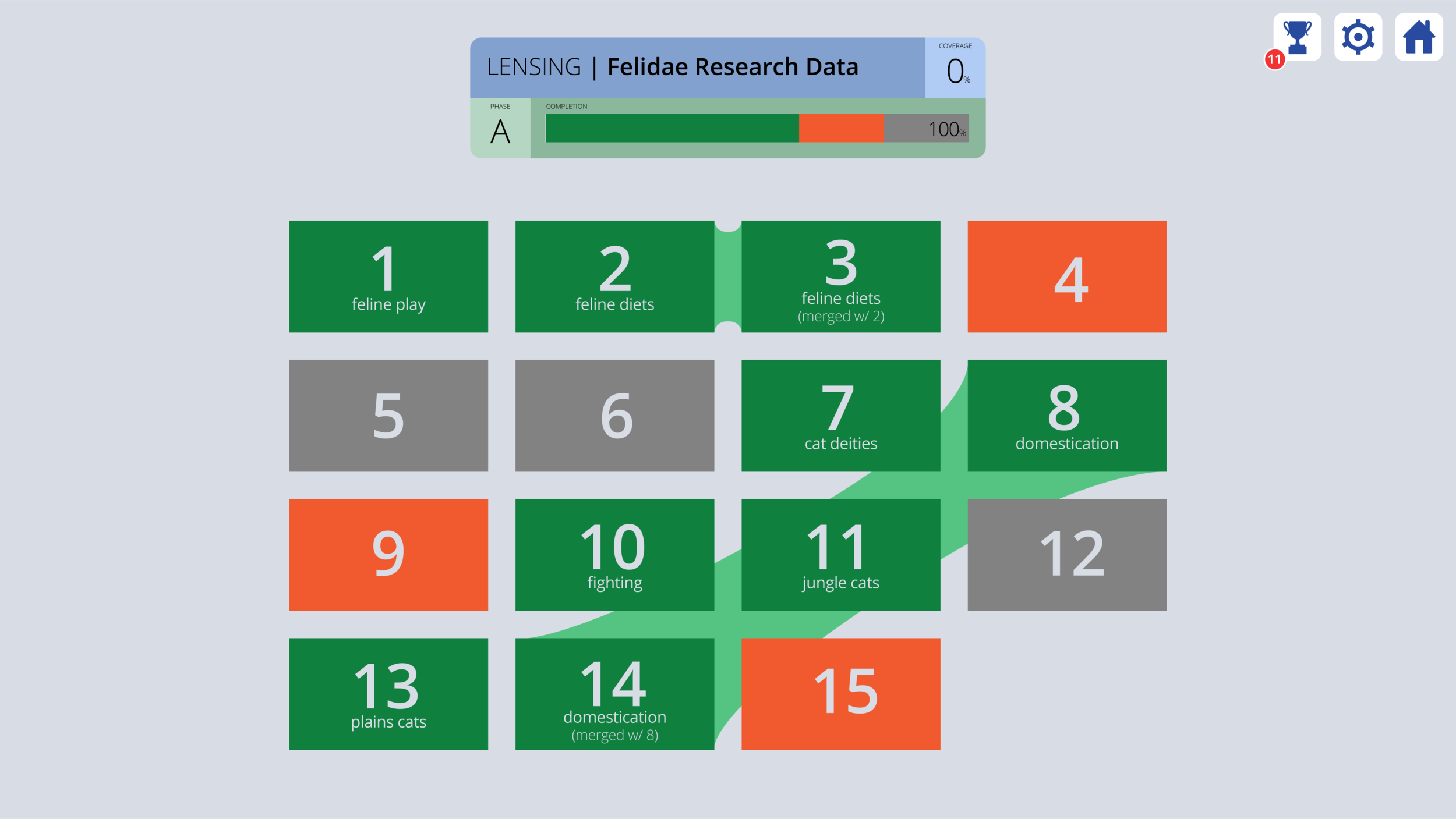
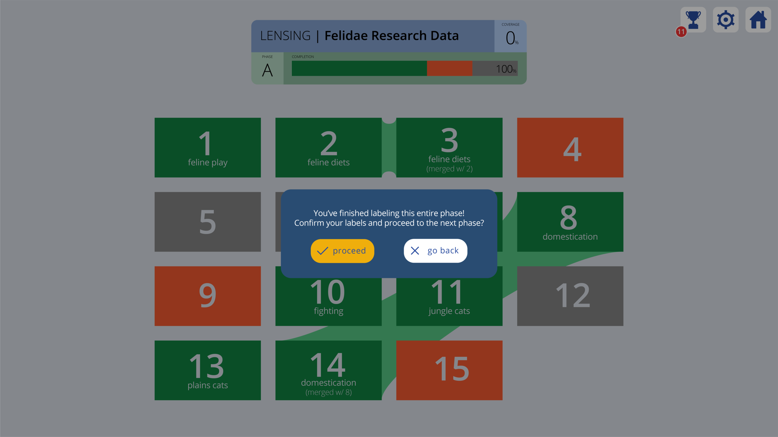
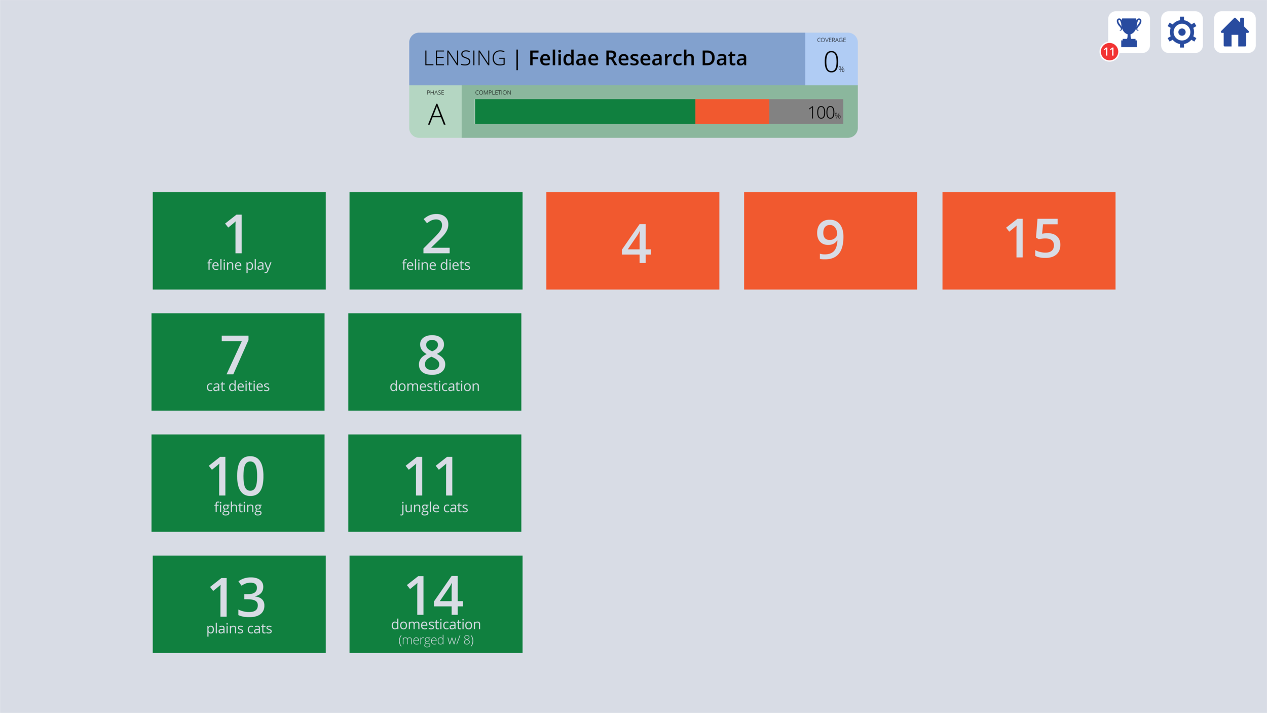
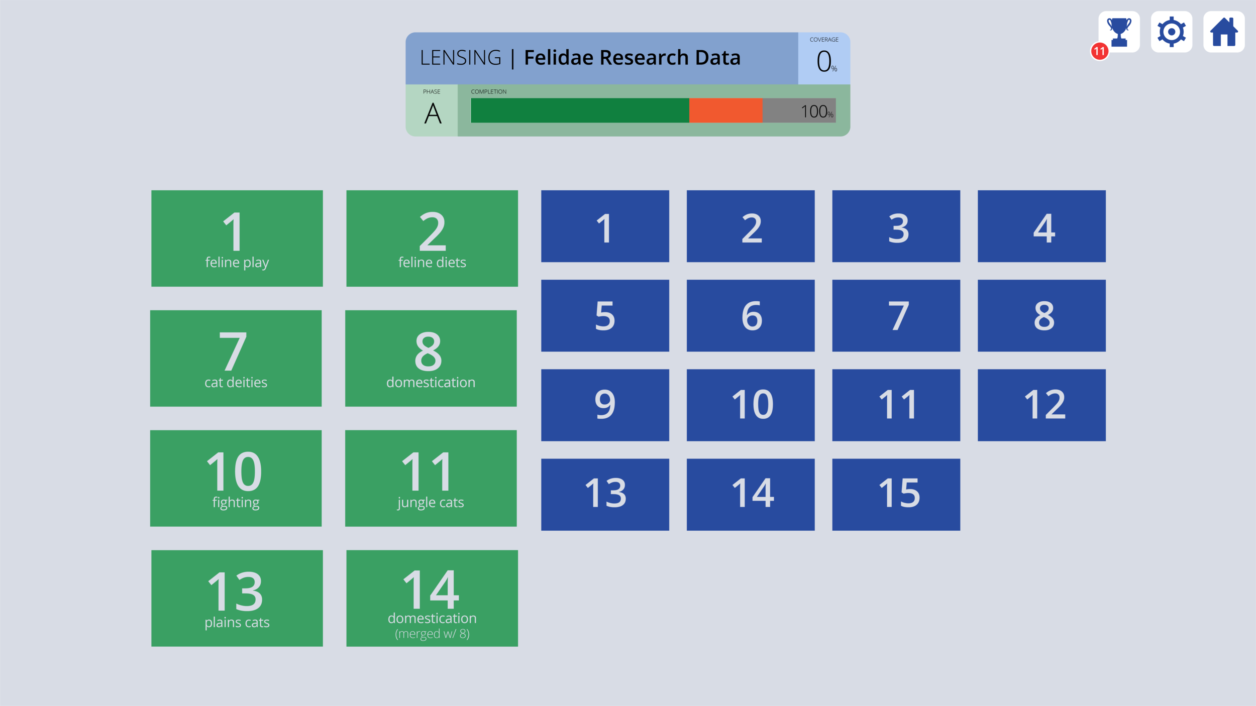
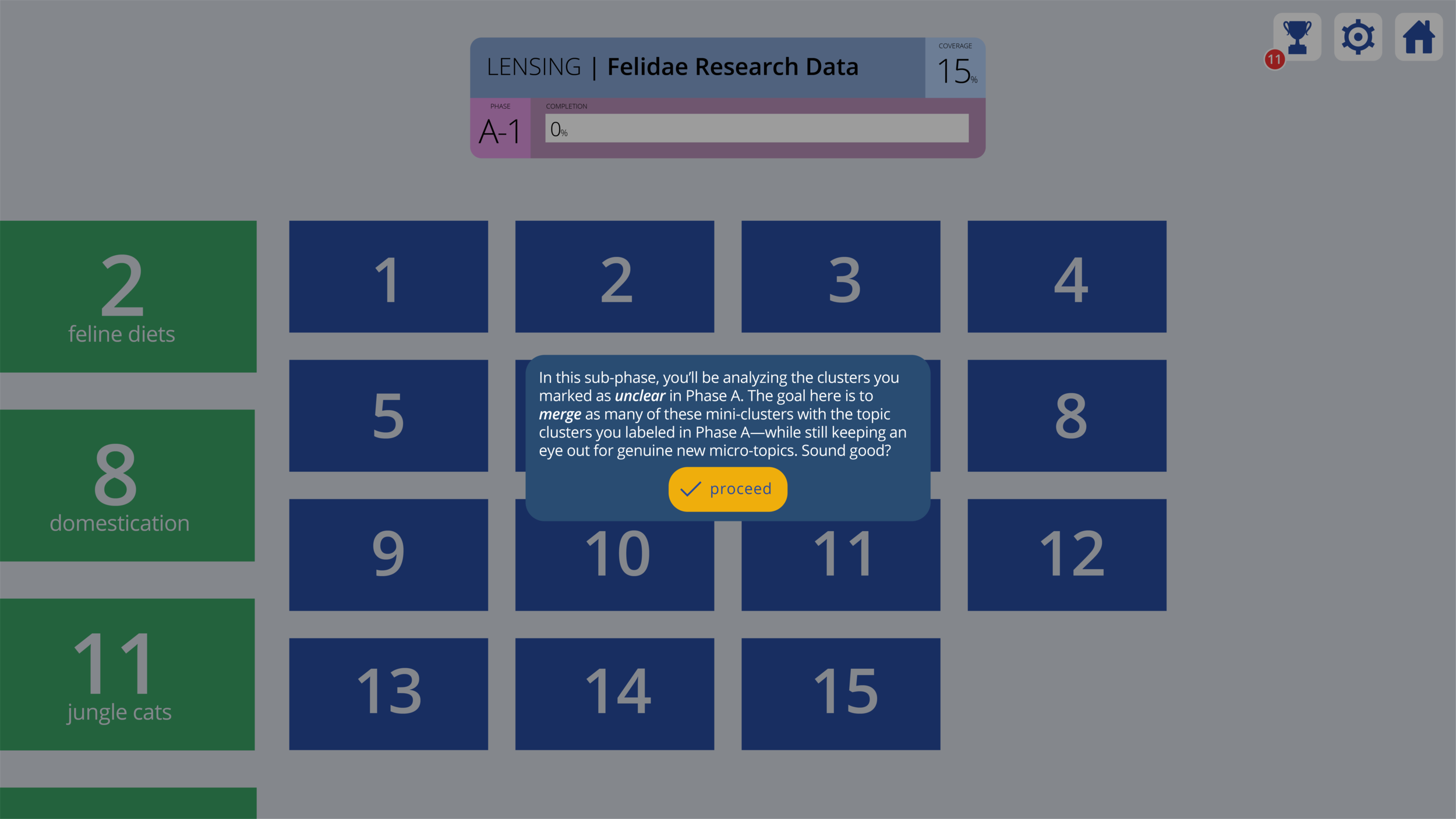
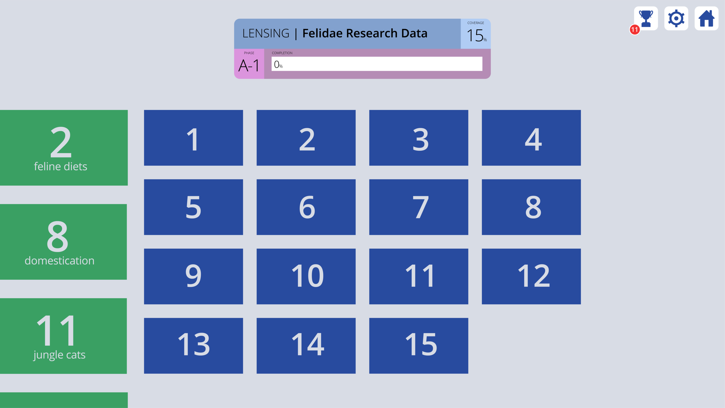
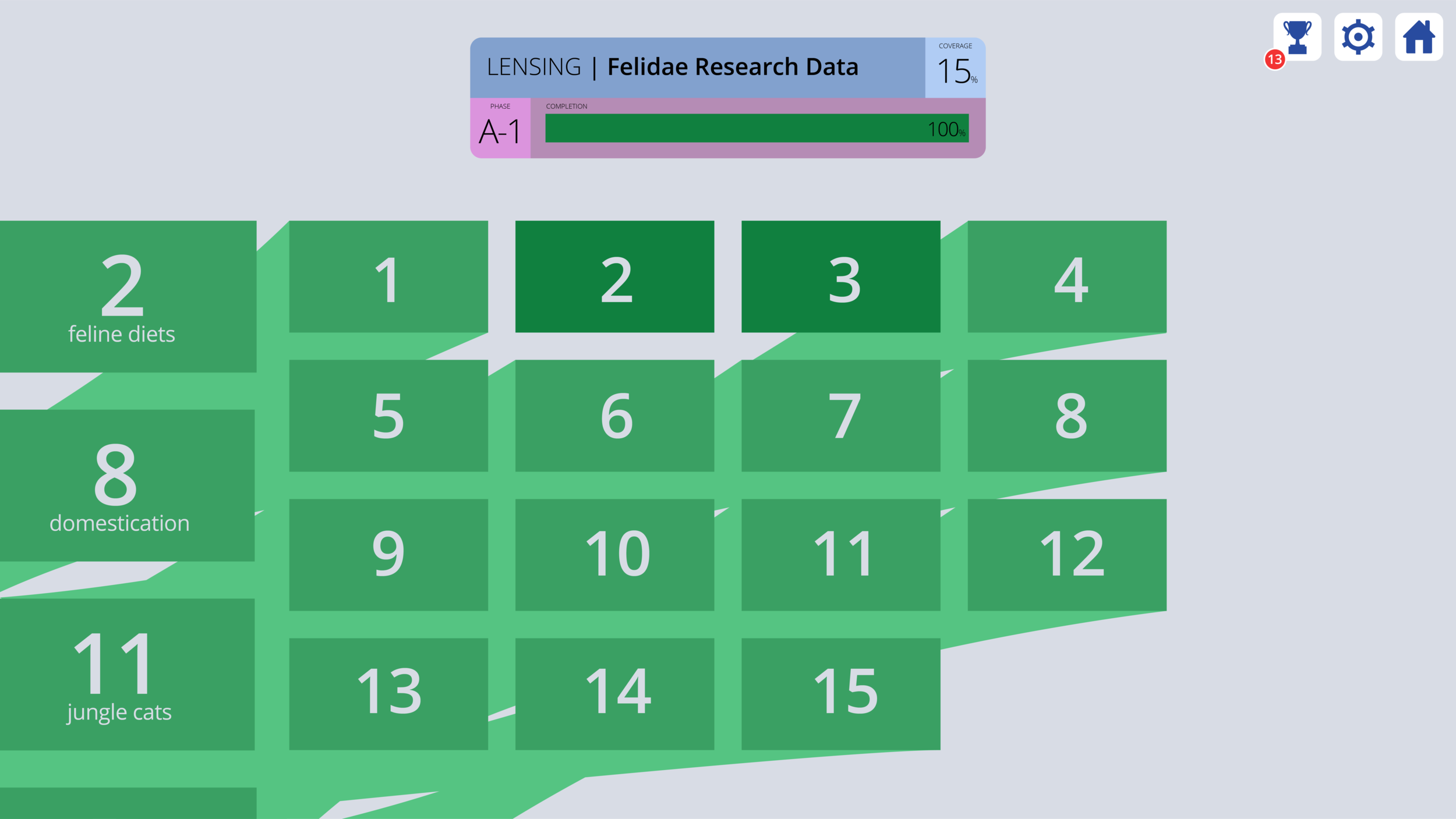
And while I wasn't able to stick around and keep iterating on the Pienso UI (my final year of grad school beckoned), my wireframes, maps and lexicons were a handy launching pad for the experience design team that was getting built up just as I was leaving.
Collateral
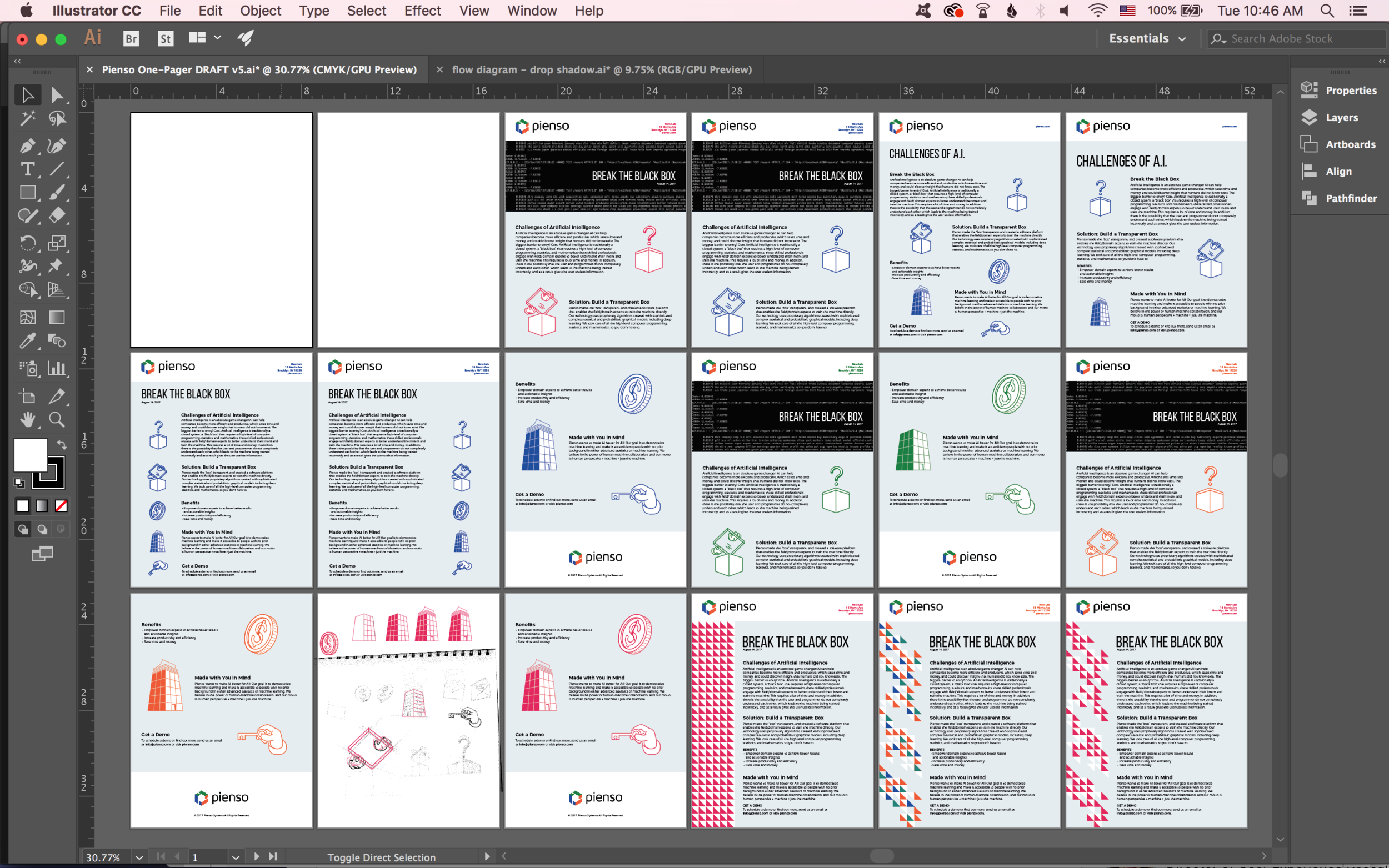
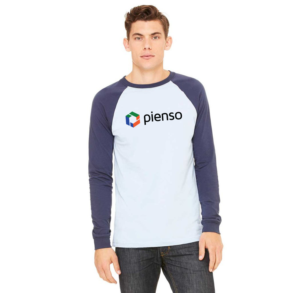
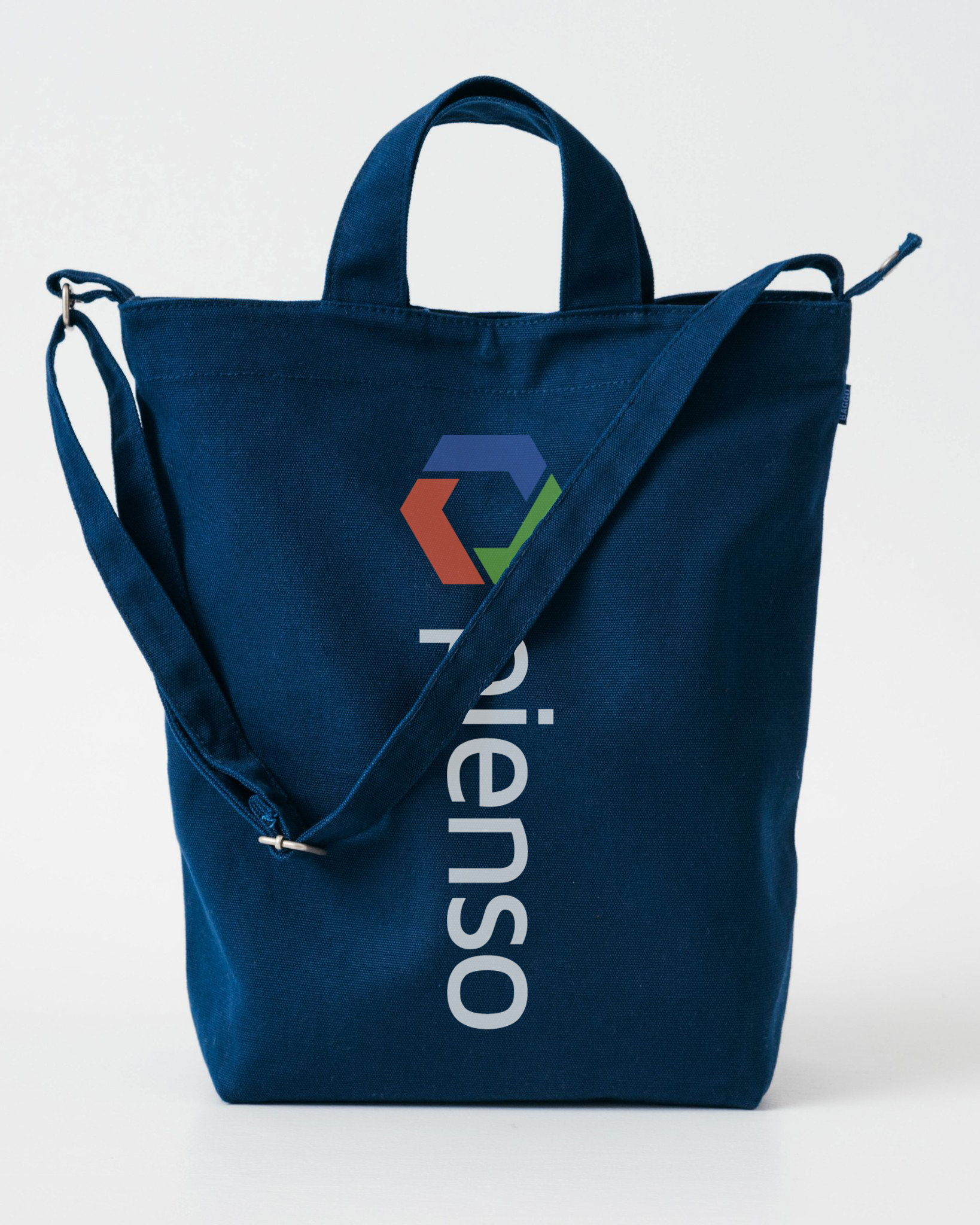
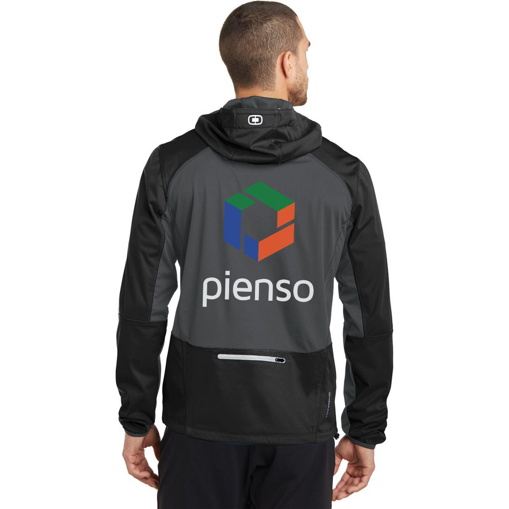
While my primary focus was developing rules and ideas for the Pienso platform, I was there to jump on any design needs that arose — and as you might expect for a new company, there were a few. I designed job descriptions and offer letters, workplace signage and branded swag. Perhaps most notably, I designed the Pienso business card, which is printed on a semitransparent frosted plastic. One of the most enjoyable parts of being a multidisciplinary designer is getting to work on both very conceptual and tactical levels in the same day.
Sketching
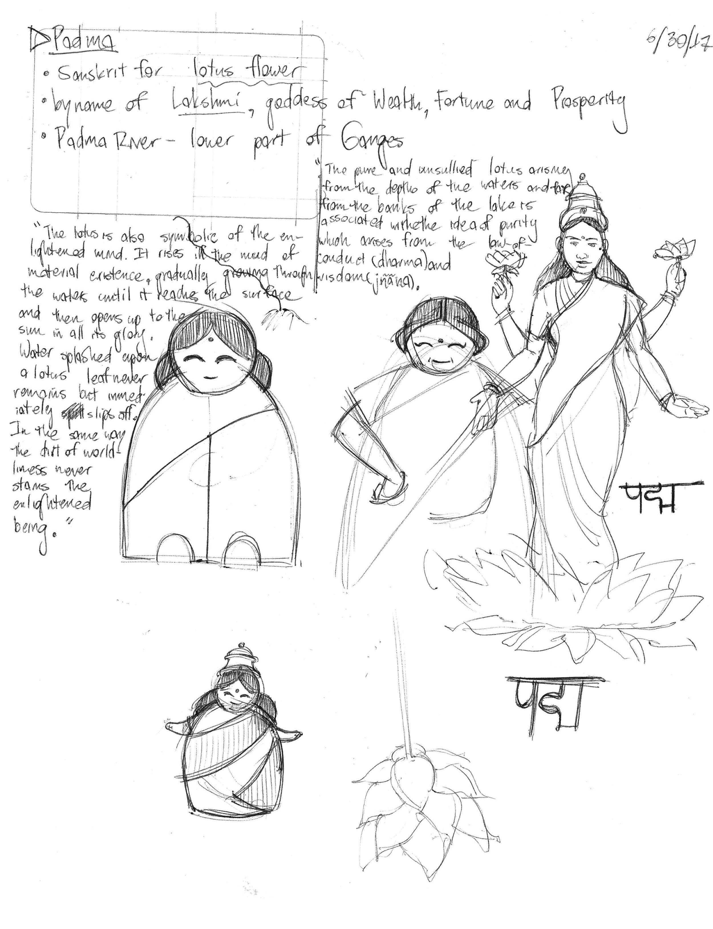
Every step of my creative process begins in my sketchbook — even research. Here are scans of some select pages to give a glimpse of how I work.
~ ~ ~
After completing my master’s degree, I rejoined Pienso in the fall of 2018. You can catch up with our latest progress here.


